
Header and Footer
You can add a title to the FlexPie control by setting its Header property. Besides a title, you may also set a footer by setting the Footer property.
There are also some additional properties to customize header and footer text in a FlexPie.
- HeaderAlignment - Lets you set the alignment for header text.
- FooterAlignment - Lets you set the alignment for footer text.
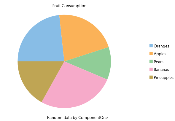
The image below shows how the FlexPie appears after these properties have been set.
In Code
The following code example demonstrates how to set these properties in C#. This example uses the sample created in the Quick Start section.
//Set header and footer
chart.Header = "Fruit Consumption";
chart.HeaderAlignment = LayoutAlignment.Center;
chart.Footer = "Random data by ComponentOne";
chart.FooterAlignment = LayoutAlignment.Center;
In XAML
The following code example demonstrates how to set these properties in XAML. This example uses the sample created in the Quick Start section.
<c1:FlexPie x:Name="chart" ItemsSource="{Binding Data}" BindingName="Name"
    Binding="Value" Header="Fruit Consumption" HeaderAlignment="Center"
    Footer="Random data by ComponentOne" FooterAlignment="Center" />