Calendar
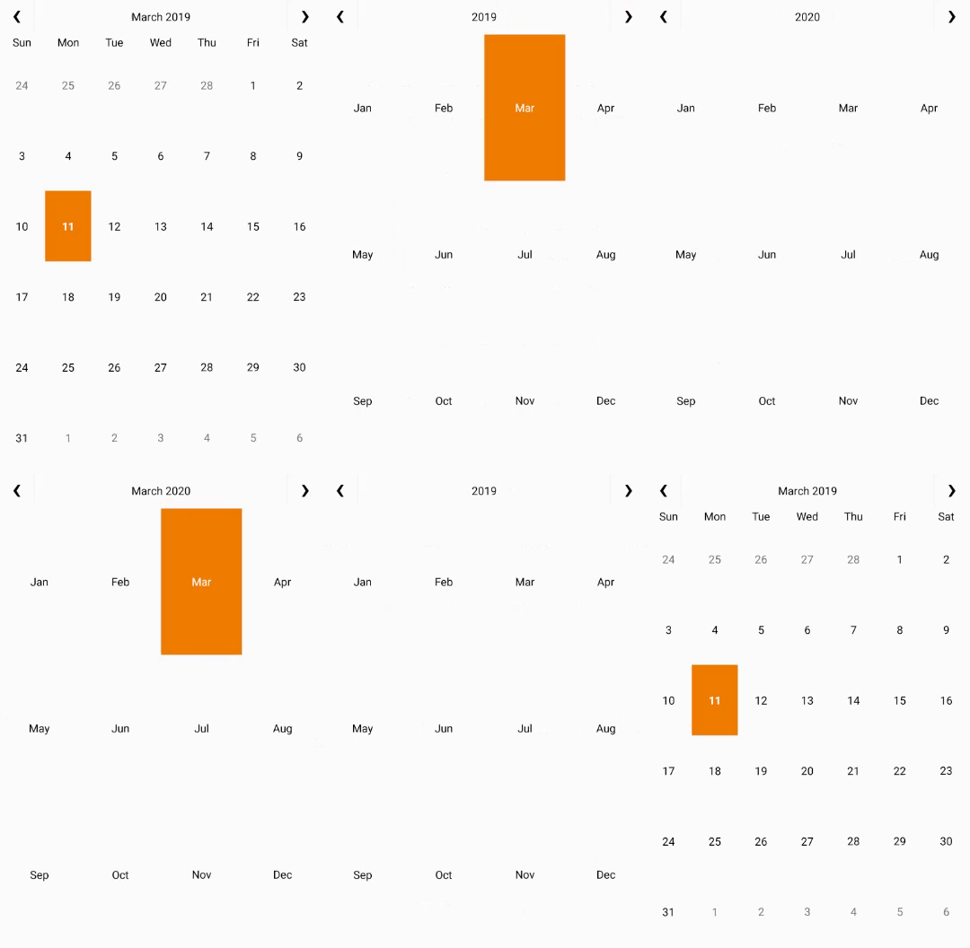
The Calendar control provides a calendar through which you can navigate to any date in any year. The control comes with an interactive date selection user interface (UI) with month, year and decade view modes. Users can view as well as select multiple dates on the calendar.
Calendar provides the ability to customize day slots so that users can visualize date information on the calendar. In addition, you can also customize the appearance of the calendar using your own content and style.

Key Features
- Custom Day Content: Customize the appearance of day slots by inserting custom content.
- View Modes: Tap header to switch from month mode to year and decade mode.
- Appearance: Easily style different parts of the control with heavy customizations.
- Date Range Selection: Simply tap two different dates to select all the dates in between.
- Orientation: Toggle the scroll orientation to either horizontal or vertical.
- Animation: By default, Calendar confers fast, animated transitions for enhanced user experience.


