- Getting Started with Xamarin Edition
-
Controls
- Calendar
- DataCollection
- FlexChart
-
FlexGrid
- Quick Start: Add Data to FlexGrid
- Key Features
-
Features
- Reordering Rows and Columns
- Custom Cells
- Custom Icon
- Customize Appearance
- Clipboard and Keyboard Support
- Data Mapping
- Defining Columns
- Editing
- Export
- Filtering
- Formatting Columns
- Frozen Rows and Columns
- Grouping
- Material Theme
- Merging Cells
- Pull To Refresh
- Resizing Columns/Rows
- Row Details
- Sorting
- Selecting Cells
- Star and Auto Sizing
- Wordwrap
- FlexPie
- FlexViewer
- Gauge
- Input
- Sunburst Chart
- TreeMap
- Release History
Grouping
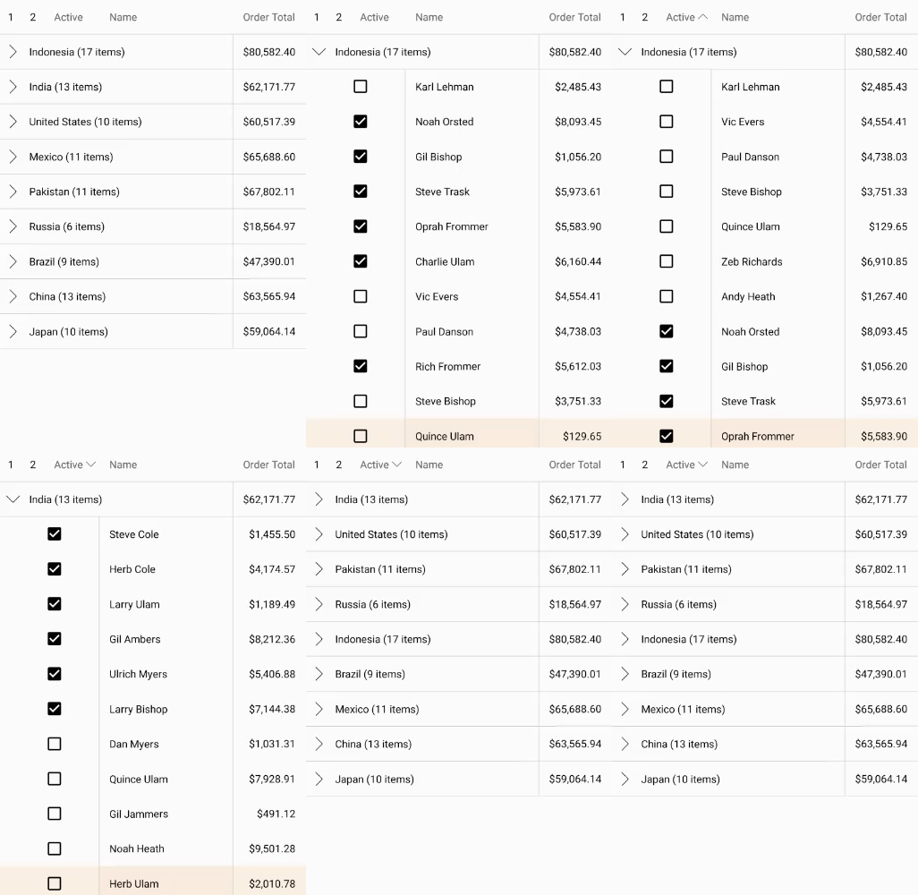
FlexGrid supports grouping through the ICollectionView. To enable grouping, add one or more GroupDescription objects to the C1GroupedCollectionView property. GroupDescription objects are flexible, allowing you to group data based on value or on grouping functions. You can tap anywhere in the group row to expand or collapse grouped rows.
The image below shows how the FlexGrid appears, after these properties have been set.
The following code example demonstrates how to apply Grouping in FlexGrid in C# and XAML. The example uses the data source, Customer.cs created in the Quick start section.
Add a new Content Page, Grouping.xaml, to your portable project.
To initialize a FlexGrid control and enabling grouping in XAML, modify the markup between the <ContentPage></ContentPage> tags and inside the <StackLayout></StackLayout> tags as illustrated in the code below.
<ContentPage xmlns="http://xamarin.com/schemas/2014/forms"
             xmlns:x="http://schemas.microsoft.com/winfx/2009/xaml"
             xmlns:c1="clr-namespace:C1.Xamarin.Forms.Grid;assembly=C1.Xamarin.Forms.Grid"
             x:Class="FlexGridFeatures.Grouping">
    <StackLayout Orientation="Vertical">
        <Grid VerticalOptions="FillAndExpand">
            <c1:FlexGrid x:Name="grid"  AutoGenerateColumns="False" ShowOutlineBar="True" GridLinesVisibility="Vertical" IsReadOnly="True">
                <c1:FlexGrid.Columns>
                    <c1:GridColumn Binding="Active" Width="Auto"/>
                    <c1:GridColumn Binding="Name" Width="*"/>
                    <c1:GridColumn Binding="OrderTotal" Width="Auto" Format="C" Aggregate="Sum" HorizontalAlignment="End"/>
                </c1:FlexGrid.Columns>
                <c1:FlexGrid.Behaviors>
                    <c1:EmptyGridBehavior EmptyView="{x:Reference Name=emptyListLabel}" />
                </c1:FlexGrid.Behaviors>
            </c1:FlexGrid>
            <Label x:Name="emptyListLabel"
            Text="There are no items to show."
            FontSize="Large"
            HorizontalOptions="Center"/>
        </Grid>
    </StackLayout>
</ContentPage>
In the Solution Explorer, expand the Grouping.xaml node and open the Grouping.xaml.cs to view the C# code.
Add the following code to apply grouping to the column Country in the FlexGrid control.
public partial class Grouping : ContentPage
{
    C1CollectionView<Customer> _collectionView;
    public Grouping()
    {
        InitializeComponent();
        var task = UpdateVideos();
    }
    private async Task UpdateVideos()
    {
        var data = Customer.GetCustomerList(100);
        _collectionView = new C1CollectionView<Customer>(data);
        await _collectionView.GroupAsync(c => c.Country);
        grid.ItemsSource = _collectionView;
    }
}


