- Introduction
- Report Readers
- Report Authors
- DevOps
-
Developers
- Quick Start
- Breaking Changes
- ActiveReports Version Compatibility and Migration
- License ActiveReports
- Configure ActiveReports Using Code
- Work with Reports using Code
- Report Parts
- Create Designer and Viewer Applications
- Extensibility in ActiveReports
- External Customizations in ActiveReports
- Export Reports
- Print Reports
- Plugins Development
- Samples
- Troubleshooting
Report Parts
Introduction
ActiveReports.NET includes the web designer component that you can integrate into your web-application to allow end-users to create and modify reports. The web designer covers most of the functionality of the VS.NET integrated designer and the standalone report designer; it allows configuring data binding, adding report items, and setting their properties. However, end-users of your application might not have extensive knowledge of data binding, report items, and surrounding topics. To streamline the user experience, ActiveReports.NET offers the Report Parts feature. Report Parts are basically pre-configured report items that end-users could drag-and-drop into a report body and customize further. The available customization properties are also defined in a report part.
Report Libraries
A Report Library is a report that contains one or more Report Parts. You can build multiple report libraries for different user groups. If an end-user adds a report part to a target report, then it includes a link to the corresponding report library. You can then modify report parts definitions within a report library, and modifications will be automatically picked up for all target reports that use these report parts. Note that the data sources, datasets, and parameters are copied to a target report. Hence, modifying these items in the report library won’t immediately affect the target reports.
Creating Report Libraries
To create a report library, you can create a new or open an existing RDLX Report in the standalone designer application, or in the VS.NET integrated designer. Once you decided which report items should be exposed as report parts, you can initialize a new report part using the following methods:
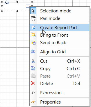
Select one or more report items, right-click the selection, and in the context menu, choose the Create Report Part menu.
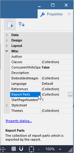
Select the Report object by clicking anywhere outside the report body, and open the Report Parts collection from the Properties Panel.
Open the Report Menu and click the Report Parts item.

Right-click the Report node in the Report Explorer and select the Report Parts… item.
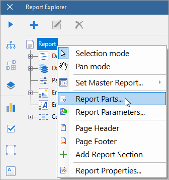
As the result of these actions, the Exported Report Parts dialog appears.
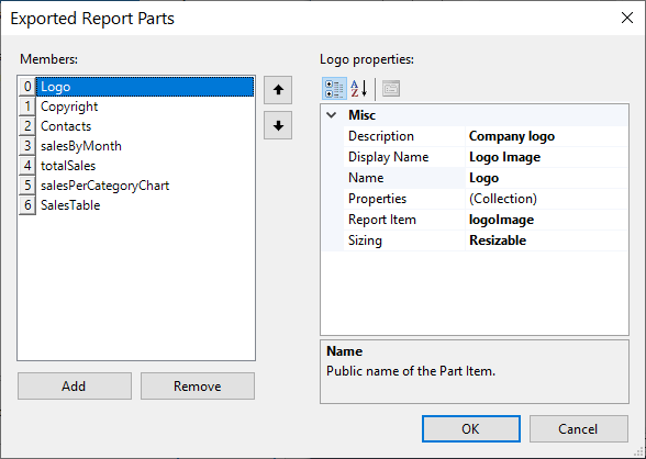
If you open the Export Report Parts dialog via the context menu of an existing report item, the new report part linked to that report item will be automatically created. In all other cases, you can add report parts manually. Each report part exposes the following properties:
Description - the description of a report part that will be visible for end-users. You can use this property to provide additional information for them.
Display name - the name of a report part that will be visible for end-users.
Name - the unique, internal name of a report part. Note that it should be a CLI-compliant identification.
Properties - A collection of custom properties that should be available for end-users to customize a report part. The configuration of a custom property includes:
Category - the category under which a custom property appears in the property grid of the web designer. You can group custom properties by using categories.
Default value - the initial value of a custom property.
Description - the description of a custom property that will be visible for end-users in the web designer property grid.
Display Name - the name of a custom property that will be useful for end-users in the web designer property grid.
Name - the unique, internal name of a custom property. Note that it should be a CLI-compliant identification.
Property Type - identifies the editor of a custom property that will be available for end-users. For example, if you want to allow end-users to modify the background color of a report item, you can set the type of the corresponding custom property to 'Color' and the color editor will appear in the web designer property grid.
Report Item - the link to the report item that is represented by a report part.
Sizing - Identifies whether end-users could resize a report part after adding it to a report.
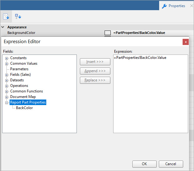
After defining a custom property, you can refer to its value by using the PartProperties collection. For example, if you have defined the 'BackColor' custom property in a report part, you can set the Background Color of a report item to the =PartProperties.BackColor.Value expression. The custom properties for all report parts are available via the expression editor.
Integrating Report Libraries
After creating a report library and saving it (it is just an RDLX report), you can save it within the resources of a web-application that uses the web designer. The recommended way is to keep the report libraries the same way you keep other reports – in the file system or a database. Then you can list the report libraries that should be available for end-users via the WebDesigner API . Here is the sample of code:
<html lang="en">
<head>
    @*get these files from the installation location for the package: \node_modules\@mescius\activereportsnet-designer\dist*@
    <link rel="stylesheet" href="web-designer.css" />
    <script src="web-designer.js"></script>
</head>
<body>
    <div id="web-designer-host">
    </div>
<script>
        GrapeCity.ActiveReports.Designer.create('#web-designer-host', {
            rdlx: {
                reportParts: {
                    enabled: true,
                    libraries: [{
                        name: 'Sales',
                        path: 'Libraries/Lib_Sales.rdlx'
                    },
                    {
                        name: 'Marketing',
                        path: 'Libraries/Lib_Marketing.rdlx'
                    }]
                }
            }
        });
    </script>
</body>
</html>
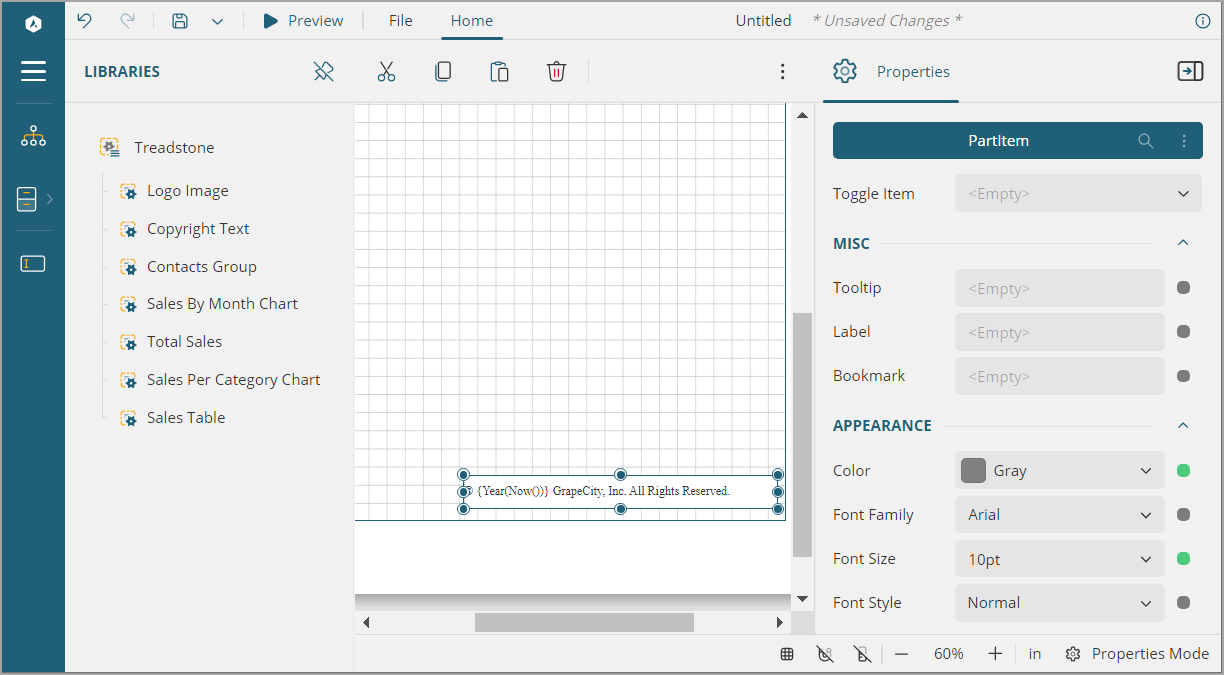
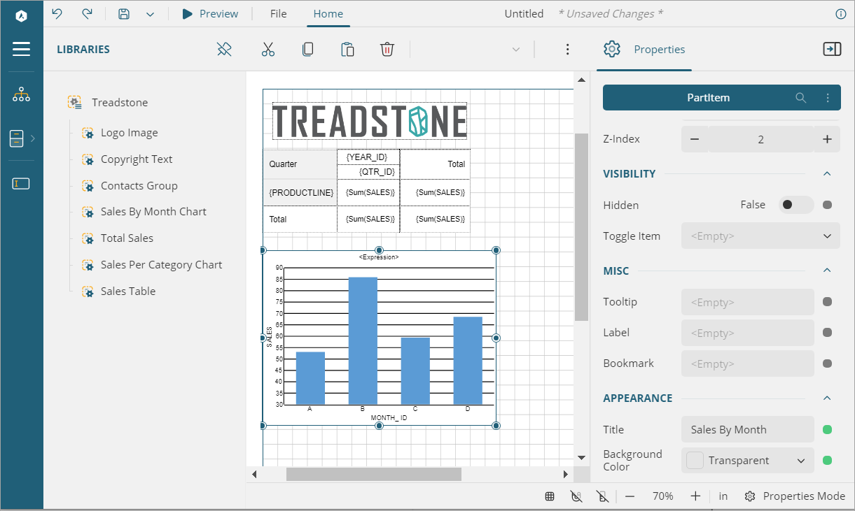
After running the application, the web designer will have the Libraries' panel that lists available libraries and the report parts. End-users will be able to drag-and-drop the report parts, modify the custom properties. Upon previewing a report, the report parts will be rendered according to its definition with the customization applied.
Report Parts Sample
You can download the example of report parts usage from the ActiveReports GitHub repository.
Upon running the sample, you can see a customized web designer with almost all standard UI removed and the report libraries panel available and opened by default.
To observe how a library is created, go to the File menu > libraries and open 'Treadstone.rdlx' report. This is a multi-section report with three sections Cards, Tables, and Charts. All report parts that are available in this library can be viewed from the Report Parts property of the report.
The following image shows the report parts present in 'Treadstone' library in the Exported Report Parts dialog and the properties set for one of the report part in the Report Part Properties dialog, in desktop designer.
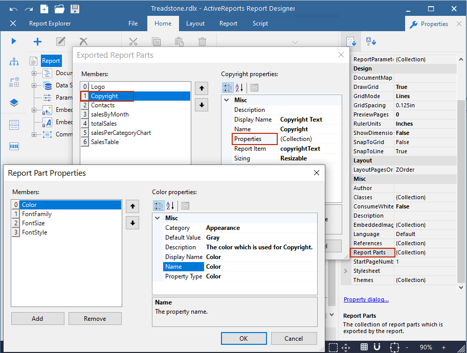
The 'Treadstone' library contains report parts as shown in the table below. The table describes the custom property of each report part, the original report item linked to the report part, and the expression used for referencing the report part properties into the report item's property.
Report Part | Custom properties of the Report Part* | Linked Original Report Item | Corresponding Report Item property and the Expression (in WebDesigner) |
|---|---|---|---|
Logo | BorderColor | Image | Border > Color > Default {PartProperties!BorderColor.Value} |
BorderStyle | Border > Style > Default {PartProperties!BorderStyle.Value} | ||
BorderWidth | Border > Width > Default {PartProperties!BorderWidth.Value} | ||
Copyright | Color | TextBox | Text > Color {PartProperties!Color.Value} |
FontFamily | Text > Font Family {PartProperties!FontFamily.Value} | ||
FontSize | Text > Font Size {PartProperties!FontSize.Value} | ||
FontStyle | Text > Font Style {PartProperties!FontStyle.Value} | ||
Contacts | Color | Container. The properties are applied on the text boxes it contains. | Text > Color {PartProperties!Color.Value} |
FontFamily | Text > Font Family {PartProperties!FontFamily.Value} | ||
FontSize | Text > Font Size {PartProperties!FontSize.Value} | ||
FontStyle | Text > Font Style {PartProperties!FontStyle.Value} | ||
salesByMonth | Title | Chart | Select Chart's Header > Caption {PartProperties!Title.Value} |
BackgroundColor | Background >Color {PartProperties!BackgroundColor.Value} | ||
totalSales | Caption | FormattedText | The corresponding expressions are used in the 'Html' property as shown. |
ValueFont | |||
ValueFontSize | |||
ValueFontStyle | |||
salesPerCategoryChart | Title | Chart | Select Chart's Header > Caption {PartProperties!Title.Value} |
BackgroundColor | Background > Color {PartProperties!BackgroundColor.Value} | ||
SalesTable | HeaderTextColor | Tablix | Select Table Header's TextBox: Text > Color {PartProperties!HeaderTextColor.Value} |
HeaderBgColor | Background > Color {PartProperties!HeaderBgColor.Value} | ||
HeaderBorderColor | Border > Color > Default {PartProperties!HeaderBorderColor.Value} |
*For complete list of custom properties in each report part, check the sample.
Try drag-and-dropping report parts from the Libraries panel to the report body, and modifying the custom properties, and previewing the result.
