
- Introduction
- Report Readers
- Report Authors
- DevOps
-
Developers
- Quick Start
- Breaking Changes
- ActiveReports Version Compatibility and Migration
- License ActiveReports
- Configure ActiveReports Using Code
- Work with Reports using Code
- Report Parts
-
Create Designer and Viewer Applications
- .NET Viewer Application
- Web Viewer and Web Designer Middlewares
- Js Viewer Application
- ASP.NET WebViewer Application
- Blazor Viewer Application
- WebDesigner Application
- Blazor WebDesigner Application
- End User Report Designer in WinForms Application
- Themes in WebDesigner and Js Viewer Components
- Role Based Authorization with JWT
- Extensibility in ActiveReports
- External Customizations in ActiveReports
- Export Reports
- Print Reports
- Plugins Development
- Samples
- Troubleshooting
Themes in WebDesigner and Js Viewer Components
The creation of custom themes and applying them on Web Designer and Js Viewer is now simpler.
The modules '@mescius/activereportsnet-designer' and '@mescius/activereportsnet-viewer' provide 'ColorTheme' and 'ColorThemes' objects, which can be used in both designer and viewer components to customize their appearance. Using the respective APIs, you can modify the color scheme of all interface elements within the Designer and Viewer to align with specific use case requirements. Let's explore some quick use cases and update the Script.js file in our WebSamples for WebDesigner and Js Viewer.
import { createViewer, ColorTheme, ColorThemes } from '@mescius/activereportsnet-viewer';
import { arWebDesigner} from '@mescius/activereportsnet-designer';
Create Custom Theme
Use the following code to create a custom theme:
var theme = {
    name: 'testTheme',
    backgroundMain: '#f0f0f0',
    backgroundPanels: '#ffffff',
    primary: 'blue',
    secondary: 'green',
    neutral: 'grey',
    error: 'red',
    warning: 'yellow',
    fontFamily: 'Arial'
};
Create Custom Theme based on Built-in Theme
Use the following code to create a custom theme based on built-in theme:
var theme = {
    ...ActiveReports.ColorThemes.default
    name: 'testTheme',
    primary: 'blue',
    secondary: 'green'
});
Themes in WebDesigner
Apply Theme using the Application's UI
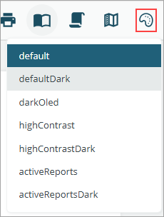
Use Theme Picker to select from the pre-defined themes in the application.
Manage Themes using WebDesigner API
Use the initialTheme API to apply an initial or default theme to the WebDesigner component.
Apply a Custom Theme
The following code sets a custom theme as the initial theme of the WebDesigner.
GrapeCity.ActiveReports.Designer.create('#ar-web-designer', {
    themes: {
        initialTheme: 'testTheme',
        themeSelector: {
            enabled: false,
            availableThemes: ['Default', theme]
        }
    }
});
Apply a Built-in Theme
The following code sets a built-in theme as the initial theme of the WebDesigner. Here are the built-in themes you can choose from: default, defaultDark, darkOled, highContrast, and highContrastDark.
GrapeCity.ActiveReports.Designer.create('#ar-web-designer', {
    themes: {
        initialTheme: 'defaultDark',
        themeSelector: { enabled: false }
    },
});
Themes in Js Viewer
Use the initialThemeAPI to apply an initial or default theme to the Js Viewer component.
Apply Theme using the Application's UI
Use Theme Picker to select from the pre-defined themes in the application.
Apply a Custom Theme
The following code sets a custom theme as the initial theme of the Js Viewer.
GrapeCity.ActiveReports.JSViewer.create({
    element: '#root',
    themes: {
        initialTheme: 'testTheme',
        themeSelector: {
            enabled: false,
            availableThemes: ['Default', theme]
        }
    }
});
Apply Built-in Theme
The following code sets a built-in theme as the initial theme of the Js Viewer. Here are the built-in themes you can choose from: activeReports, activeReportsDark, darkOled, default, defaultDark, highContrast, and highContrastDark.
GrapeCity.ActiveReports.JSViewer.create({
    element: '#root',
    themes: {
        initialTheme: 'defaultDark',
        themeSelector: { enabled: false }
    },
});