
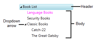
TreeView Elements
The C1TreeView class is a StackPanel with two elements:
A header that represents the actual node, with a button to collapse and expand the children.
A body that is another StackPanel and contains other nodes.
C1TreeViewItems can be added to the C1TreeView control as static items defined either in the XAML or in the code behind or can be defined on your page or user control by using any of the following methods:
Static creation using XAML syntax or programmatically through the code behind file
Dynamic creation using a constructor to create new instances of the C1TreeViewItem class.
Data source creation through binding C1TreeView to a SiteMapDataSource, XMLDataSource, or an AccessDataSource.
Static Creation
Each node in the Tree is represented by a name/value pair, defined by the text and value properties of treenode, respectively. The text of a node is rendered, whereas the value of a node is not rendered and is typically used as additional data for handling postback events.
A static menu is the simplest way to create the treeview structure.
To display static C1TreeViewItems using XAML syntax, first nest opening and closing <c1:C1TreeViewItem > tags between opening and closing tags of the C1TreeView control. Next, create the treeview structure by nesting <c1:C1TreeViewItem> elements between opening and closing <c1:C1TreeViewItem> tags. Each <c1:C1TreeViewItem> element represents a node in the control and maps to a C1TreeViewItem object.
Declarative syntax can be used to define the C1TreeViewItems inline on your page.
For example:
<Grid x:Name="LayoutRoot">
   <c1:C1TreeView x:Name="Tree">
       <c1:C1TreeViewItem Header="Book List" IsExpanded="True" IsSelected="True">
           <c1:C1TreeViewItem Header="Language Books"/>
           <c1:C1TreeViewItem Header="Security Books"/>
           <c1:C1TreeViewItem Header="Classic Books">
               <c1:C1TreeViewItem Header="Catch-22"/>
               <c1:C1TreeViewItem Header="The Great Gatsby"/>
           </c1:C1TreeViewItem>
       </c1:C1TreeViewItem>
   </c1:C1TreeView>
</Grid>
Dynamic Creation
Dynamic tree views can be created on the server side or client side. When creating dynamic tree view on the server side, use a constructor to dynamically create a new instance of the C1TreeView class. For example:
Public Sub New()
    InitializeComponent()
    InitializeTreeView()
End Sub
Private Sub InitializeTreeView()
   ' Remove items that were added at design time
    Tree.Items.Clear()
    Dim booklist As New C1TreeViewItem()
    booklist.Header = "Book List"
    Tree.Items.Add(booklist)
    ' Adding child items
    Dim language As New C1TreeViewItem()
    language.Header = "Language Books"
    booklist.Items.Add(language)
    ' Adding child items
    Dim security As New C1TreeViewItem()
    security.Header = "Security Books"
    booklist.Items.Add(security)
    ' Adding child items
    Dim classic As New C1TreeViewItem()
    classic.Header = "Classic Books"
    booklist.Items.Add(classic)
    'Add checkbox
    classic.Header = New CheckBox()
    ' Adding child items
    Dim subclassic As New C1TreeViewItem()
    subclassic.Header = "Catch-22"
    classic.Items.Add(subclassic)
    Dim subclassic2 As New C1TreeViewItem()
    subclassic2.Header = "The Great Gatsby"
    classic.Items.Add(subclassic2)
End Sub
public MainPage()
{
InitializeComponent();
InitializeTreeView();
}
void InitializeTreeView()
{
// Remove items that were added at design time
Tree.Items.Clear();
C1TreeViewItem booklist = new C1TreeViewItem();
booklist.Header = "Book List";
Tree.Items.Add(booklist);
// Adding child items
C1TreeViewItem language = new C1TreeViewItem();
language.Header = "Language Books";
booklist.Items.Add( language );
// Adding child items
C1TreeViewItem security = new C1TreeViewItem();
security.Header = "Security Books";
booklist.Items.Add(security);
// Adding child items
C1TreeViewItem classic = new C1TreeViewItem();
classic.Header = "Classic Books";
booklist.Items.Add(classic);
//Add checkbox
classic.Header = new CheckBox();
// Adding child items
C1TreeViewItem subclassic = new C1TreeViewItem();
subclassic.Header = "Catch-22";
classic.Items.Add(subclassic);
C1TreeViewItem subclassic2 = new C1TreeViewItem();
subclassic2.Header = "The Great Gatsby";
classic.Items.Add(subclassic2);
}Data Source Creation
TreeView items can be created from a hierarchal datasource control such as an XMLDataSource or SiteMapDataSource. This allows you to update the treeview items without having to edit code.
When using multi-level data as ItemsSource for the C1TreeView, you need to specify a C1HierarchicalDataTemplate for the items.
The template will tell the C1TreeView where to find the next level of data, this is done through the "ItemsSource" property of the C1HierarchicalDataTemplate.
Adding Images
You can add images to a node by grabbing its first child (the header), casting that to a StackPanel, and inserting an image element at whatever position you prefer. For example:
StackPanel nodeHeader = TreeNode.Children[0] as StackPanel;
nodeHeader.Children.Insert(0, myImage);