
Menu and Context Menu Elements
C1Menu Elements
The C1Menu is a control that allows hierarchical organization of elements associated with event handlers. The menus can be nested to any depth that you desire, and you can add as many items to the menu as you need to add.
The following image diagrams the elements of the C1Menu control.
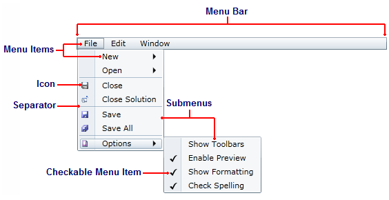
The elements of the C1Menu control can be described as follows:
Menu Bar
The main menu is a horizontal, top-level menu. It is comprised of first-level C1MenuItems and can hold any feature available to C1MenuItems.
Submenus
Submenus are menus that can only be accessed from other menus. A submenu is created when you nest a C1MenuItem within another C1MenuItem.
Menu Items
Menu items are represented by the C1MenuItem class. Menu items can have labels and icons, and they can also be specified as checkable menu items. Each menu item is associated with a click event handler.
Checkable Menu Item
Checkable menu items are objects of the C1MenuItem class that can be selected or cleared by users. You can make checkable menu items standalone, or you can group them with other checkable menu items to create a list of mutually exclusive check boxes. Checkable menu items can't be used in the menu bar.
Icon
Icons are created by adding an Image control to the Icon property. Icons can't be used in the menu bar.
Separator
Separators are created through the C1Separator class. Icons can't be used in the menu bar.
C1ContextMenu Elements
The C1ContextMenu provides a pop-up menu that provides frequently used commands that are associated with the selected object. The C1ContextMenuService class exposes context menus as extender properties that can be attached to any FrameworkElement objects on the page, much like the ToolTip property provided by the ToolTipService class. Once the menu is attached to an object, the users can right-click that object to open the menu.
The following image diagrams the elements of the C1ContextMenu control.
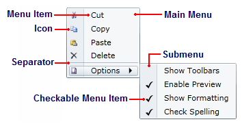
The elements of the C1ContextMenu control can be described as follows:
Main Menu
The main menu is a horizontal bar comprised of first-level C1MenuItems. Menu items can be standalone items, or they can contain lists of submenu items.
Submenus
Submenus are menus that can only be accessed from other menus. A submenu is created when you nest a C1MenuItem within another C1MenuItem.
Menu Items
Menu items are represented by the C1MenuItem class. Menu items can have labels and icons, and they can also be specified as checkable menu items. Each menu item is associated with a click event handler.
Checkable Menu Item
Checkable menu items are objects of the C1MenuItem class that can be selected or cleared by users. You can make checkable menu items standalone, or you can group them with other checkable menu items to create a list of mutually exclusive check boxes.
Icon
Icons are created by adding an Image control to the Icon property.
Separator
Separators are created through the C1Separator class. They can be used to create visual groups of menu items.