
Theming
Silverlight themes are a collection of image settings that define the look of a control or controls. The benefit of using themes is that you can apply the theme across several controls in the application, thus providing consistency without having to repeat styling tasks.
This topic only illustrates themes on the C1Menu control. However, the themes for the C1ContextMenu control are identical to the theming of the C1Menu control's submenus.
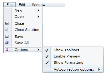
When you add the C1Menu control to your project, it appears with the default blue theme:
You can theme the C1Menu control with one of our six included Silverlight themes: BureauBlack, Cosmopolitan, ExpressionDark, ExpressionLight, RainierOrange, ShinyBlue, and WhistlerBlue.
You can add any of these themes to the menu controls by declaring the theme around the control in markup.
C1Menu Theming
Complete the following steps:
Open the .xaml page in Visual Studio.
Place your cursor between the <Grid></Grid> tags.
In the Tools panel, double-click the C1ThemeRainierOrange icon to declare the theme. Its tags will appear as follows:
<my:C1ThemeRainierOrange></my:C1ThemeRainierOrange>Place your cursor between the <my:C1ThemeRainierOrange> and </my:C1ThemeRainierOrange> tags.
In the Tools panel, double-click the C1Menu icon to add the control to the project. Its tags will appear as children of the <my:C1ThemeRainierOrange> tags, causing the markup to resemble the following:
<my:C1ThemeRainierOrange>
    <c1:C1Menu></c1:C1Menu>
</my:C1ThemeRainierOrange>
Run your project.
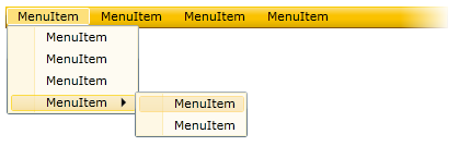
The following image depicts a C1Menu control with the C1ThemeRainierOrange theme.
C1ContextMenu Theming
Because the C1ContextMenu control is always attached to another control using a service, adding a theme to the C1ContextMenu control is going to be slightly different than adding a theme to another Silverlight control. You will have to wrap the theme around a grid or a panel and then use the implicit style manager to ensure that the theme will be passed down to the C1ContextMenu control.
Complete the following steps:
Open the .xaml page in Visual Studio.
Place your cursor between the <Grid></Grid> tags.
In the Tools panel, double-click the C1ThemeRainierOrange icon to declare the theme. Its tags will appear as follows:
<my:C1ThemeRainierOrange></my:C1ThemeRainierOrange>Place your cursor between the <my:C1ThemeRainierOrange> and </my:C1ThemeRainierOrange> tags and press Enter.
In the Tools panel, double-click the Grid icon. The grid tags appear between the theme tags, as follows:
<my:C1ThemeRainierOrange>
    <Grid></Grid>
</my:C1ThemeRainierOrange>
Add a C1ContextMenu between the <Grid> and </Grid> tags.
Add following namespace to the <UserControl> tag:
xmlns:c1Theming="clr-namespace:C1.Silverlight.Theming;assembly=C1.Silverlight.Theming"Set the by ApplyMode property by adding c1Theming:ImplicitStyleManager.ApplyMode="Auto" to the <c1:C1ContextMenu> tag so that your markup resembles the following:
<c1:C1ContextMenu c1Theming:ImplicitStyleManager.ApplyMode="Auto">Run your project.
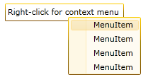
The following image depicts a C1ContextMenu control with the C1ThemeRainierOrange theme.