
Drop Down Elements
C1DropDown Elements
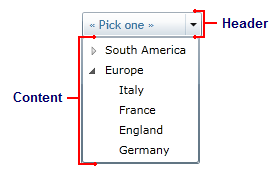
The C1DropDown control consists of two parts: a header area and a content area. The header appears visible when the drop-down box is not open; the content is what is visible when the drop-down area is clicked. The image below identifies the header and content area:
You can add content to neither, either, or both the header and content areas. You can customize the C1DropDown control in XAML by adding content to the header and content areas. For example the following markup creates a drop-down control similar to the one pictured above:
<c1:C1DropDown Height="36" HorizontalAlignment="Left" Margin="10,12,0,0" Name="C1DropDown1" VerticalAlignment="Top" Width="101">
    <c1:C1DropDown.Header>
        <TextBlock Height="21" Name="TextBlock1" Text="« Pick one »" Width="120" />
    </c1:C1DropDown.Header>
    <c1:C1DropDown.Content>
        <TreeView HorizontalAlignment="Left" Name="TreeView1" Width="120">
            <TreeViewItem Header="South America">
                <TreeViewItem Header="Brazil" />
                <TreeViewItem Header="Argentina" />
                <TreeViewItem Header="Uruguay" />
            </TreeViewItem>
            <TreeViewItem Header="Europe">
                <TreeViewItem Header="Italy" />
                <TreeViewItem Header="France" />
                <TreeViewItem Header="England" />
                <TreeViewItem Header="Germany" />
            </TreeViewItem>
        </TreeView>
    </c1:C1DropDown.Content>
</c1:C1DropDown>
Note that the <c1:C1DropDown.Header> and <c1:C1DropDown.Content> tags are used to define header and content. You can add controls and content within these tags.
C1DropDownButton Elements
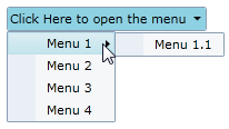
The C1DropDownButton control is similar to the C1DropDown control and consists of two parts: a header area and a content area. The header appears visible when the drop-down box is not open; the content is what is visible when the drop-down area is clicked. For example, in the below image the content area concludes a structured menu:
You can add content to neither, either, or both the header and content areas. You can customize the C1DropDown control in XAML by adding content to the header and content areas. For example the following markup creates a drop-down control similar to the one pictured above:
<c1:C1DropDownButton x:Name="ddl" Header="Click Here to open the menu" HorizontalAlignment="Left">
    <c1:C1MenuList>
        <c1:C1MenuItem Header="Menu 1">
                <c1:C1MenuItem Header="Menu 1.1" />
        </c1:C1MenuItem>
        <c1:C1MenuItem Header="Menu 2" />
        <c1:C1MenuItem Header="Menu 3" />
        <c1:C1MenuItem Header="Menu 4" />
    </c1:C1MenuList>
</c1:C1DropDownButton>
Note that the header text is defined in the <c1:C1DropDownButton> tag and the content is placed within the <c1:C1DropDownButton></c1:C1DropDownButton> tags.
C1SplitButton Elements
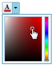
The C1SplitButton control combined a button and a drop-down content area, similar to a standard SplitButton. The C1SplitButton is more dynamic in the type of content that can be included. In the following image, the C1SplitButton's header includes a color picker icon that changes when a color is picked and the C1SplitButton's content area includes a color picker:
You can add content to neither, either, or both the header and content areas. You can customize the C1SplitButton control in XAML by adding content to the header and content areas. For example the following markup creates a drop-down control similar to the one pictured above:
<c1:C1SplitButton x:Name="btn" DropDownWidth="100" DropDownHeight="100" HorizontalAlignment="Left" Click="btn_Click">
    <c1:C1DropDown.Header>
        <StackPanel>
            <TextBlock FontFamily="Times New Roman" FontSize="12" Text="A" FontWeight="Bold" VerticalAlignment="Top" Margin="3 0 0 -2" />
            <Border x:Name="selectedColorBorder" Background="Red">
                <Border.Style>
                    <Style TargetType="Border">
                        <Setter Property="BorderThickness" Value="1" />
                        <Setter Property="BorderBrush" Value="#FF9E9DA7" />
                        <Setter Property="Width" Value="14" />
                        <Setter Property="Height" Value="5" />
                        <Setter Property="VerticalAlignment" Value="Bottom" />
                        <Setter Property="Margin" Value="1,0,0,1" />
                    </Style>
                </Border.Style>
            </Border>
        </StackPanel>
    </c1:C1DropDown.Header>
    <Border BorderThickness="1" BorderBrush="#FF207A9C" Background="#FFEFF5FF">
        <Border.Resources>
            <c1:ColorConverter x:Key="colorConverter" />
        </Border.Resources>
        <c1:C1SpectrumColorPicker ShowAlphaChannel="False" Margin="4" Color="{Binding Background, ElementName=selectedColorBorder, Mode=TwoWay, Converter={StaticResource colorConverter}}" />
    </Border>
</c1:C1SplitButton>
Note that the <c1:C1DropDown.Header> defines the header element and the content element is contained within the <c1:C1SplitButton></c1:C1SplitButton> tags.