
- Spread for WPF Overview
- Key Features
- Getting Started
- Quick Start
- Designer
- Features
- Assembly Reference
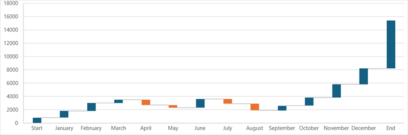
Waterfall Chart
Waterfall charts are statistical tools that visually represent the cumulative effect of values being added or subtracted. They are particularly useful for understanding how an initial value is influenced by a series of positive and negative changes. Waterfall charts are commonly used to analyze fluctuations in product earnings, net income, or overall profit.
Sample Image | Description |
|---|---|
| ChartType.Waterfall Represents a waterfall chart. It is used to present data inflows and outflows. |
Using Code
Refer to the following example code to add a waterfall chart.
C#
// Waterfall chart.
object[,] dataArray = {
    {"Start", 800},
    {"January", 1000},
    {"February", 1200},
    {"March", 500},
    {"April", -800},
    {"May", -400},
    {"June", 300},
    {"July", -700},
    {"August", -1000},
    {"September", 700},
    {"October", 1200},
    {"November", 2000},
    {"December", 2400},
    {"End", 7200}
};

for (int i = 0; i < dataArray.GetLength(0); i++)
{
    for (int j = 0; j < dataArray.GetLength(1); j++)
    {
        spreadSheet1.Workbook.ActiveSheet.Cells[i, j].Value = dataArray[i, j];
    }
}
spreadSheet1.Workbook.ActiveSheet.Cells["A1:B14"].Select();
spreadSheet1.Workbook.ActiveSheet.Shapes.AddChart(GrapeCity.Spreadsheet.Charts.ChartType.Waterfall, 100, 150, 400, 300, false);
VB
' Waterfall chart.
Dim dataArray = {
        {"Start", 800},
        {"January", 1000},
        {"February", 1200},
        {"March", 500},
        {"April", -800},
        {"May", -400},
        {"June", 300},
        {"July", -700},
        {"August", -1000},
        {"September", 700},
        {"October", 1200},
        {"November", 2000},
        {"December", 2400},
        {"End", 7200}}

For i = 0 To dataArray.GetLength(0) - 1
        For j = 0 To dataArray.GetLength(1) - 1
            spreadSheet1.Workbook.ActiveSheet.Cells(i, j).Value = dataArray(i, j)
        Next
Next
spreadSheet1.Workbook.ActiveSheet.Cells("A1:B14").[Select](/spreadnet/docs/latest/online-wpf/spreadwpffeatures/charts/chart-types/statistical-charts/waterfall-charts)
spreadSheet1.Workbook.ActiveSheet.Shapes.AddChart(GrapeCity.Spreadsheet.Charts.ChartType.Waterfall, 100, 150, 400, 300, False)