
- Spread for WPF Overview
- Key Features
- Getting Started
- Quick Start
- Designer
- Features
- Assembly Reference
Bar Chart
Bar charts are used to compare categorical data through horizontal bars. The length of each bar represents the value of the corresponding category. The data displayed in columns or rows of a worksheet can be plotted in a bar chart. In these charts, the categories are organized along the vertical axis, where the data values are displayed along the horizontal axis.
Types of Bar Charts
Spread for WPF supports the following types of bar charts.
Sample Image | Description |
|---|---|
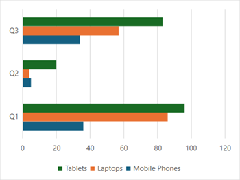
| ChartType.BarClustered Represents a clustered bar chart. It is used to display the comparisons of values across different categories. |
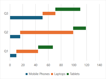
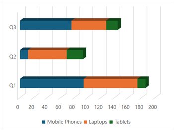
| ChartType.BarStacked Represents a stacked bar chart. It is used to display the relationship of each item/category to the whole in two-dimensional and three-dimensional rectangles. |
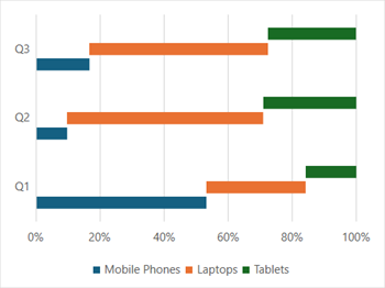
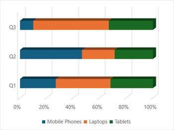
| ChartType.BarStacked100 Represents a 100% stacked bar chart. It is used to display the comparisons of the percentage that each of the values contributes to the total across different categories. |
| ChartType.Bar3DClustered Represents a clustered 3D bar chart. It is used to display the chart demonstration in 3D, which is a modification of the 2DBarClustered chart. It does not have a third dimension. It only looks volumetric in appearance. |
| ChartType.Bar3DStacked Represents a stacked 3D bar chart. It is used to represent the BarStacked chart demonstration in 3D, which looks volumetric in appearance. |
| ChartType.Bar3DStacked100 Represents a 100% stacked 3D bar chart. It is used to represent the BarStacked100 chart demonstration in 3D, which is a modification of a 2D chart in appearance. |
Using Code
Refer to the following example code to add a bar chart.
C#
// Add data.
spreadSheet1.Workbook.ActiveSheet.Cells[0, 1].Value = "Q1";
spreadSheet1.Workbook.ActiveSheet.Cells[0, 2].Value = "Q2";
spreadSheet1.Workbook.ActiveSheet.Cells[0, 3].Value = "Q3";
spreadSheet1.Workbook.ActiveSheet.Cells[1, 0].Value = "Mobile Phones";
spreadSheet1.Workbook.ActiveSheet.Cells[2, 0].Value = "Laptops";
spreadSheet1.Workbook.ActiveSheet.Cells[3, 0].Value = "Tablets";
for (var r = 1; r <= 3; r++)
{
    for (var c = 1; c <= 3; c++)
    {
        Random random = new Random();
        spreadSheet1.Workbook.ActiveSheet.Cells[r, c].Value = random.Next(0, 100);
    }
}
spreadSheet1.Workbook.ActiveSheet.Cells["A1:D4"].Select();
// Add BarClustered chart.
spreadSheet1.Workbook.ActiveSheet.Shapes.AddChart(GrapeCity.Spreadsheet.Charts.ChartType.BarClustered, 100, 150, 400, 300, true);
VB
' Add data.
spreadSheet1.Workbook.ActiveSheet.Cells(0, 1).Value = "Q1"
spreadSheet1.Workbook.ActiveSheet.Cells(0, 2).Value = "Q2"
spreadSheet1.Workbook.ActiveSheet.Cells(0, 3).Value = "Q3"
spreadSheet1.Workbook.ActiveSheet.Cells(1, 0).Value = "Mobile Phones"
spreadSheet1.Workbook.ActiveSheet.Cells(2, 0).Value = "Laptops"
spreadSheet1.Workbook.ActiveSheet.Cells(3, 0).Value = "Tablets"
For r = 1 To 3
    For c = 1 To 3
        Dim random As Random = New Random()
        spreadSheet1.Workbook.ActiveSheet.Cells(r, c).Value = random.Next(0, 100)
    Next
Next
spreadSheet1.Workbook.ActiveSheet.Cells("A1:D4").[Select](/spreadnet/docs/latest/online-wpf/spreadwpffeatures/charts/chart-types/basic-charts/bar-chart)
' Add BarClustered chart.
spreadSheet1.Workbook.ActiveSheet.Shapes.AddChart(GrapeCity.Spreadsheet.Charts.ChartType.BarClustered, 100, 150, 400, 300, True)