
- Spread for WPF Overview
- About the Product
- Getting Started
- Quick Start
- Designer
- Features
- Assembly Reference
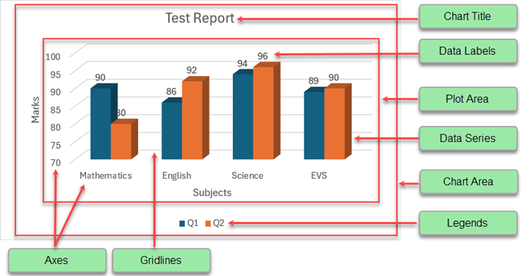
Chart Elements
Charts are powerful tools for data visualization. Each chart is made up of several chart elements, which can be formatted individually to generate charts with a customized layout. Configuring chart elements in a spreadsheet not only enables users to represent information in a meaningful way but also helps them put together a clear view of comparisons and trends for advanced data visualization and analysis.
A basic chart with the primary chart elements is shown in the image below.
The following topics explain the various chart elements and their formatting options:
| Chart Elements | Descriptions |
|---|---|
| Chart Title | Represents a the title of the chart. |
| Chart Area | Represents the entire chart control area. |
| Plot Area | Represents the graphics area used to draw the chart trends. |
| Axes | Represents the ruler used to draw the chart trends. |
| Data Series | Represents the data trends for one group of data values. |
| Trendline | Represents a straight or curved line that is added on the chart to show the trends. |
| Error Bar | Represents the error or uncertainty of data on charts. |
| Lines | Represents the High-Low and Drop lines on charts. |
| Up-Down Bars | Represents up-down bars used in line charts. |
| Data Table | Represents a grid that displays the source data of the chart |
| Data Lable | Represents the relevant information on the chart. |
| Legend | Represents the identifiers for each of the series of the data. |