
- Spread for WPF Overview
- About the Product
- Getting Started
- Quick Start
- Designer
- Features
- Assembly Reference
Pie Chart
Pie charts are one of the most common charts used for data visualization. They are circular graphs that display the proportionate contribution of different categories, which is represented by a slice of a pie. The size of each slice corresponds to the magnitude of the dependent variable, making it proportional to the angle of the slice. These charts are suitable for plotting just one series with non-zero and positive values.
Types of Pie Charts
Spread for WPF supports the following types of pie charts.
Sample Image | Description |
|---|---|
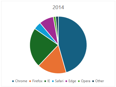
| ChartType.Pie Represents a common pie chart. It is used to display a single data series in a circle-type structure, with each sector representing a different category. |
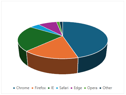
| ChartType.Pie3D Represents a 3D pie chart. It is used to display the chart demonstration in 3D which is a modification of the 2DPie chart in terms of appearance. |
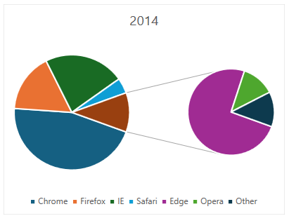
| ChartType.PieOfPie Represents a pie of pie chart. It is used to separate the slices from the main pie chart and display them in an additional pie chart. |
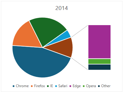
| ChartType.BarOfPie Represents a bar of pie chart. It is used to separate the slices from the main pie chart and display them in an additional stacked bar chart. |
Using Code
Refer to the following example code to add a pie chart.
C#
// Add data.
object[,] dataArray = {
     {"", "Chrome", "Firefox", "IE", "Safari", "Edge", "Opera", "Other"},
     {2014, 0.4966, 0.1801, 0.2455, 0.0470, 0.0898, 0.0150, 0.0158},
     {2015, 0.5689, 0.1560, 0.1652, 0.0529, 0.0158, 0.0220, 0.0192},
     {2016, 0.6230, 0.1531, 0.1073, 0.0464, 0.0311, 0.0166, 0.0225},
     {2017, 0.6360, 0.1304, 0.0834, 0.0589, 0.0443, 0.0223, 0.0246}
     };
for (int i = 0; i < dataArray.GetLength(0); i++)
{
    for (int j = 0; j < dataArray.GetLength(1); j++)
    {
        spreadSheet1.Workbook.ActiveSheet.Cells[i, j].Value = dataArray[i, j];
    }
}
// Pie chart.
spreadSheet1.Workbook.ActiveSheet.Cells["A1:H5"].Select();
spreadSheet1.Workbook.ActiveSheet.Shapes.AddChart(GrapeCity.Spreadsheet.Charts.ChartType.BarOfPie, 100, 150, 400, 300, false);
VB
' Add data.
Dim dataArray = {
         {"", "Chrome", "Firefox", "IE", "Safari", "Edge", "Opera", "Other"},
         {2014, 0.4966, 0.1801, 0.2455, 0.0470, 0.0898, 0.0150, 0.0158},
         {2015, 0.5689, 0.1560, 0.1652, 0.0529, 0.0158, 0.0220, 0.0192},
         {2016, 0.6230, 0.1531, 0.1073, 0.0464, 0.0311, 0.0166, 0.0225},
              {2017, 0.6360, 0.1304, 0.0834, 0.0589, 0.0443, 0.0223, 0.0246}}
For i = 0 To dataArray.GetLength(0) - 1
        For j = 0 To dataArray.GetLength(1) - 1
            spreadSheet1.Workbook.ActiveSheet.Cells(i, j).Value = dataArray(i, j)
        Next
Next
' Pie chart.
spreadSheet1.Workbook.ActiveSheet.Cells("A1:H5").Select()
spreadSheet1.Workbook.ActiveSheet.Shapes.AddChart(GrapeCity.Spreadsheet.Charts.ChartType.BarOfPie, 100, 150, 400, 300, False)