
- Spread for WPF Overview
- Key Features
- Getting Started
- Quick Start
- Designer
- Features
- Assembly Reference
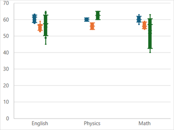
Box and Whisker Chart
Box-and-Whisker charts are statistical charts that display the distribution of numerical data through quartiles, means, and outliers. As the name suggests, these charts use boxes and whiskers to represent these values. The boxes illustrate the range of quartiles, including the lower quartile, upper quartile, and median, while the whiskers indicate the variability beyond the upper and lower quartiles. Any data point that falls outside the whiskers is considered an outlier.
These charts are particularly helpful for comparing distributions across multiple groups or data sets. For example, they can effectively show the variation in monthly temperatures between two cities.
Sample Image | Description |
|---|---|
| ChartType.BoxWhisker Represents a Box and Whisker chart. It is used to display the variation within a set of data. |
Using Code
Refer to the following example code to add a boxwhisker chart.
C#
// BoxWhisker chart.
object[,] dataArray ={
    { "Course A", "School A", "School B", "School C" },
    { "English", 63,  53,  45},
    { "Physics", 61  ,54  ,65},
    { "English", 62  ,55,  58},
    { "Math",  63 , 56  ,57},
    { "English", 59,  57  ,65},
    { "English", 58  ,53  ,64},
    { "Math",    60 , 54  ,63},
    { "Math",    61  ,55  ,58},
    { "English", 62 , 56  ,57},
    { "English", 63 , 57  ,59},
    { "Physics", 59  ,58 , 60},
    { "English", 58  ,59,  54},
    { "Math",    57  ,59,  45},
    { "Math",    60,  58,  40},
    { "English", 61,  57,  49}
};
for (int i = 0; i < dataArray.GetLength(0); i++)
    for (int j = 0; j < dataArray.GetLength(1); j++)
        spreadSheet1.Workbook.ActiveSheet.Cells[i, j].Value = dataArray[i, j];
spreadSheet1.Workbook.ActiveSheet.Cells["A1:D16"].Select();
spreadSheet1.Workbook.ActiveSheet.Shapes.AddChart(GrapeCity.Spreadsheet.Charts.ChartType.BoxWhisker, 100, 150, 400, 300, false);
VB
' BoxWhisker chart.
Dim dataArray = {
        {"Course A", "School A", "School B", "School C"},
        {"English", 63, 53, 45},
        {"Physics", 61, 54, 65},
        {"English", 62, 55, 58},
        {"Math", 63, 56, 57},
        {"English", 59, 57, 65},
        {"English", 58, 53, 64},
        {"Math", 60, 54, 63},
        {"Math", 61, 55, 58},
        {"English", 62, 56, 57},
        {"English", 63, 57, 59},
        {"Physics", 59, 58, 60},
        {"English", 58, 59, 54},
        {"Math", 57, 59, 45},
        {"Math", 60, 58, 40},
        {"English", 61, 57, 49}}
For i = 0 To dataArray.GetLength(0) - 1
        For j = 0 To dataArray.GetLength(1) - 1
            spreadSheet1.Workbook.ActiveSheet.Cells(i, j).Value = dataArray(i, j)
        Next
Next
spreadSheet1.Workbook.ActiveSheet.Cells("A1:D16").[Select](/spreadnet/docs/latest/online-wpf/spreadwpffeatures/charts/chart-types/statistical-charts/boxwhisker-charts)
spreadSheet1.Workbook.ActiveSheet.Shapes.AddChart(GrapeCity.Spreadsheet.Charts.ChartType.BoxWhisker, 100, 150, 400, 300, False)