
- Spread for WPF Overview
- Key Features
- Getting Started
- Quick Start
- Designer
- Features
- Assembly Reference
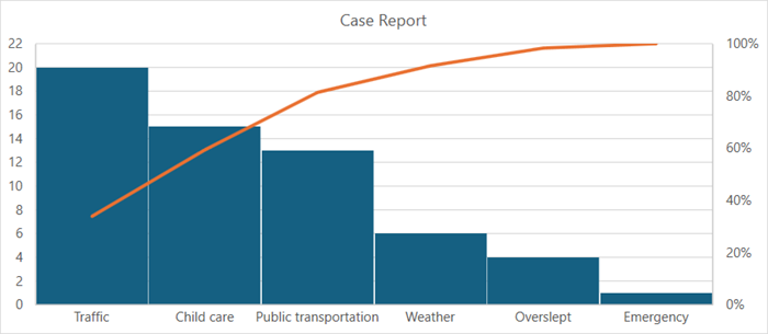
Pareto Chart
Pareto charts graphically summarize the process problems in ranking order from the most frequent to the least one. These charts contain both a bar and a line chart where bar chart values are plotted in decreasing order of relative frequency while the line chart plots the cumulative total percentage of frequencies. Pareto charts are useful for task prioritizing.
This type of chart is essentially used in scenarios where the data is broken into different categories, and when the developer needs to highlight the most important factors from a given set of factors. For example, quality control, inventory control, and customer grievance handling are some areas where Pareto chart analysis can be frequently used.
Sample Image | Description |
|---|---|
| ChartType.Pareto Represents a Pareto chart. It is used to show the relative portion of each factor to the total or the most significant factors in the data. |
Using Code
Refer to the following example code to add a pareto chart.
C#
// Pareto chart.
object[,] dataArray ={
        {"Reason", "Cases" },
        {"Traffic", 20 },
        {"Child care",  15 },
        {"Public transportation",   13 },
        {"Weather", 6 },
        {"Overslept",   4 },
        {"Emergency",   1 }
};
for (int i = 0; i < dataArray.GetLength(0); i++)
     for (int j = 0; j < dataArray.GetLength(1); j++)
          spreadSheet1.Workbook.ActiveSheet.Cells[i, j].Value = dataArray[i, j];
spreadSheet1.Workbook.ActiveSheet.Cells["A1:B7"].Select();
spreadSheet1.Workbook.ActiveSheet.Shapes.AddChart(GrapeCity.Spreadsheet.Charts.ChartType.Pareto, 100, 150, 400, 300, false);
spreadSheet1.Workbook.ActiveSheet.ChartObjects[0].Chart.ShowTitle();
spreadSheet1.Workbook.ActiveSheet.ChartObjects[0].Chart.ChartTitle.Text = "Case Report";
VB
' Pareto chart.
Dim dataArray = {
            {"Reason", "Cases"},
            {"Traffic", 20},
            {"Child care", 15},
            {"Public transportation", 13},
            {"Weather", 6},
            {"Overslept", 4},
            {"Emergency", 1}}
For i = 0 To dataArray.GetLength(0) - 1
        For j = 0 To dataArray.GetLength(1) - 1
            spreadSheet1.Workbook.ActiveSheet.Cells(i, j).Value = dataArray(i, j)
        Next
Next
spreadSheet1.Workbook.ActiveSheet.Cells("A1:B7").[Select](/spreadnet/docs/latest/online-wpf/spreadwpffeatures/charts/chart-types/statistical-charts/pareto-chart)
spreadSheet1.Workbook.ActiveSheet.Shapes.AddChart(GrapeCity.Spreadsheet.Charts.ChartType.Pareto, 100, 150, 400, 300, False)
spreadSheet1.Workbook.ActiveSheet.ChartObjects(0).Chart.ShowTitle()
spreadSheet1.Workbook.ActiveSheet.ChartObjects(0).Chart.ChartTitle.Text = "Case Report"