
- Spread for WPF Overview
- About the Product
- Getting Started
- Quick Start
- Designer
- Features
- Assembly Reference
Scatter Chart
Scatter charts (XY chart) are used to illustrate relationships between individual items or categories. They are ideal for showing comparisons in scientific, statistical, and engineering data. The data arranged in columns or rows of a worksheet can be plotted in a scatter chart.
Unlike other types of charts, scatter charts display the actual values for both the x and y variables along the horizontal and vertical axes, respectively. These charts combine the x and y values into single data points and show them at irregular intervals. Also, this chart does not make use of the category axis because both the horizontal axis (primary axis) and vertical axes (secondary axis) are value axes.
Types of Scatter Charts
Spread for WPF supports the following types of scatter charts.
Sample Image | Description |
|---|---|
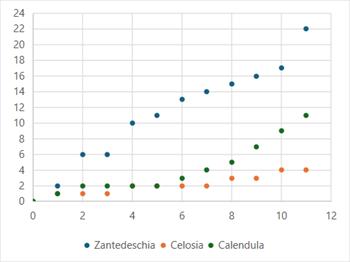
| ChartType.XYScatter Represents an XY scatter chart. This scatter chart displays the data points based on a selected data range. This helps the users to analyze and determine the relationship between x and y variables. |
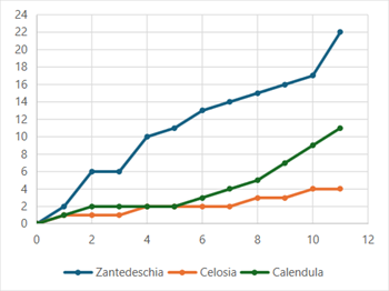
| ChartType.XYScatterLines Represents an XY scatter chart with lines. This scatter chart with straight lines displays a straight connecting line between data points in a particular series without showing the individual points. |
| ChartType.XYScatterLinesNoMarkers Represents an XY scatter chart with lines and no markers. This scatter chart with straight lines and no data markers displays a smooth curve that connects all the data points in a particular series. |
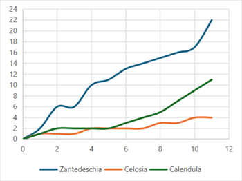
| ChartType.XYScatterSmooth Represents a smoothed XY scatter chart. This scatter chart with smooth lines displays a connecting line between data points in a particular series without showing the individual points. |
| ChartType.XYScatterSmoothNoMarkers Represents a smoothed XY scatter chart with no markers. This scatter chart with smooth lines and no data markers displays a smooth curve that connects all the data points in a particular series. |


Using Code
Refer to the following example code to add a scatter chart.
C#
// Scatter chart.
object[,] dataArray = {
      { "Period", "Zantedeschia", "Celosia", "Calendula" },
      { 0, 0, 0, 0},
      {1, 2, 1, 1},
      {2, 6, 1, 2},
      {3, 6, 1, 2},
      {4, 10, 2, 2},
      {5, 11, 2, 2},
      {6, 13, 2, 3},
      {7, 14, 2, 4},
      {8, 15, 3, 5},
      {9, 16, 3, 7},
      {10, 17, 4, 9},
      {11, 22, 4, 11}
};
for (int i = 0; i < dataArray.GetLength(0); i++)
{
      for (int j = 0; j < dataArray.GetLength(1); j++)
      {
        spreadSheet1.Workbook.ActiveSheet.Cells[i, j].Value = dataArray[i, j];
      }
}
spreadSheet1.Workbook.ActiveSheet.Cells["A1:D13"].Select();
spreadSheet1.Workbook.ActiveSheet.Shapes.AddChart(GrapeCity.Spreadsheet.Charts.ChartType.XYScatter, 100, 150, 400, 300, false);
VB
' Scatter chart.
Dim dataArray = {
          {"Period", "Zantedeschia", "Celosia", "Calendula"},
          {0, 0, 0, 0},
          {1, 2, 1, 1},
          {2, 6, 1, 2},
          {3, 6, 1, 2},
          {4, 10, 2, 2},
          {5, 11, 2, 2},
          {6, 13, 2, 3},
          {7, 14, 2, 4},
          {8, 15, 3, 5},
          {9, 16, 3, 7},
          {10, 17, 4, 9},
          {11, 22, 4, 11}}
For i = 0 To dataArray.GetLength(0) - 1
        For j = 0 To dataArray.GetLength(1) - 1
            spreadSheet1.Workbook.ActiveSheet.Cells(i, j).Value = dataArray(i, j)
        Next
Next
spreadSheet1.Workbook.ActiveSheet.Cells("A1:D13").Select()
spreadSheet1.Workbook.ActiveSheet.Shapes.AddChart(GrapeCity.Spreadsheet.Charts.ChartType.XYScatter, 100, 150, 400, 300, False)