
- Spread for WPF Overview
- Key Features
- Getting Started
- Quick Start
- Designer
- Features
- Assembly Reference
Area Chart
Area charts are similar to line charts, but they fill an area between the line chart and the axis with color or shading. These charts represent the changes in one or more data quantities over time. In area charts, the data points are plotted and connected by line segments. This helps in showing the magnitude of the value at different time intervals. While line charts simply present the data values to demonstrate the trends, the filled portion of the area chart enhances communicating the magnitude of the trend as well.
Types of Area Charts
Spread for WPF supports the following types of area charts.
Sample Image | Description |
|---|---|
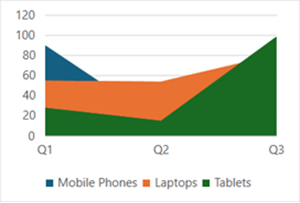
| ChartType.Area Represents an area chart. It is used to depict the data series as colored regions that help in comparing the values of multiple series for the same data point. This chart shows trends over time (years, months, and days) or categories. |
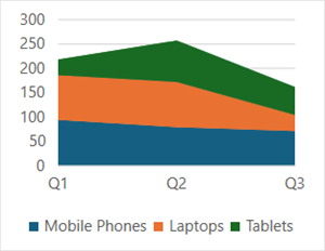
| ChartType.AreaStacked Represents a stacked area chart. It is used to depict data series as stacked regions with different colors that help in performing comparisons between multiple series for the same data point. This chart shows the trend of the contribution of each value over time or other categorical data. |
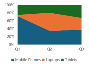
| ChartType.AreaStacked100 Represents a 100% stacked area chart. It is used to depict the series of data points with positive and negative values shown over time to reveal values of multiple series for the same data point. This chart shows the percentage that each value contributes over time or other categorical data. |
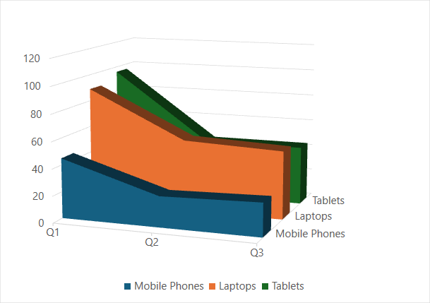
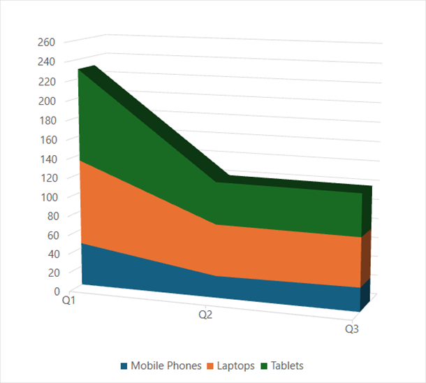
| ChartType.Area3D Represents a 3D area chart. It is used to represent the chart demonstration in 3D, which is a modification of 2D area chart. It looks volumetric in appearance. |
| ChartType.AreaStacked3D Represents a stacked 3D area chart. It is used to represent an AreaStacked chart with a 3D visual effect, which is a modification of the 2D chart. |
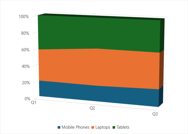
| ChartType.AreaStacked1003D Represents a 100% stacked 3D area chart. It is used to represent an AreaStacked100 chart with 3D visual effect, which looks volumetric in appearance. |
Using Code
Refer to the following example code to add an area chart.
C#
// Add data.
spreadSheet1.Workbook.ActiveSheet.Cells[0, 1].Value = "Q1";
spreadSheet1.Workbook.ActiveSheet.Cells[0, 2].Value = "Q2";
spreadSheet1.Workbook.ActiveSheet.Cells[0, 3].Value = "Q3";
spreadSheet1.Workbook.ActiveSheet.Cells[1, 0].Value = "Mobile Phones";
spreadSheet1.Workbook.ActiveSheet.Cells[2, 0].Value = "Laptops";
spreadSheet1.Workbook.ActiveSheet.Cells[3, 0].Value = "Tablets";
for (var r = 1; r <= 3; r++)
{
    for (var c = 1; c <= 3; c++)
    {
        Random random = new Random();
        spreadSheet1.Workbook.ActiveSheet.Cells[r, c].Value = random.Next(0, 100);
    }
}
spreadSheet1.Workbook.ActiveSheet.Cells["A1:D4"].Select();
// Add area chart.
spreadSheet1.Workbook.ActiveSheet.Shapes.AddChart(GrapeCity.Spreadsheet.Charts.ChartType.Area, 100, 150, 400, 300, false);
VB
' Add data.
spreadSheet1.Workbook.ActiveSheet.Cells(0, 1).Value = "Q1"
spreadSheet1.Workbook.ActiveSheet.Cells(0, 2).Value = "Q2"
spreadSheet1.Workbook.ActiveSheet.Cells(0, 3).Value = "Q3"
spreadSheet1.Workbook.ActiveSheet.Cells(1, 0).Value = "Mobile Phones"
spreadSheet1.Workbook.ActiveSheet.Cells(2, 0).Value = "Laptops"
spreadSheet1.Workbook.ActiveSheet.Cells(3, 0).Value = "Tablets"
For r = 1 To 3
    For c = 1 To 3
        Dim random As Random = New Random()
        spreadSheet1.Workbook.ActiveSheet.Cells(r, c).Value = random.Next(0, 100)
    Next
Next
spreadSheet1.Workbook.ActiveSheet.Cells("A1:D4").[Select](/spreadnet/docs/latest/online-wpf/spreadwpffeatures/charts/chart-types/basic-charts/area-chart)
' Add area chart.
spreadSheet1.Workbook.ActiveSheet.Shapes.AddChart(GrapeCity.Spreadsheet.Charts.ChartType.Area, 100, 150, 400, 300, False)