- Spread for WPF Overview
- Key Features
- Getting Started
- Quick Start
- Designer
- Features
- Assembly Reference
Button Cell
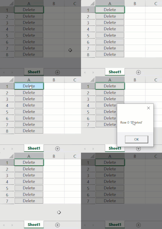
Button cell displays a button inside the cell.
You can use the ButtonCellType class in the GrapeCity.Wpf.SpreadSheet.CellType namespace to configure it. By default, it displays a rectangular-shaped button with gray color. This type of cell can display text and pictures on buttons. The Content property allows you to display text on the button, making it easy to label its purpose. To enable the display of custom data, such as images, you can use the ContentTemplate property.
Additionally, button cells support command execution, where clicking the button triggers a command. For this functionality, use the properties of the CellCommandParameter class, which contains details about the specific cell where the button was clicked. The available properties are listed in the table below.
Property | Description |
|---|---|
Column | Gets the column of the button that is clicked. |
Row | Gets the row of the button that is clicked. |
CustomCommandParameter | Gets or sets the parameters to pass to the command. |
Worksheet | Gets the worksheet of the button that is clicked. |

The following example code implements the process of deleting a row when the button is clicked as defined in the MyDeleteCommand class.
C#
private void Window_Loaded(object sender, RoutedEventArgs e)
{
    // Button cell type.
    ButtonCellType btn = new ButtonCellType();
    btn.Content = "Delete";
    btn.Command = new MyDeleteCommand(spreadSheet1);
    btn.CustomCommandParameter = "Deleted";
    spreadSheet1.Workbook.ActiveSheet.Columns[0].CellType = btn;
    spreadSheet1.Workbook.ActiveSheet.Columns[0].ColumnWidth = 100;
    spreadSheet1.Workbook.ActiveSheet.RowCount = 8;
}

internal class MyDeleteCommand : ICommand
{
    private GcSpreadSheet GcSpreadSheet;
    public MyDeleteCommand(GcSpreadSheet GcSpreadSheet)
    {
        this.GcSpreadSheet = GcSpreadSheet;
    }
    public event EventHandler CanExecuteChanged;
    public bool CanExecute(object parameter)
    {
        return true;
    }
    public void OnCanExecuteChanged()
    {
        CanExecuteChanged?.Invoke(this, EventArgs.Empty);
    }
    public void Execute(object parameter)
    {
        if (parameter is CellCommandParameter cellCommandParameter)
        {
            GcSpreadSheet.Workbook.ActiveSheet.RemoveRows(cellCommandParameter.Row, 1);
            MessageBox.Show(string.Format("Row {0} '{2}'", cellCommandParameter.Row, null, cellCommandParameter.CustomCommandParameter));
        }
    }
}
VB
Private Sub Window_Loaded(sender As Object, e As RoutedEventArgs)
        ' Button cell type.
        Dim btn As ButtonCellType = New ButtonCellType()
        btn.Content = "Delete"
        btn.Command = New MyDeleteCommand(spreadSheet1)
        btn.CustomCommandParameter = "Deleted"
        spreadSheet1.Workbook.ActiveSheet.Columns(0).CellType = btn
        spreadSheet1.Workbook.ActiveSheet.Columns(0).ColumnWidth = 100
        spreadSheet1.Workbook.ActiveSheet.RowCount = 8
End Sub

Friend Class MyDeleteCommand
        Inherits ICommand
        Private GcSpreadSheet As GcSpreadSheet
        Public Sub New(GcSpreadSheet As GcSpreadSheet)
            Me.GcSpreadSheet = GcSpreadSheet
        End Sub
        Public Event CanExecuteChanged As EventHandler
        Public Function CanExecute(parameter As Object) As Boolean
            Return True
        End Function
        Public Sub OnCanExecuteChanged()
            RaiseEvent CanExecuteChanged(Me, EventArgs.Empty)
        End Sub
        Public Sub Execute(parameter As Object)
            Dim cellCommandParameter As CellCommandParameter = Nothing
            If CSharpImpl.__Assign(cellCommandParameter, TryCast(parameter, CellCommandParameter)) IsNot Nothing Then
                GcSpreadSheet.Workbook.ActiveSheet.RemoveRows(cellCommandParameter.Row, 1)
                MessageBox.Show(String.Format("Row {0} '{2}'", cellCommandParameter.Row, Nothing, cellCommandParameter.CustomCommandParameter))
            End If
        End Sub
        Private Class CSharpImpl
            <Obsolete("Please refactor calling code to use normal Visual Basic assignment")>
            Shared Function __Assign(Of T)(ByRef target As T, value As T) As T
                target = value
                Return value
            End Function
        End Class
End Class

