
- Spread for WPF Overview
- Key Features
- Getting Started
- Quick Start
- Designer
- Features
- Assembly Reference
Axes
Axes refers to the lines on a chart that help you understand the scales and dimensions of the data being displayed.
There are three types of axes in charts:
Category axis - Displays categories generally in the horizontal axis for all types of charts.
An exception is the bar chart, where categories are shown along the Y-axis (vertical axis).
Value axis - Displays series values in the vertical axis.
An exception is the bar chart, where series values are shown along the X-axis (horizontal axis).
Series axis - Displays data series for the three-dimensional charts.
You can use the properties of the IAxis Interface to configure an axis in a chart and to customize other elements, such as Axis title, Format, Display Unit, Logarithmic Scale, Number Format, Cross, and many more.
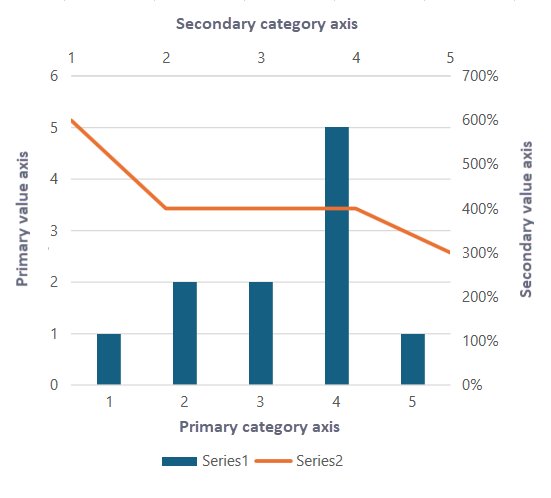
By default, a chart contains two primary axes - Primary Category Axis (X-axis) and Primary Value Axis (Y-axis). However, if a single set of primary axes is not sufficient to illustrate the data, such as when you are working with mixed data types, like combining a bar chart with a line chart, then secondary axes can be used. Secondary axes help you to efficiently represent datasets with different scales or units on the same chart.
Use the ShowAxis method of the IChart interface to show the axis. This method displays the axis specified by AxisType and AxisGroup enumerations.
!type=note
Note: There are some charts, like pie charts, sunburst charts, or treemaps, do not use axes. Instead, they represent data visually through proportions or hierarchies.
The following example code demonstrates how to configure primary and secondary axes for better data representation.
C#
object[,] values = new object[,] { { 1, 6 }, { 2, 4 }, { 2, 4 }, { 5, 4 }, { 1, 3 } };
var sheet1 = spreadSheet1.Workbook.ActiveSheet;
sheet1.SetValue(0, 0, values, false);
sheet1.Cells["A1:B5"].Select();
sheet1.Shapes.AddChart(GrapeCity.Spreadsheet.Charts.ChartType.ColumnClustered, 100, 50, 330, 350, false);
// Change 2nd series to line chart.
sheet1.ChartObjects[0].Chart.Series[1].ChartType = ChartType.Line;
// Show 2nd series in secondary axis.
sheet1.ChartObjects[0].Chart.Series[1].AxisGroup = AxisGroup.Secondary;
// Configure and show the secondary axis.
sheet1.ChartObjects[0].Chart.Axes[AxisType.Value, AxisGroup.Secondary].TickLabels.NumberFormat = "0%";
sheet1.ChartObjects[0].Chart.ShowAxis(AxisType.Category, AxisGroup.Secondary);
VB
Dim values = New Object(,) {
    {1, 6},
    {2, 4},
    {2, 4},
    {5, 4},
    {1, 3}}
Dim sheet1 = spreadSheet1.Workbook.ActiveSheet
sheet1.SetValue(0, 0, values, False)
sheet1.Cells("A1:B5").[Select](/spreadnet/docs/latest/online-wpf/spreadwpffeatures/charts/chart-elements/axes)
sheet1.Shapes.AddChart(GrapeCity.Spreadsheet.Charts.ChartType.ColumnClustered, 100, 50, 330, 350, False)
' Change 2nd series to line chart.
sheet1.ChartObjects(0).Chart.Series(1).ChartType = ChartType.Line
' Show 2nd series in secondary axis.
sheet1.ChartObjects(0).Chart.Series(1).AxisGroup = AxisGroup.Secondary
' Configure and show the secondary axis.
sheet1.ChartObjects(0).Chart.Axes(AxisType.Value, AxisGroup.Secondary).TickLabels.NumberFormat = "0%"
sheet1.ChartObjects(0).Chart.ShowAxis(AxisType.Category, AxisGroup.Secondary)
Let's discuss some of the common axis elements used to configure chart in the following sections.
Axis Title
Axis titles are the short text descriptions that explain the data displayed along a particular axis. They typically appear along the horizontal and vertical axes of a chart.
To display an axis title, you need to set the HasTitle property of the IAxis interface to true. After that, you can set the text of the axis title using the Text property from the IAxisTitle interface. Additionally, Spread for WPF also allows you to customize axis titles using various other properties of the IAxisTitle interface, such as Alignment, Orientation, TextOrientation, and so on.
Refer to the following example code to set the title for axes.
C#
// Set axis title.
spreadSheet1.Workbook.ActiveSheet.ChartObjects[0].Chart.Axes[AxisType.Category].HasTitle = true;
spreadSheet1.Workbook.ActiveSheet.ChartObjects[0].Chart.Axes[AxisType.Category].AxisTitle.Text = "Quarter";

spreadSheet1.Workbook.ActiveSheet.ChartObjects[0].Chart.Axes[AxisType.Value].HasTitle = true;
spreadSheet1.Workbook.ActiveSheet.ChartObjects[0].Chart.Axes[AxisType.Value].AxisTitle.Text = "Quantity";
VB
' Set axis title.
spreadSheet1.Workbook.ActiveSheet.ChartObjects(0).Chart.Axes(AxisType.Category).HasTitle = True
spreadSheet1.Workbook.ActiveSheet.ChartObjects(0).Chart.Axes(AxisType.Category).AxisTitle.Text = "Quarter"
spreadSheet1.Workbook.ActiveSheet.ChartObjects(0).Chart.Axes(AxisType.Value).HasTitle = True
spreadSheet1.Workbook.ActiveSheet.ChartObjects(0).Chart.Axes(AxisType.Value).AxisTitle.Text = "Quantity"
Display Unit Label
When configuring the chart axis in your worksheet, you can set the display unit for a specific axis and customize its label style using the properties of the IAxis interface, such as DisplayUnit, DisplayUnitCustom, and DisplayUnitLabel. If the label defined by the DisplayUnit or DisplayUnitCustom property is not shown on the specified axis, you can ensure it appears by setting the HasDisplayUnitLabel property to true. By default, this property value is true.
Refer to the following example code to set the display unit for the value axis and configure its label.
C#
// Display unit label.
var valueAxis = spreadSheet1.Workbook.ActiveSheet.ChartObjects[0].Chart.Axes[AxisType.Value];
valueAxis.DisplayUnitCustom = 100;
valueAxis.DisplayUnitLabel.Format.Fill.ForeColor.ObjectThemeColor = GrapeCity.Core.SchemeThemeColors.Accent2;
VB
' Display unit label.
Dim valueAxis = spreadSheet1.Workbook.ActiveSheet.ChartObjects(0).Chart.Axes(AxisType.Value)
valueAxis.DisplayUnitCustom = 100
valueAxis.DisplayUnitLabel.Format.Fill.ForeColor.ObjectThemeColor = GrapeCity.Core.SchemeThemeColors.Accent2
Spread for WPF allows you to adjust the text orientation on display unit labels using the Orientation property of the IDisplayUnitLabel interface. This property accepts integer values from -90 to 90 degrees. You can also apply predefined TextFrame Orientation using TextOrientation enumeration values Upward, Horizontal, or Downward.
Refer to the following example code to set the text orientation for a display unit label.
C#
var valueaxis = spreadSheet1.Workbook.ActiveSheet.ChartObjects[0].Chart.Axes[GrapeCity.Spreadsheet.Charts.AxisType.Value];
valueaxis.HasDisplayUnitLabel = true;
valueaxis.DisplayUnit = GrapeCity.Spreadsheet.Charts.DisplayUnit.Hundreds;
// Set the display unit label orientation to horizontal
valueaxis.DisplayUnitLabel.Format.TextFrame.Orientation = GrapeCity.Spreadsheet.Drawing.TextOrientation.Horizontal;
// Set the display unit label orientation to 60 degrees
valueaxis.DisplayUnitLabel.Orientation = 60;
VB
' VB code
Dim valueaxis = spreadSheet1.Workbook.ActiveSheet.ChartObjects(0).Chart.Axes(GrapeCity.Spreadsheet.Charts.AxisType.Value)
valueaxis.HasDisplayUnitLabel = True
valueaxis.DisplayUnit = GrapeCity.Spreadsheet.Charts.DisplayUnit.Hundreds
' Set the display unit label orientation to horizontal
valueaxis.DisplayUnitLabel.Format.TextFrame.Orientation = GrapeCity.Spreadsheet.Drawing.TextOrientation.Horizontal
' Set the display unit label orientation to 60 degrees
valueaxis.DisplayUnitLabel.Orientation = 60
Tick Labels
While configuring the axis of a chart, you can set the position and layout of the tick-mark labels as per your choice using the various properties of the IAxis interface, such as TickLabelPosition, TickLabels, TickLabelSpacing, TickLabelSpacingIsAuto, and TickMarkSpacing.
Refer to the following example code to configure the tick mark label's position and layout.
C#
// Customize tick-mark labels.
var tickLables = spreadSheet1.Workbook.ActiveSheet.ChartObjects[0].Chart.Axes[AxisType.Value];
tickLables.TickLabelPosition = TickLabelPosition.Low;
tickLables.TickMarkSpacing = 2;
tickLables.TickLabels.NumberFormat = "#,##0.00";
tickLables.TickLabels.Font.Bold = true;
VB
' Customize tick-mark labels.
Dim tickLables = spreadSheet1.Workbook.ActiveSheet.ChartObjects(0).Chart.Axes(AxisType.Value)
tickLables.TickLabelPosition = TickLabelPosition.Low
tickLables.TickMarkSpacing = 2
tickLables.TickLabels.NumberFormat = "#,##0.00"
tickLables.TickLabels.Font.Bold = True
Gridlines
Gridlines refer to the horizontal and vertical lines appearing in the plot area of a chart. Only axes in the primary axis group can have gridlines.
In charts, the major gridline and minor gridline have the same axis type. While configuring the axis of a chart, you can also set the display styles of major and minor gridlines as per your choice. Set the HasMajorGridlines and the HasMinorGridlines properties of the IAxis interface to true to display the major and minor gridlines. And then, using the properties of MajorGridlines and MinorGridlines, you can customize the desired gridline styles.
Refer to the following example code to set minor gridlines' color.
C#
// Display gridlines.
var gridline = spreadSheet1.Workbook.ActiveSheet.ChartObjects[0].Chart.Axes[AxisType.Value];
gridline.HasMinorGridlines = true;
gridline.MinorGridlines.Border.Color = GrapeCity.Spreadsheet.Color.FromThemeColor(GrapeCity.Core.ThemeColors.Accent4);
gridline.MinorGridlines.Border.LineStyle = BorderLineStyle.Dashed;
VB
' Display gridlines.
Dim gridline = spreadSheet1.Workbook.ActiveSheet.ChartObjects(0).Chart.Axes(AxisType.Value)
gridline.HasMinorGridlines = True
gridline.MinorGridlines.Border.Color = GrapeCity.Spreadsheet.Color.FromThemeColor(GrapeCity.Core.ThemeColors.Accent4)
gridline.MinorGridlines.Border.LineStyle = BorderLineStyle.Dashed