
- Spread for WPF Overview
- Key Features
- Getting Started
- Quick Start
- Designer
- Features
- Assembly Reference
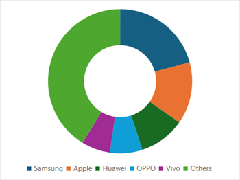
Doughnut Chart
Doughnut chart is a variant of the pie chart that has a hole in the center. It displays categories as arcs instead of slices. This chart type is useful for showing the proportions of a whole, similar to a pie chart. This type of chart is suitable when representing multiple series related to a larger sum.
Sample Image | Description |
|---|---|
| ChartType.Doughnut Represents a doughnut chart. It is used to display multiple data series concurrently, where a ring depicts the data series. |
Using Code
Refer to the following example code to add a doughnut chart.
C#
// Add data.
object[,] dataArray = {
          { "Samsung", "Apple", "Huawei", "OPPO", "Vivo", "Others" },
          { 321, 215, 160, 112, 100, 638 }
};
for (int i = 0; i < dataArray.GetLength(0); i++)
{
    for (int j = 0; j < dataArray.GetLength(1); j++)
    {
     spreadSheet1.Workbook.ActiveSheet.Cells[i, j].Value = dataArray[i, j];
    }
}
// Doughnut chart.
spreadSheet1.Workbook.ActiveSheet.Cells["A1:F2"].Select();
spreadSheet1.Workbook.ActiveSheet.Shapes.AddChart(GrapeCity.Spreadsheet.Charts.ChartType.Doughnut, 100, 150, 400, 300, false);
VB
' Add data.
Dim dataArray = {
          {"Samsung", "Apple", "Huawei", "OPPO", "Vivo", "Others"},
          {321, 215, 160, 112, 100, 638}}
For i = 0 To dataArray.GetLength(0) - 1
      For j = 0 To dataArray.GetLength(1) - 1
            spreadSheet1.Workbook.ActiveSheet.Cells(i, j).Value = dataArray(i, j)
      Next
Next
' Doughnut chart.
spreadSheet1.Workbook.ActiveSheet.Cells("A1:F2").[Select](/spreadnet/docs/latest/online-wpf/spreadwpffeatures/charts/chart-types/basic-charts/doughnut-chart)
spreadSheet1.Workbook.ActiveSheet.Shapes.AddChart(GrapeCity.Spreadsheet.Charts.ChartType.Doughnut, 100, 150, 400, 300, False)