
- Spread for WPF Overview
- About the Product
- Getting Started
- Quick Start
- Designer
- Features
- Assembly Reference
Line Chart
Line charts are the most basic charts that are created by connecting the data points with straight lines. These charts are used to visualize a trend in data by comparing values over regular intervals such as time, temperature, etc. Some examples that can be effectively represented using line charts include the closing prices of a stock in a given time frame and the monthly average sales of a product.
Types of Line Charts
Spread for WPF supports the following types of line charts.
Sample Image | Description |
|---|---|
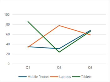
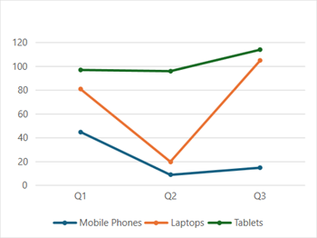
| ChartType.Line Represents a line chart. It is used to depict the data values plotted over time to display the trends. It shows continuous data over time on an evenly scaled axis. |
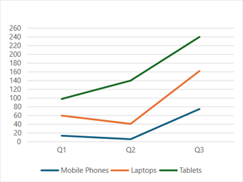
| ChartType.LineStacked Represents a stacked line chart. It is used to display stacked lines to depict the trend of the contribution of each data value or ordered category over different time intervals. |
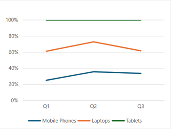
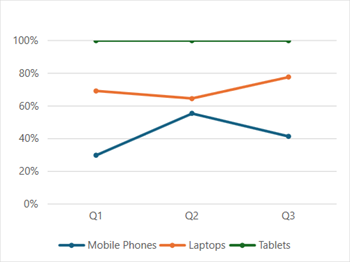
| ChartType.LineStacked100 Represents a 100% stacked line chart. It is used to display displays trends in terms of the percentage that each data value or ordered category has contributed (to the whole) over different time intervals. |
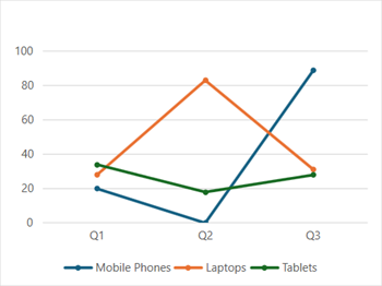
| ChartType.LineMarkers Represents a line chart with markers. It is used to display data values shown with markers. It is ideal to use this chart when there are many categories or approximate values. |
| ChartType.LineMarkersStacked Represents a stacked line chart with markers. It is used to display data values with markers, typically showing the trend of the contribution of each value over time or evenly spaced categories. |
| ChartType.LineMarkersStacked100 Represents a 100% stacked line chart with markers. It is used to display individual data values with markers, typically showing the trend of the percentage of each value that has been contributed over time or evenly spaced categories. It is ideal to use this chart when there are many categories or approximate values. |
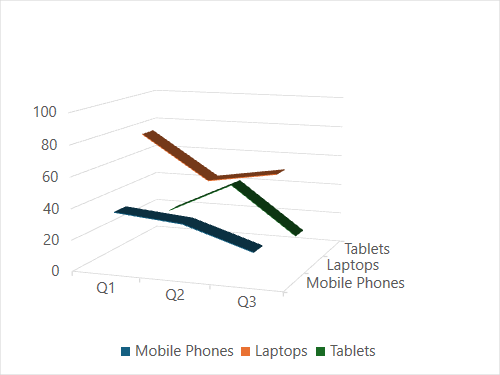
| ChartType.Line3D Represents a 3D line chart. It is used to display a 3D chart demonstration, showing trends over time or categories. It presents data on a third axis, which shows some lines that appear in front of others. |
Using Code
Refer to the following example code to add a line chart.
C#
// Add data.
spreadSheet1.Workbook.ActiveSheet.Cells[0, 1].Value = "Q1";
spreadSheet1.Workbook.ActiveSheet.Cells[0, 2].Value = "Q2";
spreadSheet1.Workbook.ActiveSheet.Cells[0, 3].Value = "Q3";
spreadSheet1.Workbook.ActiveSheet.Cells[1, 0].Value = "Mobile Phones";
spreadSheet1.Workbook.ActiveSheet.Cells[2, 0].Value = "Laptops";
spreadSheet1.Workbook.ActiveSheet.Cells[3, 0].Value = "Tablets";
for (var r = 1; r <= 3; r++)
{
    for (var c = 1; c <= 3; c++)
    {
        Random random = new Random();
        spreadSheet1.Workbook.ActiveSheet.Cells[r, c].Value = random.Next(0, 100);
    }
}
spreadSheet1.Workbook.ActiveSheet.Cells["A1:D4"].Select();
// Add line chart.
spreadSheet1.Workbook.ActiveSheet.Shapes.AddChart(GrapeCity.Spreadsheet.Charts.ChartType.Line, 100, 150, 400, 300, true);
VB
' Add data.
spreadSheet1.Workbook.ActiveSheet.Cells(0, 1).Value = "Q1"
spreadSheet1.Workbook.ActiveSheet.Cells(0, 2).Value = "Q2"
spreadSheet1.Workbook.ActiveSheet.Cells(0, 3).Value = "Q3"
spreadSheet1.Workbook.ActiveSheet.Cells(1, 0).Value = "Mobile Phones"
spreadSheet1.Workbook.ActiveSheet.Cells(2, 0).Value = "Laptops"
spreadSheet1.Workbook.ActiveSheet.Cells(3, 0).Value = "Tablets"
For r = 1 To 3
    For c = 1 To 3
        Dim random As Random = New Random()
        spreadSheet1.Workbook.ActiveSheet.Cells(r, c).Value = random.Next(0, 100)
    Next
Next
spreadSheet1.Workbook.ActiveSheet.Cells("A1:D4").Select()
' Add line chart.
spreadSheet1.Workbook.ActiveSheet.Shapes.AddChart(GrapeCity.Spreadsheet.Charts.ChartType.Line, 100, 150, 400, 300, True)