Custom Appearance
The C1ComboBox control comes with various properties to customize appearance and help deliver enhanced user experience. The C1ComboBox class provides a set of properties listed below to achieve customization in the control's overall look and feel.
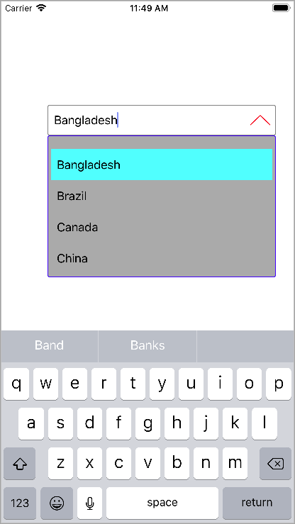
- SelectedBackgroundColor - Sets the selected background color.
- DropDownBackgroundColor - Sets the background color in drop-down list.
- DropDownBorderColor - Sets the color of drop-down border.
- DropDownMode - Sets the mode in which the drop down opens and accepts values from the DropDownMode.
The image given below shows a customized C1ComboBox control.

Add the given code in ViewController.m file to render a customized C1ComboBox control. This code example uses the sample created in the Quick Start.
ComboBoxEdit.SelectedBackgroundColor = UIColor.Cyan;
ComboBoxEdit.ButtonColor = UIColor.Red;
ComboBoxEdit.DropDownBackgroundColor = UIColor.LightGray;
ComboBoxEdit.DropDownBorderColor = UIColor.Blue;
ComboBoxEdit.DropDownMode = C1.iOS.Input.DropDownMode.ForceBelow;


