FlexGrid
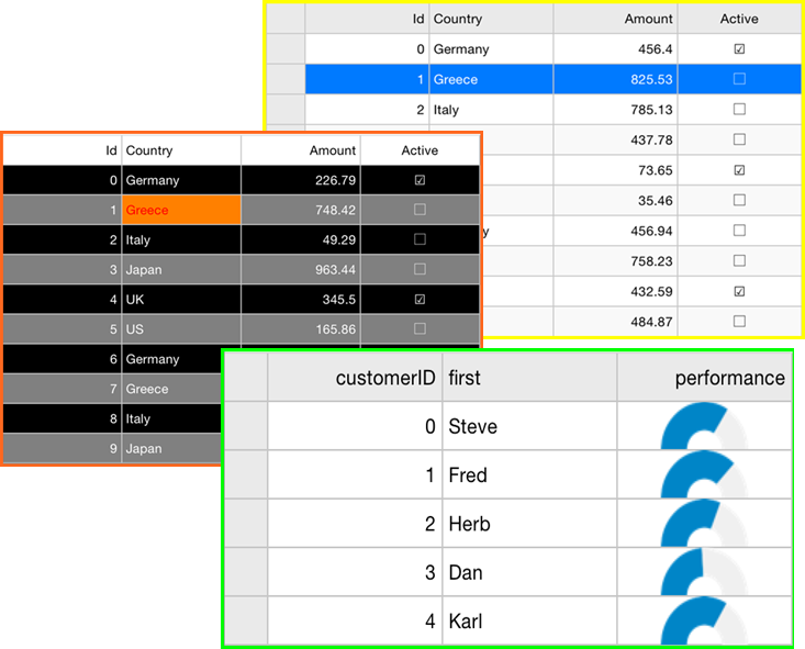
The FlexGrid control provides a powerful and flexible way to display data from a data source in tabular format. FlexGrid is a full-featured grid, providing various features including automatic column generation; sorting, grouping and filtering data using the CollectionView; and intuitive touch gestures for cell selection, sorting, scrolling and editing. FlexGrid brings a spreadsheet-like experience to your iOS mobile apps with quick cell editing capabilities.
FlexGrid provides design flexibility with conditional formatting and cell level customization. This allows developers to create complex grid-based applications, as well as provides the ability to edit and update databases at runtime.
type=note
Please note that from 2018v3 onwards, the default appearance of FlexGrid has changed to the material design pattern. For information on how to switch back to the classic view, see Material Theme.

Key Features
- Auto Generate Columns: FlexGrid generates grid columns automatically when set AutoGridColumn property to true.
- Data Binding: FlexGrid allows you to bind data with business objects, and display it in rows and columns of the grid.
- Touch-based Cell Selection, Zooming and Editing: FlexGrid supports touch-based cell selection and editing. Double-tapping inside a cell puts it into the edit mode similar to Microsoft Excel®. FlexGrid also allows smooth scrolling.
- Format columns: FlexGrid supports various format options that can be used to display data with simple format strings.
- Themes: FlexGrid supports various application and device themes to enhance grid's appearance.
- Pull-to-Refresh and Incremental Loading: FlexGrid supports the ability to load data on-demand using CollectionView and refresh data by pulling down at the top of the grid.
- Reorder Columns and Rows: FlexGrid allows you to reorder rows and columns without using any code.


