
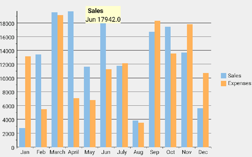
Tooltip
By default, a tooltip generally displays the name of the legend along with the X and Y values when the user taps at any point on the FlexChart control. C1 FlexChart control also allows you to customize the tooltip's background color, text color, etc.
The image below shows how a tooltip appears on FlexChart.
The following code examples demonstrate how to customize the tooltip using C#.
In Code
The following example uses the sample created in the QuickStart section.
Add the following code in MainActivity.cs file. csharp
public class MyToolTip : ChartTooltip
    {
        TextView mTitle;
        TextView mContent;
        String mParentPackage;
        public MyToolTip(FlexChart flexChart, Context context) : base(context)
        {
            mParentPackage = context.PackageName;
            //SetPadding(10, 10, 10, 10);
            // create custom layouts
            LinearLayout customLayout = new LinearLayout(Context);
            customLayout.SetBackgroundColor(Color.ParseColor("#FFFFCA"));
            customLayout.Orientation = Android.Widget.Orientation.Vertical;
            LinearLayout childLayout = new LinearLayout(Context);
            childLayout.Orientation = Android.Widget.Orientation.Horizontal;
            // initialize layout elements
            mTitle = new TextView(Context);
            mContent = new TextView(Context);
            // set element properties
            mTitle.SetTextColor(Color.Black);
            mTitle.SetTypeface(mTitle.Typeface, TypefaceStyle.Bold);
            mTitle.SetPadding(10, 10, 10, 10);
            mContent.SetTextColor(Color.Black);
            mContent.SetPadding(5,5,5,5);
            childLayout.SetBackgroundColor();
            // add layouts
            childLayout.AddView(mTitle);
            customLayout.AddView(childLayout);
            customLayout.AddView(mContent);
            AddView(customLayout);
        }
Now, set the custom tooltip in your MainActivity.cs class by adding the following line of code. csharp
// customize tooltip
mChart.Tooltip.Content = new MyTooltip(mChart, mChart.Context);