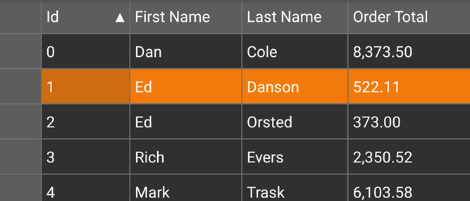
The SelectionMode property of the FlexGrid allows you to define the selection mode of the cells by setting its value to Row, Cell, CellRange, RowRange, or None. This property accepts these values from the GridSelectionMode enum.
The image below shows how the FlexGrid appears after the selectionMode property is set to Row.

The following code example demonstrates how to choose selection modes in FlexGrid. The example uses the sample created in the Defining Columns section.
| C# |
Copy Code |
|---|---|
grid.SelectionMode = GridSelectionMode.Row; | |
The SelectionMode property also controls dictates how a deletion works for a row, cell, cell range, or row range from the FlexGrid control.
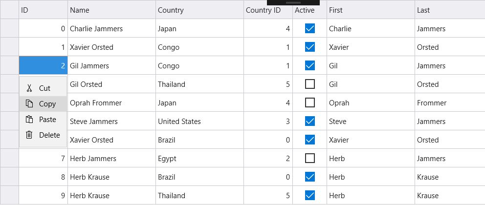
The selection menu contains common actions such as, editing, selecting, and deleting text. In FlexGrid, selection menu is enabled by default. However, you can disable it by setting the ShowSelectionMenu property to false. In desktop applications, you can activate the selection menu with a right click over a cell or by left clicking. In mobile applications, you can activate selection menu with a long press on a cell or tapping the row header. Also, it supports custom menu actions, in case you want custom actions for the selection menu, you need to set a handler for the CreateSelectionMenu event.
Use the following code snippet to create custom action for the selection menu.
| C# |
Copy Code |
|---|---|
grid.CreatingSelectionMenu += Grid_CreatingSelectionMenu; private void Grid_CreatingSelectionMenu(object sender, GridSelectionMenuEventArgs e) { e.Menu.Items.Add(new GridMenuItem("Clear", () => Clear(e))); } public void Clear(GridSelectionMenuEventArgs e) { for (int c = e.CellRange.Column; c <= e.CellRange.Column2; c++) { for (int r = e.CellRange.Row; r <= e.CellRange.Row2; r++) { grid[r, c] = null; } } } return grid; | |
