
Pie Charts
Pie charts, the most common tools used for data visualization, are circular graphs that display the proportionate contribution of each category which is represented by a pie or a slice. The magnitude of the dependent variable is proportional to the angle of the slice. These charts can be used for plotting just one series with non-zero and positive values.
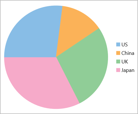
Create a Pie Chart
Pie chart is represented by the FlexPie class in FlexChart. To create a Pie chart through code, follow these steps:
In XAML, initialize the FlexPie control and configure the X and Y axes by setting the BindingName and Binding properties, respectively. Then set up the data source through the ItemsSource property., as showcased in the following code:
<c1:FlexPie x:Name="chart" ItemsSource="{Binding Data}" Binding="Q1"
          BindingName="Country" Margin="10">
</c1:FlexPie>
Switch to C# and use the following code to create the data source for the chart.
public class DataItem
{
    public string Country { get; set; }
    public double Q1 { get; set; }
    public double Q2 { get; set; }
    public double Q3 { get; set; }
    public double Q4 { get; set; }
}
List<DataItem> data = CreateData();
public List<DataItem> Data => data;
public static List<DataItem> CreateData()
{
    var countries = new string[] { "US", "China", "UK", "Japan" };
    var count = countries.Length;
    var result = new List<DataItem>();
    var rnd = new Random();
    for (var i = 0; i < count; i++)
        result.Add(new DataItem()
        {
            Country = countries[i],
            Q1 = rnd.Next(20),
            Q2 = rnd.Next(20),
            Q3 = rnd.Next(20),
            Q4 = rnd.Next(20)
        });
    return result;
}