
Axis Elements
A chart axis constitutes of various elements such as axis title, tick marks, grid lines, axis units etc. FlexChart provides a number of properties to deal with and customize these axis elements, so that you can display your data in the most effective manner.
In FlexChart, the two axes are represented by the AxisX and AxisY property which return an object of the FlexChart class. The following table lists the Axis elements you can set for FlexChart axes using code.
| Axis Elements | Description |
|---|---|
| Title | Axis title is the text that appears alongside each axis and summarizes the data shown on the same. In FlexChart, you can set the axis title by accessing the Title property of Axis class. FlexChart also lets you customize the title using the TitleStyle property. |
| Tick Marks | Tick marks are the small marks or reference points to present the intervals created by dividing the axis according to major and minor units on a value axis. In case of category axis, these marks help in identifying the position of category values on the axis. You can change the position or visibility by setting the MajorTickMarks or MinorTickMarks properties which accept the value from TickMark enumeration. The enumeration lets you set the position of tick marks to appear inside, outside or crossing on the axis. You can also set this property to None, so the tick marks do not appear at all. Moreover, length of the tick marks can also be modified using the TickLength property. |
| Units | As the scale is defined by FlexChart automatically when data is supplied to it, major and minor axis units of the value axis are also calculated as a part of the process. However, you can change the values of major and minor units by setting the MajorUnit and MinorUnit property of the Axis class. In case of a DateTime axis, FlexChart provides you an option to set the time unit as well using the TimeUnit property which lets you choose from day, month, quarter, week, and year options. This property accepts values from the TimeUnits enumeration. |
| Grid Lines | Grid lines are the lines that extend from tick marks perpendicular to the axis and facilitate the viewers with cues to know the unlabeled data points. By default, FlexChart renders the grid lines on a Y-axis but not on X-axis of the chart. However, you can choose to display or hide the same by setting the MajorGrid or MinorGrid properties of the Axis class. You can also customize the appearance of grid lines by setting the MajorGridStyle and MinorGridStyle properties. |
| Labels | Axis labels are the text referring to major divisions which appear along an axis. For information about axis labels in FlexChart, see Axis Labels. |
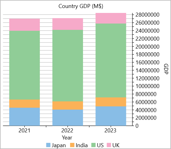
The following code example demonstrates how to set different Axis elements for FlexChart. This example uses the sample and data created in the Quick Start.
<c1:FlexChart x:Name="chart" ChartType="Column" BindingX="year" Stacking="Stacked" Header="Country GDP (M$)"
          LegendPosition="Bottom" ItemsSource="{Binding ListItem}">
    <c1:Series Binding="Japan" SeriesName="Japan"/>
    <c1:Series Binding="India" SeriesName="India"/>
    <c1:Series Binding="US" SeriesName="US"/>
    <c1:Series Binding="UK" SeriesName="UK"/>
    <c1:FlexChart.AxisX>
        <c1:Axis Position="Bottom" Title="Year" MinorTickMarks="Outside"/>
    </c1:FlexChart.AxisX>
    <c1:FlexChart.AxisY>
        <c1:Axis Position="Right" Title="GDP" MajorUnit="1000000" MinorUnit="5000000" Min="0" MajorGrid="True"/>
    </c1:FlexChart.AxisY>
</c1:FlexChart>