Navigation
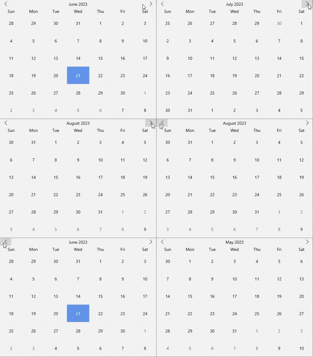
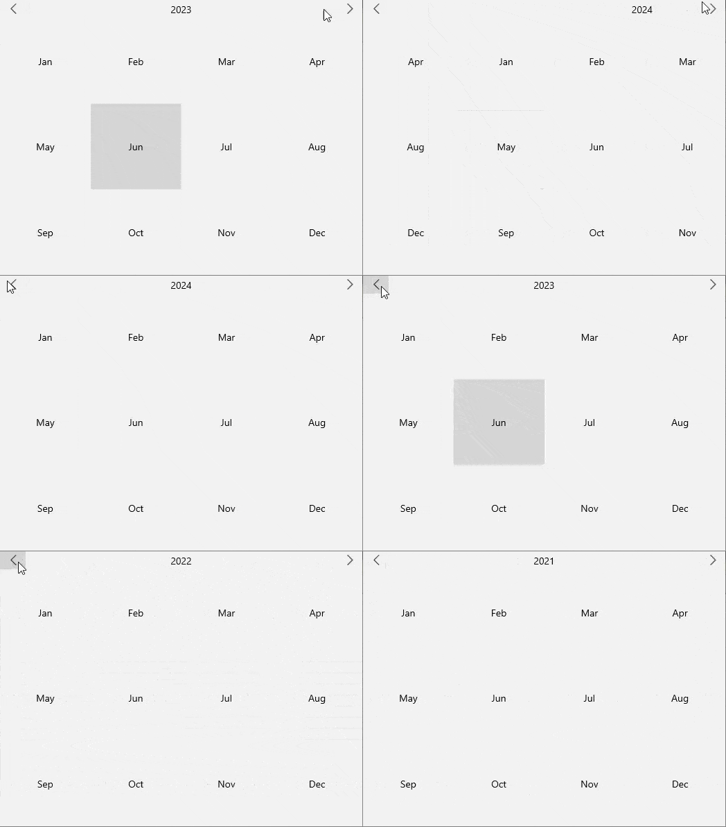
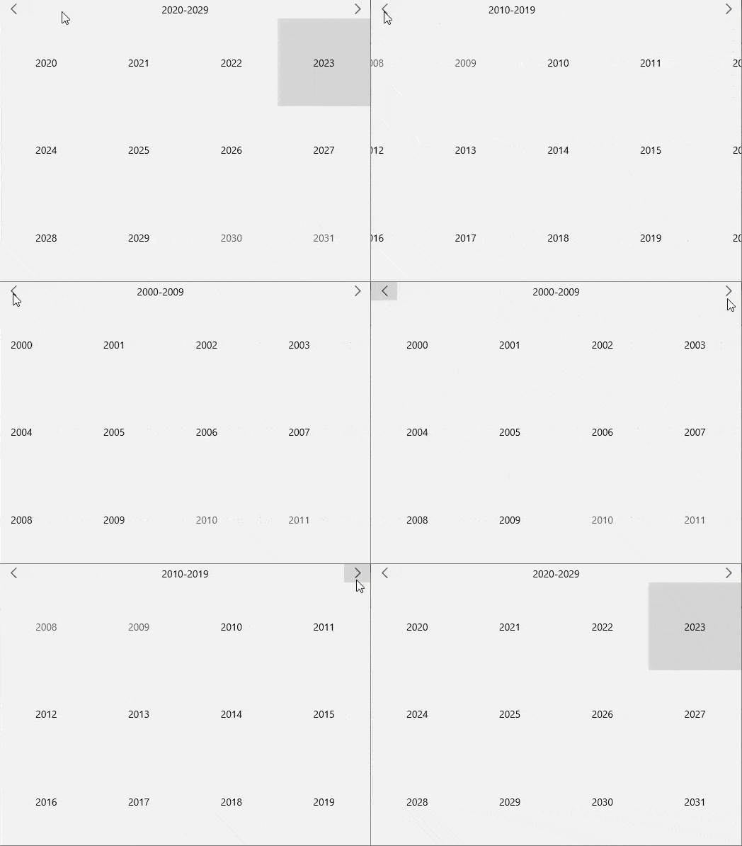
The Calendar control includes the navigation buttons for navigating between the calendar months in the default 'month' view. Clicking the previous arrow button navigates you to the previous month and clicking the next arrow navigates you to the next month. Similarly, in the year or decade views, the navigation buttons helps you navigate between the previous and next years or decades, respectively.
The navigation for month, year and decade is depicted as GIFs in the table below:
| Navigation | GIFs |
|---|---|
| In month view mode |  |
| In year view mode |  |
| In decade view mode |  |
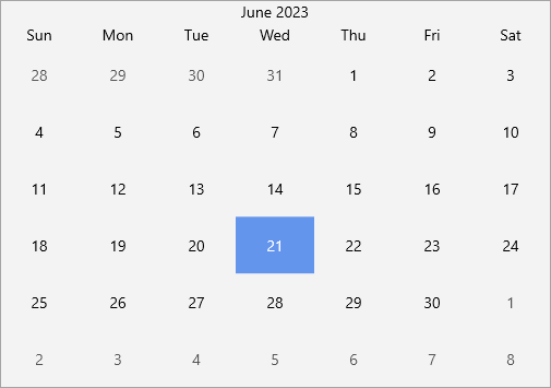
By default, the navigation buttons are visible in the Calendar control. However, you can choose to hide them by setting the ShowNavigationButtons property to false.
The following image shows the Calendar control without navigation buttons.

The following code demonstrates the use of ShowNavigationButtons property to hide navigation buttons.
xml
<c1:C1Calendar x:Name="calendar" ShowNavigationButtons="False"/>
csharp
calendar.ShowNavigationButtons = false;
Keyboard Navigation
Keyboard navigation support provides an effective way to navigate through the Calendar control, simply by using the defined keys when required. The following table lists the keyboard shortcut keys and their associated actions to use when navigating through the Calendar:
| Keyboard Keys | Action |
|---|---|
| Up ( ↑ ) | Moves focus to the date displayed above the selected date. |
| Down ( ↓ ) | Moves focus to the date displayed below the selected date. |
| Left ( ← ) | Moves focus to the date displayed on the left side of the selected date. |
| Right ( → ) | Moves focus to the date displayed on the right side of the selected date. |


