
- SpreadJS Overview
- Getting Started
- JavaScript Frameworks
- Best Practices
- Features
- SpreadJS Designer
- SpreadJS Designer VSCode Plugin
- Tutorials
-
SpreadJS Designer Component
- Getting Started
- Quick Start
- Theme
- Designer Interface
- JavaScript Frameworks
- Template-Based Workbook Initialization
- Customizations
-
Work in Designer Component
- AutoSum Functions
- Set Range Template Cell
- Name Box
- Select Cells Using Go To
- Find and Replace
- Edit Font Size
- Edit Font Family
- Manage Conditional Formatting Rules
- Shape Selection Pane
- Automatic Outline
- Format Painter
- Table Slicer
- Data Source
- TableSheet
- GanttSheet Designer
- ReportSheet Designer
- Data Chart Designer
- Text to Columns
- Remove Duplicates
- Pivot Table
- Dockable Side Panel
- Command Palette
- Transform Cells with LAMBDA Formula
- Threaded Comments Panel
- What-If Analysis
- Insert Function Dialog
- Named Cell Templates
- Insert Pictures in Designer
- Toolbar Ribbon
- API Documentation
- SpreadJS Collaboration Server
- Touch Support
- Formula Reference
- Import and Export Reference
- Events
- API Documentation
- Release Notes
Managing Columns
The Columns tab defines the schema of a table in the Data Manager.
Here, you can:
Add new columns
Configure column data definitions and behaviors
Define relationships between tables
Configure validation, styles, and hierarchy settings
All column configurations correspond to the table schema used at runtime by the Data Manager.
For conceptual explanations of schema, relationships, and hierarchy, refer to the Data Manager section in Features.
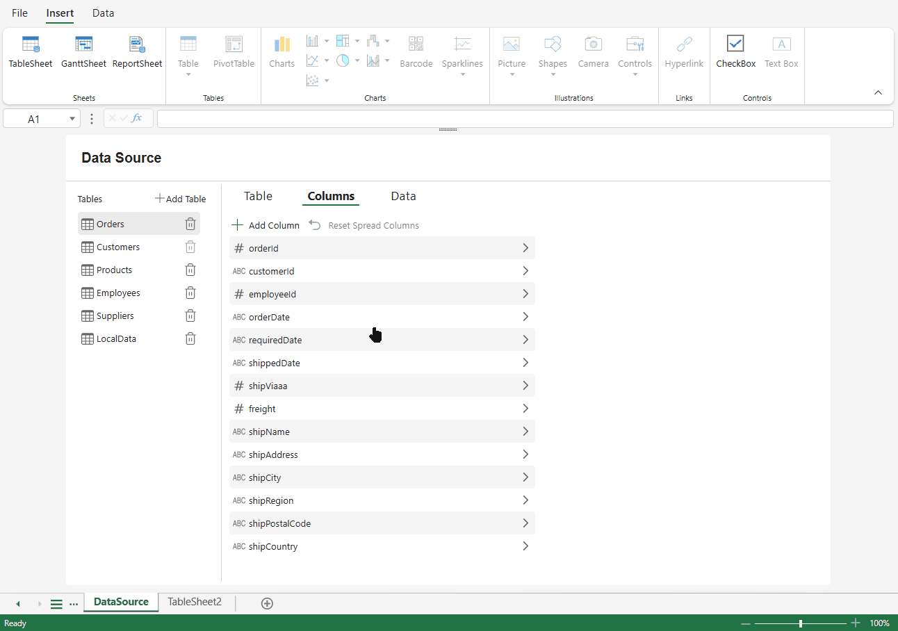
Column List
The Column List displays all columns defined in the table.
Click a column to open its configuration panel.
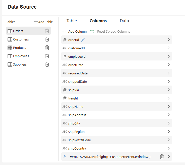
Column Type Indicators
An icon appears before the column name to indicate its type category.
For example:
# indicates numeric-related types (such as Number or RowOrder).
ABC indicates text-based types (such as String or None).
B indicates Boolean.
A rectangle icon
 indicates Object.
[] indicates Array.
A calendar icon
 indicates Date.
fx indicates a user-defined formula column.
The fx icon is displayed only for columns created using Add Column.
The icon is automatically determined by the column's data type. To modify the type, update the Type setting in the Schema section described below.
Column Status and Actions
Additional icons may appear after the column name to indicate column status or available actions.
A relationship icon indicates
 that the column participates in a configured relationship.
A delete (trash) icon
 appears for user-added formula columns and allows the column to be removed.
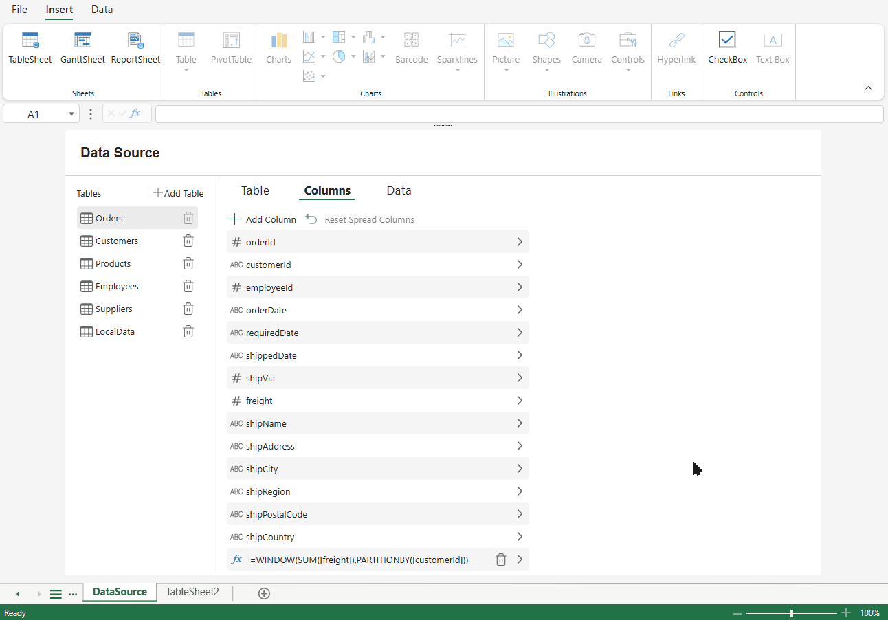
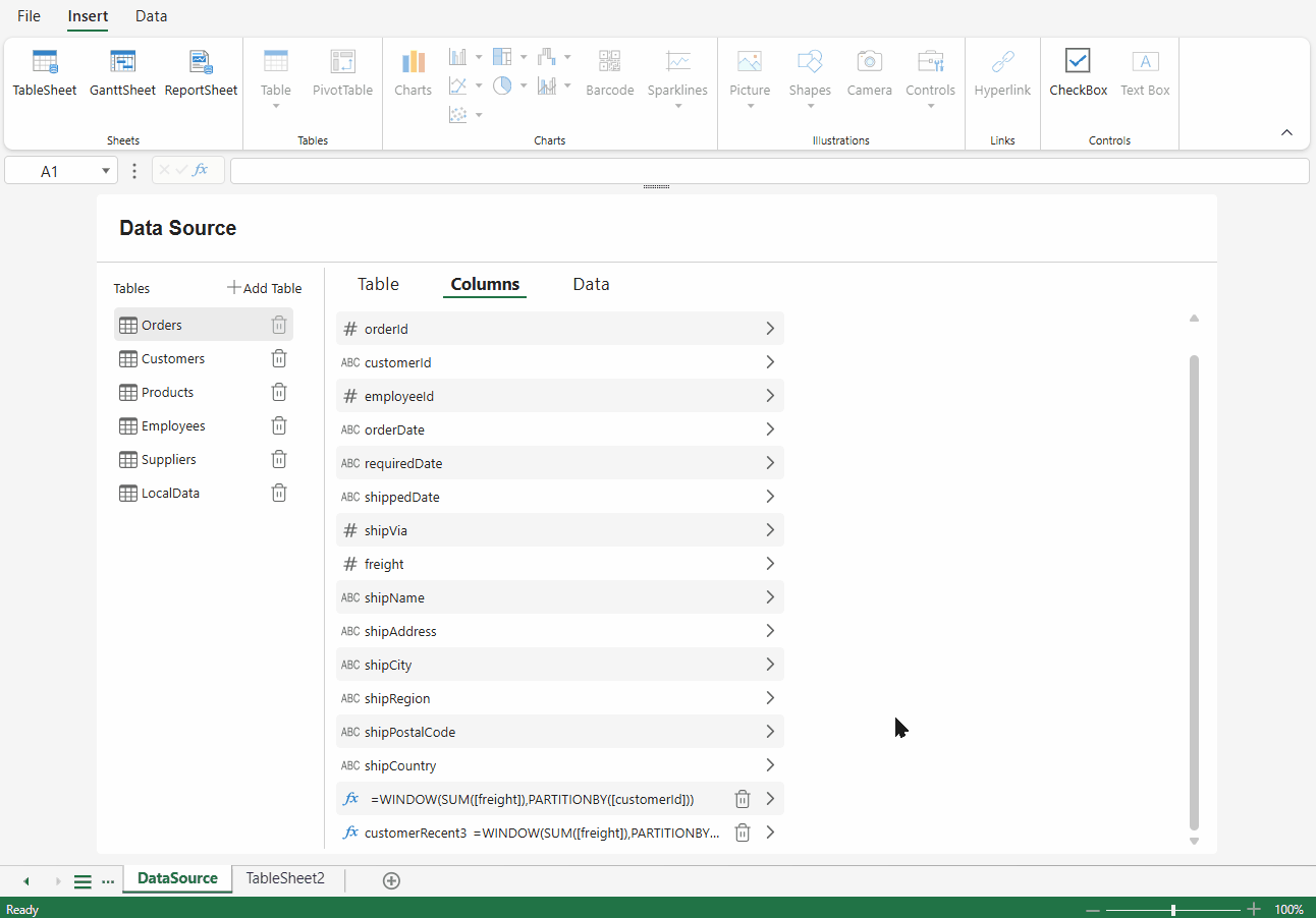
Adding a Column
Click Add Column to create a new formula column.
Newly added columns:
Are created as formula columns
Display the fx icon
Appear at the end of the column list
Removing a Column
Only user‑added formula columns can be deleted.
Columns that originate from the table schema cannot be removed. To hide an existing column, clear the Visible option in its properties.
Resetting Spread Columns
Click Reset Spread Columns to synchronize the Data Manager column definitions with the current column bindings in the Spread.
This action updates the column structure based on how fields are currently defined or bound in the Spread, including nested data paths.
Use this option when the Spread structure has changed and you need to align the Data Manager columns with it.
Configuring a Column
When you select a column, the configuration panel opens.
Settings are organized into the following sections:
Basic Column Properties
Schema and Trigger
Styles and Validation
Relationships
Hierarchy
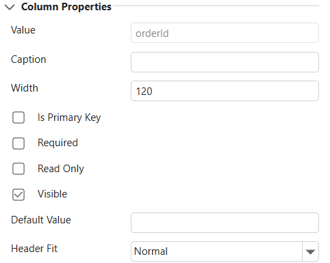
Basic Column Properties
When a column is selected, its basic properties are displayed in the right panel.
These properties control how the column behaves and appears in bound components.
These settings control how the column behaves and appears in bound components.
Property | Description |
|---|---|
Value | The field name of the column. This property is read-only and cannot be modified. |
Caption | The display text shown in the column header. By default, this field is empty. If not specified, the header displays the field name. |
Width | Specifies the column width. The default value is 120. |
Is Primary Key | Marks the column as a primary key. When enabled, an indicator appears in the column header. |
Required | Indicates that the column must contain a value. When enabled, a required indicator appears in the column header. |
Read Only | Prevents the column from being edited. When enabled, a read-only indicator appears in the column header. |
Visible | Controls whether the column is displayed in the Spread. If cleared, the column remains part of the schema but is hidden from view. |
Default Value | Specifies the default value assigned to the column when new rows are created. |
Header Fit | Controls how the column header text is displayed. Options: Normal, Stack, Vertical. |
Schema and Trigger
The Schema section defines how the column data is interpreted, formatted, and processed by the Data Manager.
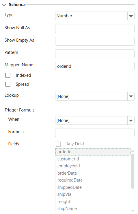
Core Settings
Setting | Description |
|---|---|
Type | Specifies the data type of the column, such as Number, String, Boolean, Date, Object, Array, or RowOrder. The column type icon updates automatically when changed. |
Show Null As | Defines the display text for null values. Affects presentation only. |
Show Empty As | Defines the display text for empty values. Affects presentation only. |
Pattern | Specifies the formatting or parsing pattern, such as date or numeric formats. |
Mapped Name | Specifies the field path used to bind the column to the data source. Can be a direct field name or a nested path (for example, |
Indexed | Indicates whether the column is indexed to improve filtering and query performance. |
Spread and Lookup
Setting | Description |
|---|---|
Spread | Applies to Object-type columns. When enabled, object properties are flattened into first-level columns. Use Reset Spread Columns to restore the original nested structure. |
Lookup | Marks the column as a lookup column. It appears as a combo box or multi-column drop-down list. You can specify fixed lookup values using an array-like string format (for example, 1,2,3). |
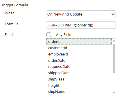
Trigger Settings
Trigger Formula automatically calculates or updates the column value when data is created or modified.
Setting | Description |
|---|---|
When | Specifies when the formula is applied: onNew (when a row is created) or onNewAndUpdate (when a row is created or updated). |
Formula | The expression used to calculate the value. The result is written back to the column. |
Fields | Available only when When is set to onNewAndUpdate. Specifies which fields trigger recalculation. Select Any Field to trigger on any column change, or choose specific fields. |
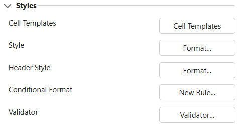
Styles and Validation
The Styles section provides quick access to visual styling and data validation settings for the selected column.
These options open the corresponding configuration dialogs in SpreadJS. Detailed behavior and advanced options are documented separately.
Setting | Description |
|---|---|
Cell Templates | Opens the Cell Templates dialog. Allows you to apply a named cell template that may include style, conditional formatting, validation rules, and cell state settings. |
Style | Opens the Format Cells dialog to configure visual properties such as number format, font, alignment, border, and fill. |
Header Style | Opens the Format Cells dialog for the column header. |
Conditional Format | Opens the Conditional Formatting Rules Manager to create or manage conditional formatting rules for the column. |
Validator | Opens the Data Validation dialog to configure input validation rules for the column. |
These settings affect how the column is rendered and how user input is validated. They do not modify the underlying data schema.
Relationships
The Relationship section allows you to define a relationship between the current column and a column in another table.
Although configured from a column, a relationship establishes a connection between two tables in the Data Manager.
Relationship Settings
Setting | Description |
|---|---|
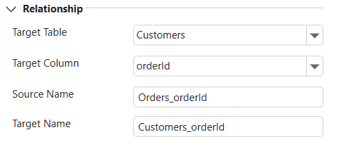
Target Table | Selects the table to relate to. The drop-down list displays available tables in the Data Manager. |
Target Column | Selects the column in the target table to establish the relationship with. The available columns depend on the selected Target Table. |
Source Name | The relationship name on the source table. This value is generated automatically after selecting the target table and column. The default format is |
Target Name | The relationship name on the target table. This value is generated automatically. The default format is |
Once a relationship is configured, a relationship icon appears next to the column name in the Columns list.
For detailed explanations of relationship behavior and how relationships affect data navigation and lookup, refer to the Data Manager section in Features.
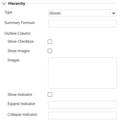
Hierarchy
The Hierarchy section enables tree-structured display for hierarchical data.
Hierarchy settings assume that the data source already follows a supported hierarchical structure.
Notes:
Hierarchy configuration assumes that the underlying data source already follows a supported hierarchical structure.
Hierarchy becomes visually effective only when Show Indicator is enabled.
Hierarchy Settings
Setting | Description |
|---|---|
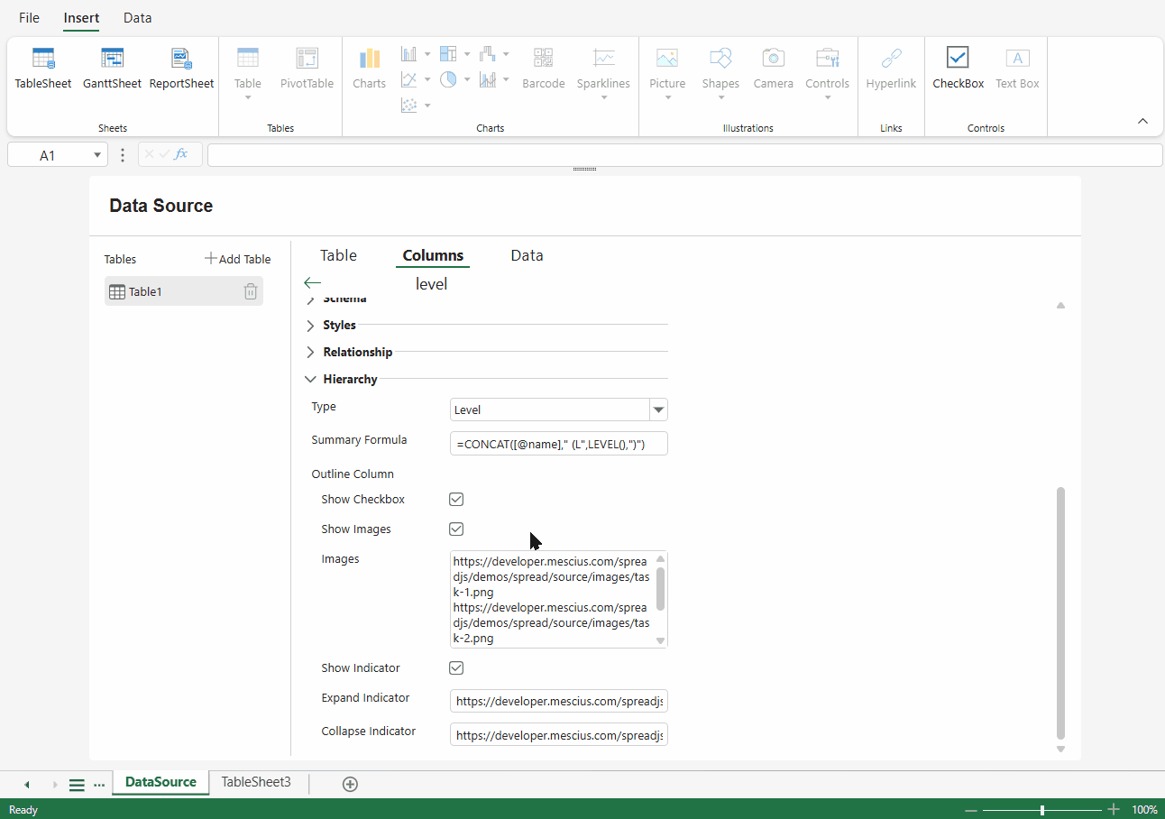
Type | Specifies the hierarchy type. Available options include Parent, ChildrenPath, and Level. Select None to disable hierarchy. |
Summary Formula | Defines a formula used to calculate summary values for parent rows. The formula is applied only when a record has child rows. |
Outline Column | Configures how the current column behaves as the tree (outline) column. Only one outline column can be defined in a table. |
Outline Column Options
Option | Description |
|---|---|
Show Checkbox | Displays a checkbox next to each row in the hierarchy column. |
Show Images | Displays custom images for hierarchy levels. |
Images | Specifies images used for different hierarchy levels. Enter one image per line. Each value must be a valid URL or Base64 string. Images are applied in order according to hierarchy depth. |
Show Indicator | Displays expand and collapse controls. This option must be enabled for the hierarchy structure to be visually interactive. |
Expand Indicator | Specifies the icon used for expanded nodes. Only a single value is allowed. Must be a valid URL or Base64 string. |
Collapse Indicator | Specifies the icon used for collapsed nodes. Only a single value is allowed. Must be a valid URL or Base64 string. |
After Enabling Hierarchy
Rows are displayed in a tree structure.
Expand and collapse controls appear when Show Indicator is enabled.
Parent rows can display calculated summary values when a Summary Formula is defined.
Custom images are applied by hierarchy level when Show Images is enabled.
For advanced hierarchy behavior and data structure requirements, refer to the Data Manager section in Features.