
Theme
The SpreadJS Designer Component introduces an advanced theme system that supports four distinct theme options to enhance user interface (UI) customization and adaptability. These include three preset themes—Light, Dark, and Classic—alongside a flexible customizable theme system.
The Light and Dark themes are designed to align with modern display preferences, offering optimized visual styles for high contrast and readability in respective environments.
The Classic theme provides a familiar and neutral aesthetic, ideal for users seeking a traditional spreadsheet interface.
The customizable theme system empowers developers to tailor the Designer Component’s appearance, enabling adjustments to colors, border radius, and shadows to match specific application branding or unique user preferences.
Together, this diverse theme ecosystem ensures that SpreadJS Designer Component can seamlessly integrate into varied user contexts, balancing out-of-the-box convenience with extensive flexibility for personalized UI design.
Include Designer Theme CSS File
Implementing different themes for the SpreadJS Designer Component primarily relies on including the appropriate CSS files in your project. To apply a specific theme, developers need to explicitly link the corresponding CSS file within their project.
For instance, adding a <link> tag to the <head> section of the HTML structure, ensuring the href attribute points to the correct CSS file path. A typical example would be:
<link rel="styleSheet" href="css/gc.spread.sheets.designer.light.x.x.x.min.css" />For convenience, pre-packaged theme CSS files are provided in the downloaded ZIP bundle, located at \SpreadJS.Release.xxxx\Designer\Designer Component\css. This directory contains all necessary preset theme files, streamlining the process of accessing and referencing the desired styles.
Themes can also be imported using a module loader if preferred.
Note:
Only one Designer theme CSS file should be referenced at a time.
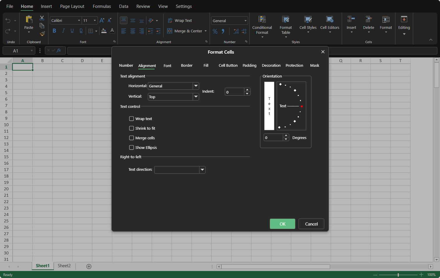
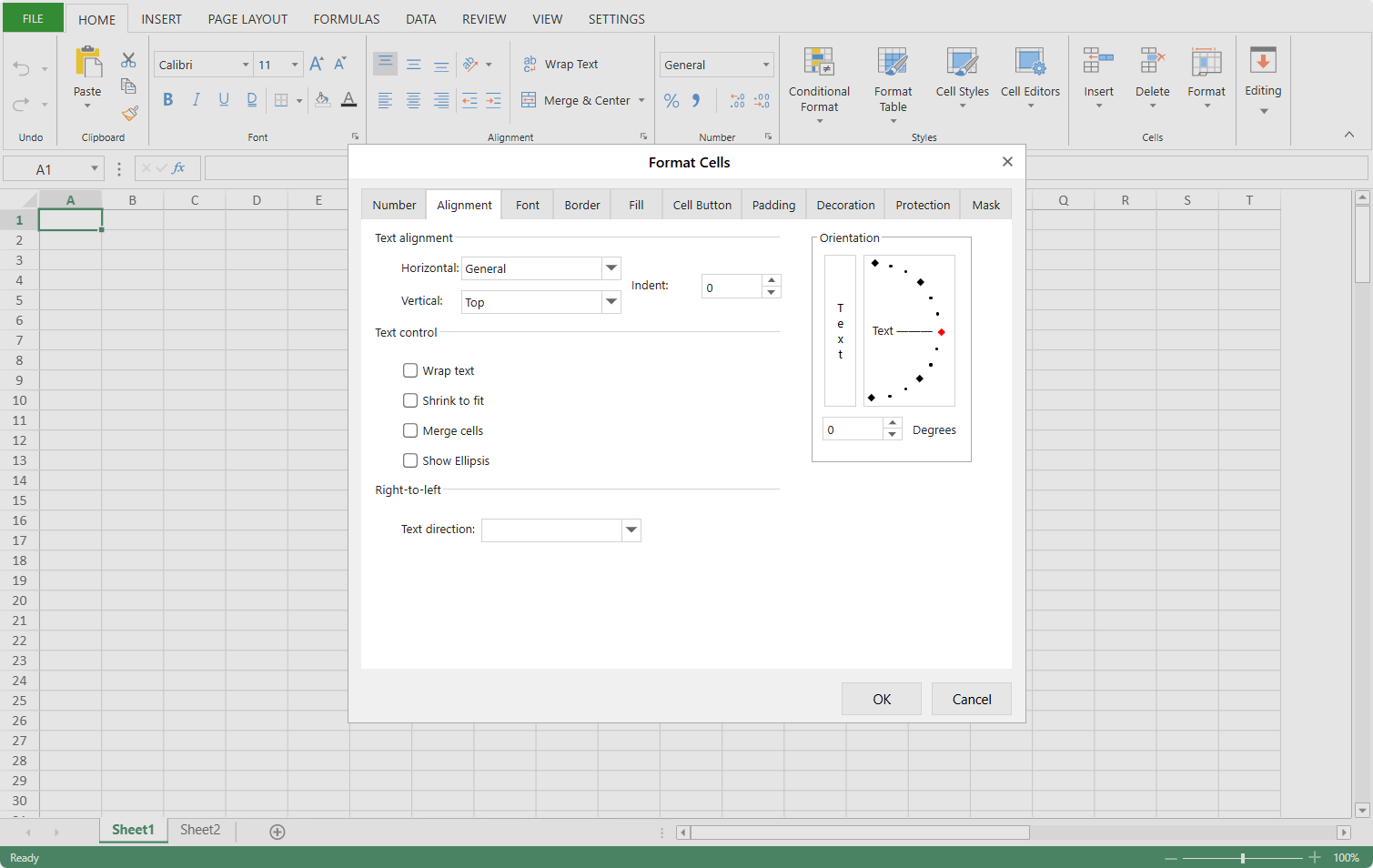
Preset Themes
The preset themes each present distinct visual identities, shaped by differences in color schemes, contrast levels, and stylistic nuances—ranging from tab flatness and border radii to shadow softness, icon optimization, and state-based hues (e.g., hover/selected states).
These variations collectively influence not only the overall UI harmony but also the appearance of key components like the Ribbon, Dialogs, and Panels, ensuring each theme aligns with specific aesthetic preferences.
The following themes are available:
Name | CSS File | Snapshots (Preview, Dialog, Panel) | ||
|---|---|---|---|---|
Light (default) | gc.spread.sheets.designer.light.x.x.x.min.css |
|
|
|
Dark | gc.spread.sheets.designer.dark.x.x.x.min.css |
|
|
|
Classic | gc.spread.sheets.designer.x.x.x.min.css |
|
|
|
Note:
Prior to version 18.2.0, SpreadJS Designer offered the Classic preset theme as the sole UI styling option.
Custom Theme System
When creating a custom theme for the SpreadJS Designer, it is essential to first establish a base using either the Light or Dark preset theme—these new themes serve as the foundation for customization.
After selecting your base theme, you can further tailor the UI’s visual properties (such as colors, border radius, or shadows) through API calls, CSS overrides, or JavaScript modifications to align with your application’s unique branding or user experience goals.
Customize with API
To implement a custom theme dynamically, you can use the setTheme method. This approach allows runtime modifications while preserving the underlying theme architecture.
The setTheme() method accepts a Partial<GC.Spread.Sheets.Designer.ITheme> object specifying targeted properties. Only defined properties will override existing values, enabling partial theme updates. For example:
GC.Spread.Sheets.Designer.setTheme({
    colorBackground: "#F0F4F8",       // The background of all standard components
    colorForeground: "#2D3436",       // The color of all regular text
    borderRadiusM: "6px",             // Medium border radius
    shadow8: "rgba(142, 148, 156, 0.1) 0px 2px 4px, rgba(142, 148, 156, 0.06) 0px 1px 2px"  // Shadow effect
});
Note:
A comprehensive list of configurable theme properties (including colors, border radius, and shadows) will be detailed in the "Theme Properties Reference" section later in this guide.
State Management
Resetting Themes: Pass
nulltosetTheme()to revert to the active preset (Light/Dark) defaults:Designer.setTheme(null); // Revert to system presetCurrent Configuration: Retrieve the full theme state (including inherited preset values) using getTheme():
let currentTheme = GC.Spread.Sheets.Designer.getTheme();
console.log(currentTheme.colorBackground); // "#F0F4F8"
Customize with CSS or JS
The SpreadJS Designer supports dynamic theme customization through CSS variables (tokens) and JavaScript DOM manipulation. Three primary approaches are available:
1. Static Theme Overrides (CSS)
Define theme tokens directly in global CSS to override default values:
:root {
  --sjs-color-background: #F0F4F8;       // The background of all standard components
  --sjs-color-foreground: #2D3436;       // The color of all regular text
  --sjs-border-radius-m: 6px;            // Medium border radius
  --sjs-shadow-8: rgba(142, 148, 156, 0.1) 0px 2px 4px, rgba(142, 148, 156, 0.06) 0px 1px 2px;  // Shadow effect
}
Best for: Permanent theming in static applications where runtime changes aren't required.
2. Dynamic Runtime Updates (JavaScript DOM)
Modify theme tokens at runtime by targeting the document root element:
document.documentElement.style.setProperty(GC.Spread.Sheets.Designer.ThemeTokens.colorBackground, '#F0F4F8');
document.documentElement.style.setProperty(GC.Spread.Sheets.Designer.ThemeTokens.colorForeground, '#2D3436');
document.documentElement.style.setProperty(GC.Spread.Sheets.Designer.ThemeTokens.borderRadiusM, '6px');
document.documentElement.style.setProperty(GC.Spread.Sheets.Designer.ThemeTokens.shadow8, 'rgba(142, 148, 156, 0.1) 0px 2px 4px, rgba(142, 148, 156, 0.06) 0px 1px 2px'); Advantage: Enables theme switching without page reloads. Suitable for user-driven theme preferences.
3. Programmatic Rule Injection
Dynamically generate CSS rules with JavaScript for complex theming scenarios:
export function createCSSRule (selector: string, theme: GC.Spread.Sheets.Designer.ITheme | undefined): string {
    if (theme) {
        const cssVarsAsString = (Object.keys(theme) as (keyof typeof theme)[]).reduce((cssVarRule, cssVar) => {
            return `${cssVarRule}${GC.Spread.Sheets.Designer.ThemeTokens[cssVar]}: ${theme[cssVar]}; `;
        }, '');
        return `${selector} { ${cssVarsAsString} }`;
    }
    return `${selector} {}`;
}
let customThemeRule = createCSSRule(":root", {
  colorBackground: "#F0F4F8",
  colorForeground: "#2D3436",
  borderRadiusM: "6px",
  shadow8: "rgba(142, 148, 156, 0.1) 0px 2px 4px, rgba(142, 148, 156, 0.06) 0px 1px 2px",
});
let customStyleElement = document.createElement("style");
customStyleElement.sheet?.insertRule(customThemeRule);
document.head.appendChild(customStyleElement);
Use Case: Batch-theme application or theming components with complex variable dependencies.
Note:
A comprehensive list of configurable theme tokens (including colors, border radius, and shadows) will be detailed in the "Theme Properties Reference" section later in this guide.
Theme Properties Reference
SpreadJS provides two core APIs—GC.Spread.Sheets.Designer.ITheme and GC.Spread.Sheets.Designer.ThemeTokens —to empower developers with granular control over theme customization.
Whether you’re adjusting colors, border radii, or shadows, understanding the properties and tokens within these APIs is key to tailoring the Designer’s appearance to your needs.
Below, a detailed table breaks down the full list of properties in the ITheme, their corresponding ThemeTokens variables, and their practical impact on UI elements—from background hues to interactive states.
Property | Token | Description | |
|---|---|---|---|
1 | colorForeground | --sjs-color-foreground | Normal foreground color, used for the color of all regular text. |
2 | colorForegroundDisabled | --sjs-color-foreground-disabled | The color of regular text when the component is disabled. |
3 | colorBackground | --sjs-color-background | Normal background color, used for the background of all standard components. |
4 | colorBackgroundHover | --sjs-color-background-hover | Background color when a standard component is hovered. |
5 | colorBackgroundSelected | --sjs-color-background-selected | Background color when a standard component is selected. |
6 | colorBackgroundDisabled | --sjs-color-background-disable | Background color when a standard component is disabled. |
7 | colorBackground2 | --sjs-color-background-2 | Background color for the bottom-most container in the designer. |
8 | colorBackground2Hover | --sjs-color-background-2-hover | Background color when the bottom-most container’s component is hovered. |
9 | colorBackground2Selected | --sjs-color-background-2-selected | Background color when the bottom-most container’s component is selected. |
10 | colorBrandForeground | --sjs-color-brand-foreground | Text color used on top of the brand background color. |
11 | colorBrandBackground | --sjs-color-brand-background | The color representing the brand, used as the product’s color identifier. It serves as the background color for components that need to stand out or showcase the brand’s style. |
12 | colorBrandBackgroundHover | --sjs-color-brand-background-hover | Background color when the brand background color is hovered. |
13 | colorBrandBackgroundSelected | --sjs-color-brand-background-selected | Background color when the brand background color is selected. |
14 | colorStroke | --sjs-color-stroke | Border color. |
15 | colorStrokeHover | --sjs-color-stroke-hover | Border color when the component is hovered. |
16 | colorStrokeSelected | --sjs-color-stroke-selected | Border color when the component is selected. |
17 | colorStrokeDisabled | --sjs-color-stroke-disabled | Border color when the component is disabled. |
18 | borderRadiusM | --sjs-border-radius-m | Medium border radius. |
19 | borderRadiusL | --sjs-border-radius-l | Large border radius. |
20 | borderRadiusXL | --sjs-border-radius-xl | Extra-large border radius. |
21 | shadow4 | --sjs-shadow-4 | Shadow with a blur radius of 4px. |
22 | shadow8 | --sjs-shadow-8 | Shadow with a blur radius of 8px. |