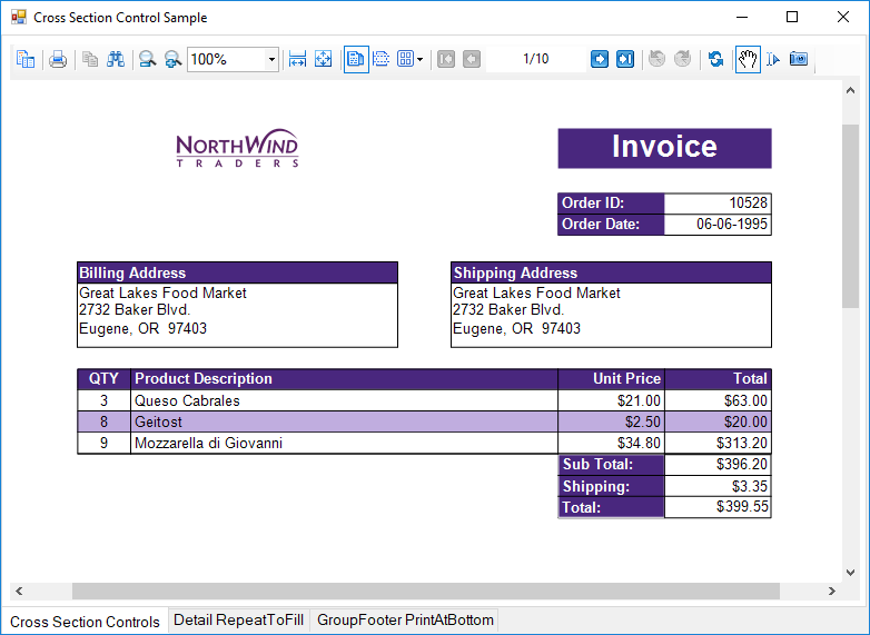
Cross Section Controls
This CrossSectionControls sample displays the invoice report of a company in detail. This sample uses the CrossSectionBox and CrossSectionLine controls to demonstrate the lines and display the Invoice report in a tabular form. It includes a ViewerForm with three tabs, three Viewer controls and an Invoice report to highlight several report features. Run the project and click the tab to see these features in action.

Sample
Visual Basic.NET
https://github.com/activereports/Samples19/tree/main/API/Section/CrossSectionControls/VB.NET
C#
https://github.com/activereports/Samples19/tree/main/API/Section/CrossSectionControls/C#
Details
When you run this sample, a form with three different tab options and each tab option displaying a report in a Viewer control is displayed. Click any tab option at the bottom of the form to display the selected tab feature applied to the report in a Viewer control. Select from the following tab options.
Cross Section Controls
Draws table style gridlines easily through multiple sections without any gap.
Detail RepeatToFill
The Detail RepeatToFill tab has the RepeatToFill property set to True. This ensures that the formatting (alternating purple and white rows and CrossSection controls) fills space as needed to keep the same layout between pages.
GroupFooter PrintAtBottom
The GroupFooter section has the PrintAtBottom property set to True. This pulls the GroupFooter section to the bottom of the page, just above the PageFooter section.
type=note
Note: To run this sample, you must have access to the Nwind.db. The NWIND.db file can be downloaded from GitHub: ..\Samples19\Data\NWIND.db.
ViewerForm: The ViewerForm has three tabs-Cross Section Controls, Detail RepeatToFill, GroupFooter PrintAtBottom, each with an ActiveReports Viewer control on it. Right-click the form and select View Code to see the code used to change the Invoice report's section properties at run time.
Invoice Report: The Invoice report demonstrates the usage of the following features.
- PageHeader Section: This section contains Shape, Label and TextBox controls. The Shape control provides a border around the Order ID and Order Date fields and labels. The orderDateTextBox has the OutputFormat property set to d to display a short date. The Label controls use the BackColor, ForeColor, and Font properties to add a distinctive style to the report.
- customerGroupHeader: The CrossSectionBox control is hosted in the GroupHeader section, and spans the Detail section to end in the GroupFooter section, forming a rectangle around the details of the invoice at run time. Three of the CrossSectionLine controls are hosted in the GroupHeader section, and span the Detail section to end in the GroupFooter section, forming vertical lines between columns of invoice details at run time.
type=note
Note: If you try to drop a CrossSectionBox or CrossSectionLine control into a section other than a header or footer, the mouse pointer changes to unavailable, and you cannot drop the control.
Two of the TextBox controls use a CalculatedField in the DataField property.
type=info
Tip: In the Report Explorer, expand the Fields node, then Calculated to see all of the calculated fields. Select BillingAddress or ShippingAddress to take a look at the Formula used in the Properties window.
The Line control is used below the column header labels to draw a horizontal line across the width of the report. (It is not visible at design time unless you make the Height of the GroupHeader section larger.) The DataField property of the customerGroupHeader section is set to the OrderID field, so that the section (followed by related details and GroupFooter) prints once per order.
Detail section: This section contains four bound TextBox controls. The four TextBox controls display each row of data associated with the current GroupHeader OrderID. The OutputFormat property of the UnitPrice and Total fields is set to C to display currency. The Line control is used below the TextBox controls to draw horizontal lines across the width of the report under each row of data. (It is not visible at design time unless you make the Height of the Detail section larger.) Right-click the report and select View Code to see the code used in the Detail Format event to create a colored bar (in this case, purple bar) report by alternating the BackColor property of the section. Click the Data Source Icon on the Detail band to view the Connection String used in the report.
customerGroupFooter section: This section has the NewPage property set to After so that a new page is printed for each OrderID (the associated GroupHeader's DataField). The Subtotal TextBox uses the following properties.
- The DataField property uses a Total CalculatedField.
- The SummaryFunc property is set to Sum, to add the values of the field in the detail section.
- The SummaryGroup property is set to the name of the customerGroupHeader, to reset the summary value each time the GroupHeader section runs.
- The SummaryRunning property is set to Group so that the value accumulates for the group rather than for the entire report or not at all.
- The SummaryType property is set to GrandTotal.
Right-click the report and select View Code to see the code used in the customerGroupFooter Format event to calculate the value for the Grand Total TextBox, and to format it as currency.
PageFooter section: The ReportInfo control uses a FormatString property value of Page of , one of the preset values you can use for quick page numbering.
type=info
Tip: In order to easily select a control within the report, in the Report explorer, expand the section node and select the control. The control is highlighted in the Report Explorer and on the report design surface.


