


- SpreadJS Overview
- Getting Started
- JavaScript Frameworks
- Best Practices
- Features
- SpreadJS Designer
- SpreadJS Designer VSCode Plugin
- Tutorials
-
SpreadJS Designer Component
- Getting Started
- Quick Start
- Theme
- Designer Interface
- JavaScript Frameworks
- Template-Based Workbook Initialization
- Customizations
-
Work in Designer Component
- AutoSum Functions
- Set Range Template Cell
- Name Box
- Select Cells Using Go To
- Find and Replace
- Edit Font Size
- Edit Font Family
- Configure Cell Borders
- Manage Conditional Formatting Rules
- Shape Selection Pane
- Automatic Outline
- Format Painter
- Sort and Filter
- Table Slicer
- Data Source
- TableSheet
- GanttSheet Designer
- ReportSheet Designer
- Data Chart Designer
- Text to Columns
- Remove Duplicates
- Pivot Table
- Dockable Side Panel
- Command Palette
- Transform Cells with LAMBDA Formula
- Threaded Comments Panel
- What-If Analysis
- Insert Function Dialog
- Named Cell Templates
- Insert Pictures in Designer
- Toolbar Ribbon
- API Documentation
- SpreadJS Collaboration Server
- Touch Support
- Formula Reference
- Import and Export Reference
- Events
- API Documentation
- Release Notes
Configure Cell Borders
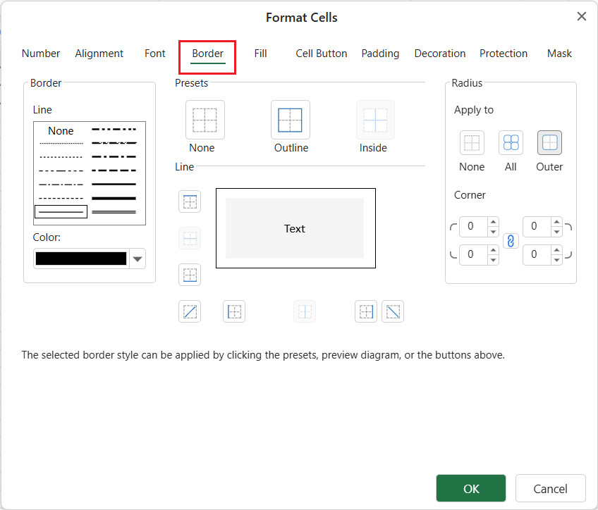
In SpreadJS Designer, you can configure cell borders from the Border tab in the Format Cells dialog. The Border tab allows you to set border line style, color, presets, individual border sides, and border radius.
Use border radius when you want cells or ranges to render as rounded rectangular sections, such as grouped report blocks, form sections, or dashboard panels.
Open the Border Settings
You can open the Border tab from either of the following locations:
On the ribbon, go to Home > Font > Borders > More Borders.

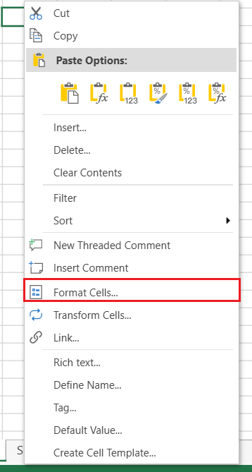
Right-click a worksheet cell, range, or header area, and then select Format Cells > Border.
The Border tab contains settings for border lines, presets, preview, and radius.
Preview Borders and Radius
The preview diagram in the center of the Border tab shows the current border configuration.
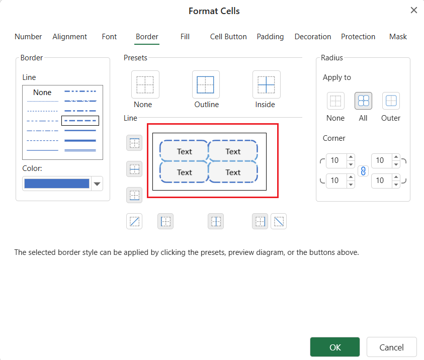
It reflects changes made from:
line style and color
border presets
individual border buttons
border radius values
Radius Apply to mode
Set Border Line Style and Color
Use the Line area to choose the border line style and color.
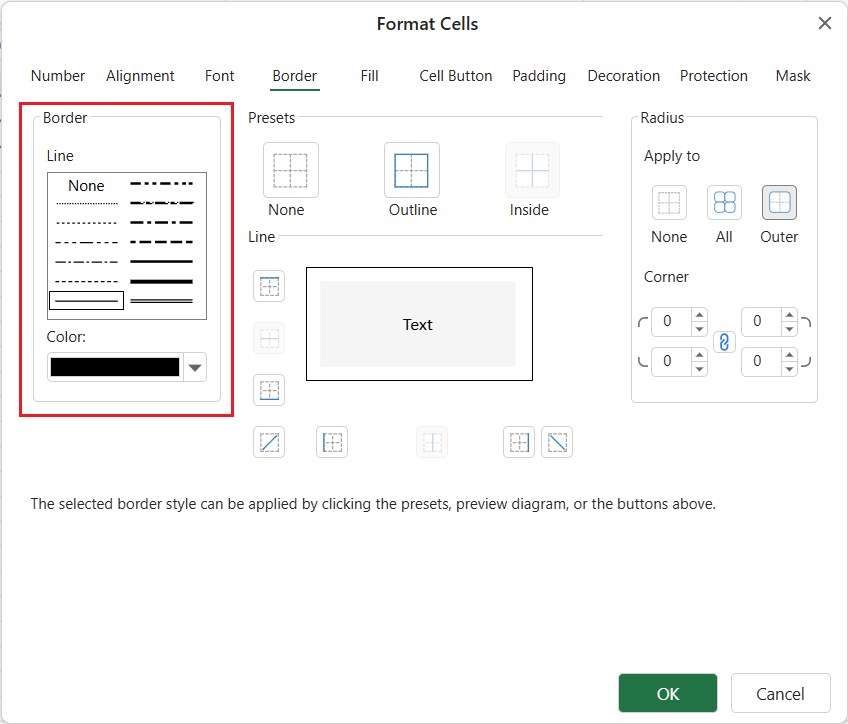
After selecting a line style and color, apply it by using one of the following controls:
Presets apply common border combinations, such as None, Outline, and Inside.
Border buttons around the preview diagram apply the selected line to specific border positions, such as outside borders, inside borders, or diagonal borders.
The preview diagram in the center shows the current border result and can also be used to apply border lines.
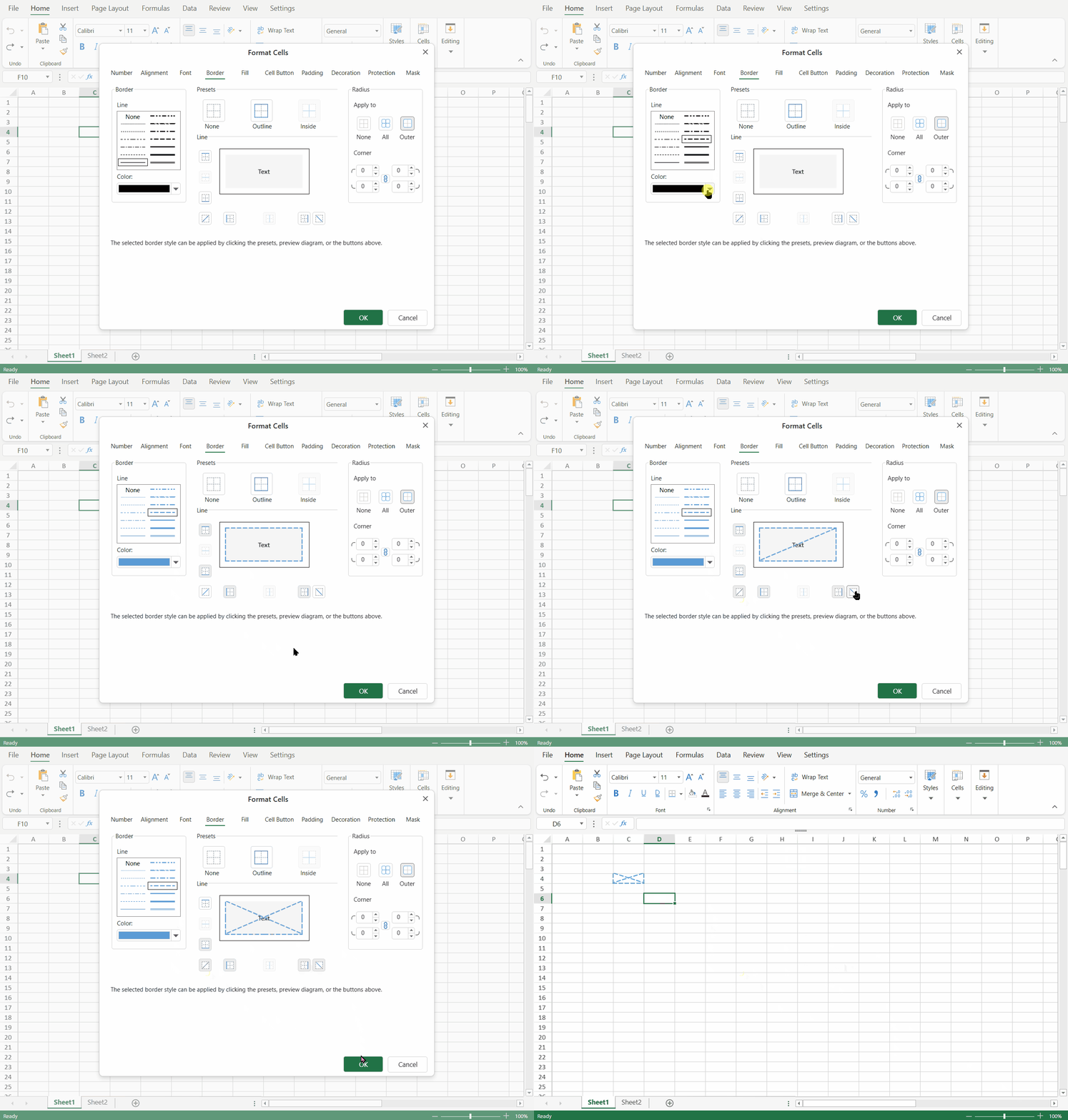
Apply Border Presets
The Presets area provides quick border configurations for the selected cell or range.
Preset | Description |
|---|---|
None | Removes the border lines from the selected target. |
Outline | Applies borders to the outer edges of the selected target. |
Inside | Applies borders to the inside lines of the selected range. |
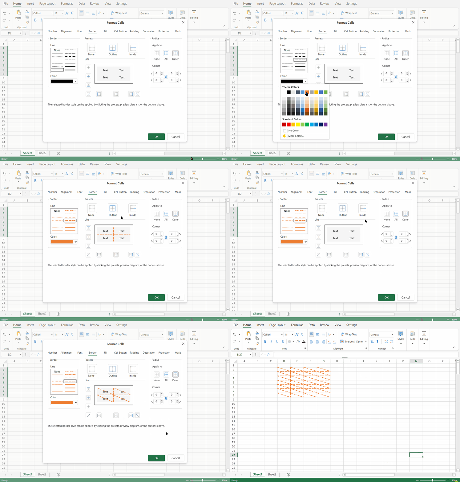
The Inside preset is meaningful for a range because it applies borders between cells in the selected range. It does not control border radius. To configure rounded corners, use the Radius group.
Configure Border Radius
The Radius group controls rounded corners for the selected cell, range, or supported style surface.
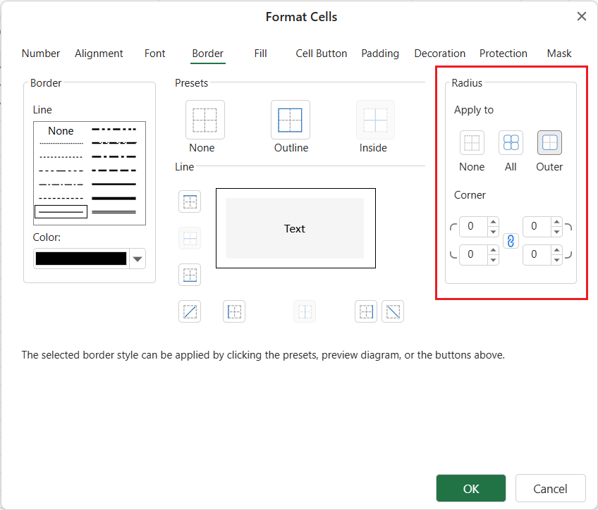
Border radius is applied independently from border line presets. For example, you can use Outline or Inside to set border lines, and then use the Radius group to control how rounded corners are applied.
The Radius group includes:
Area | Description |
|---|---|
Apply to | Defines the target scope of the current radius operation. |
Corner | Provides editors for top-left, top-right, bottom-right, and bottom-left radius values. |
Link button | Links or unlinks the four corner values. |
Apply To Modes
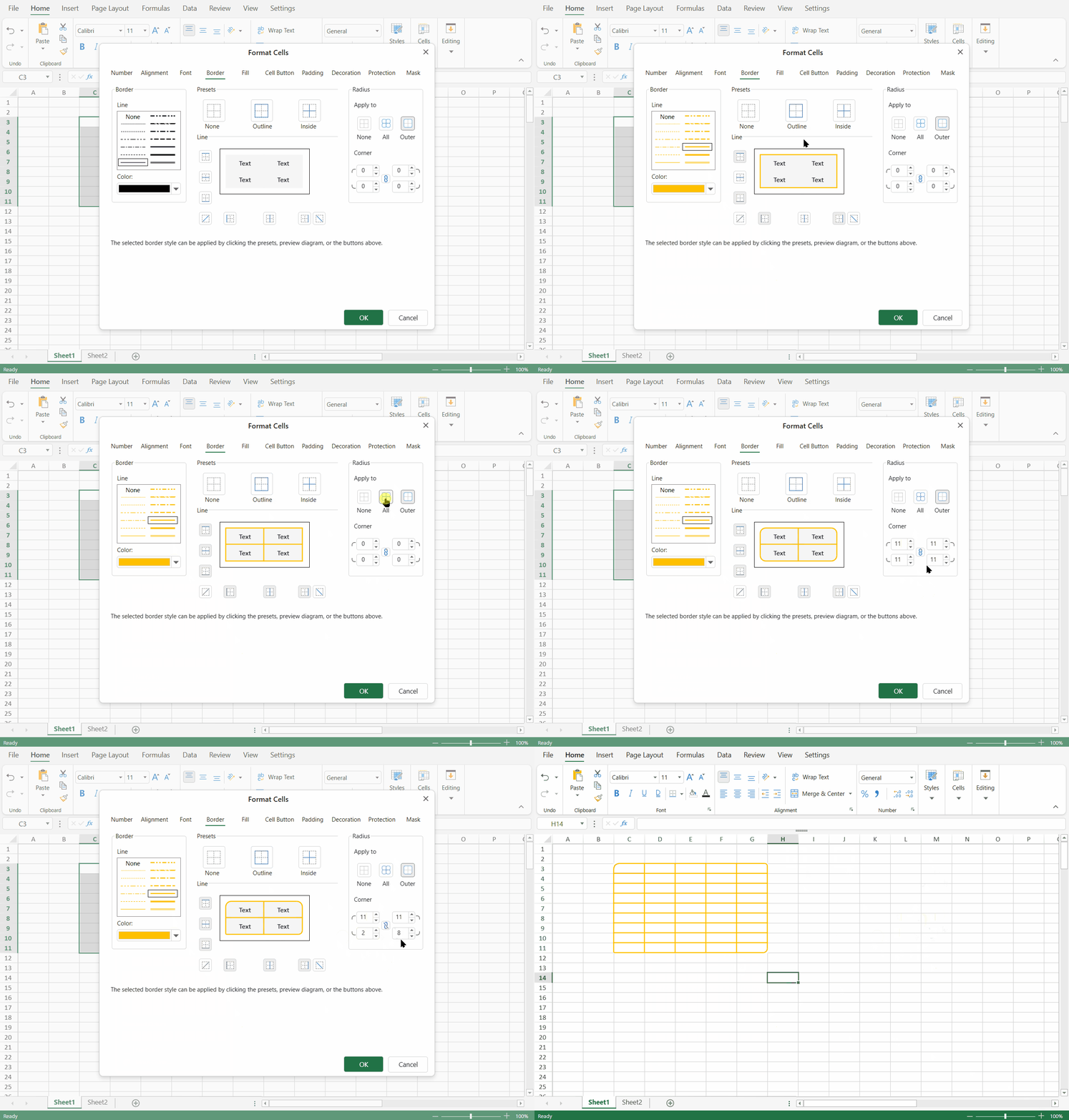
The Apply to setting controls how the current radius value is applied to the selected target. It is an editing command and is not stored as a separate shape state.
Mode | Description |
|---|---|
None | Disables rounded corners for the current operation. The corner editors show zero and are disabled. |
All | Applies the radius to all applicable corners in the selected cell or range. For a multi-cell range, each cell can display rounded corners according to the applied border geometry. |
Outer | Applies the radius to the outer contour of the selected range. |
When the dialog is opened, Outer is used as the initial editing scope. The editor displays the current radius values for the outer corners.
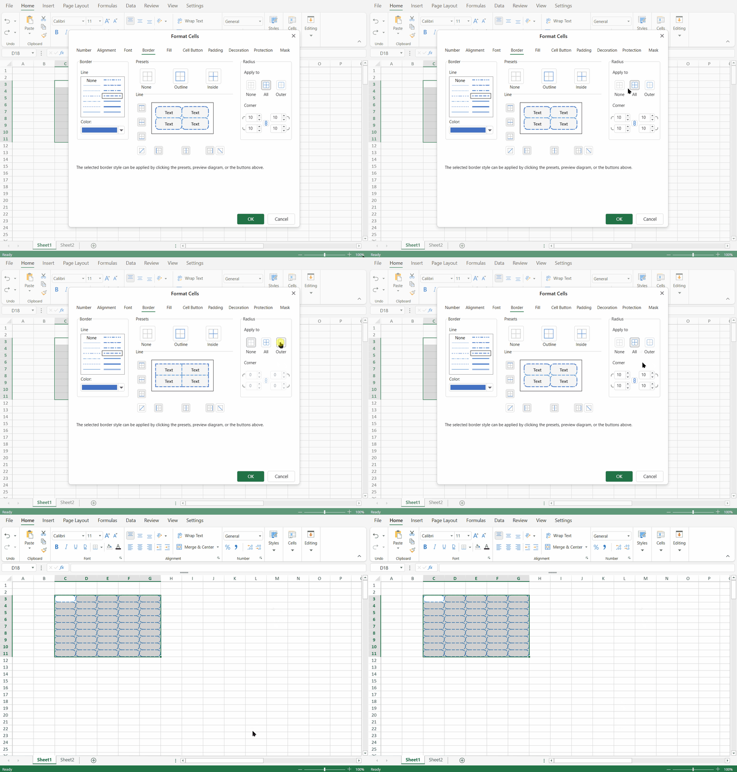
Changing Apply to only changes the scope of the next radius edit. It does not indicate how the existing radius values were originally created.
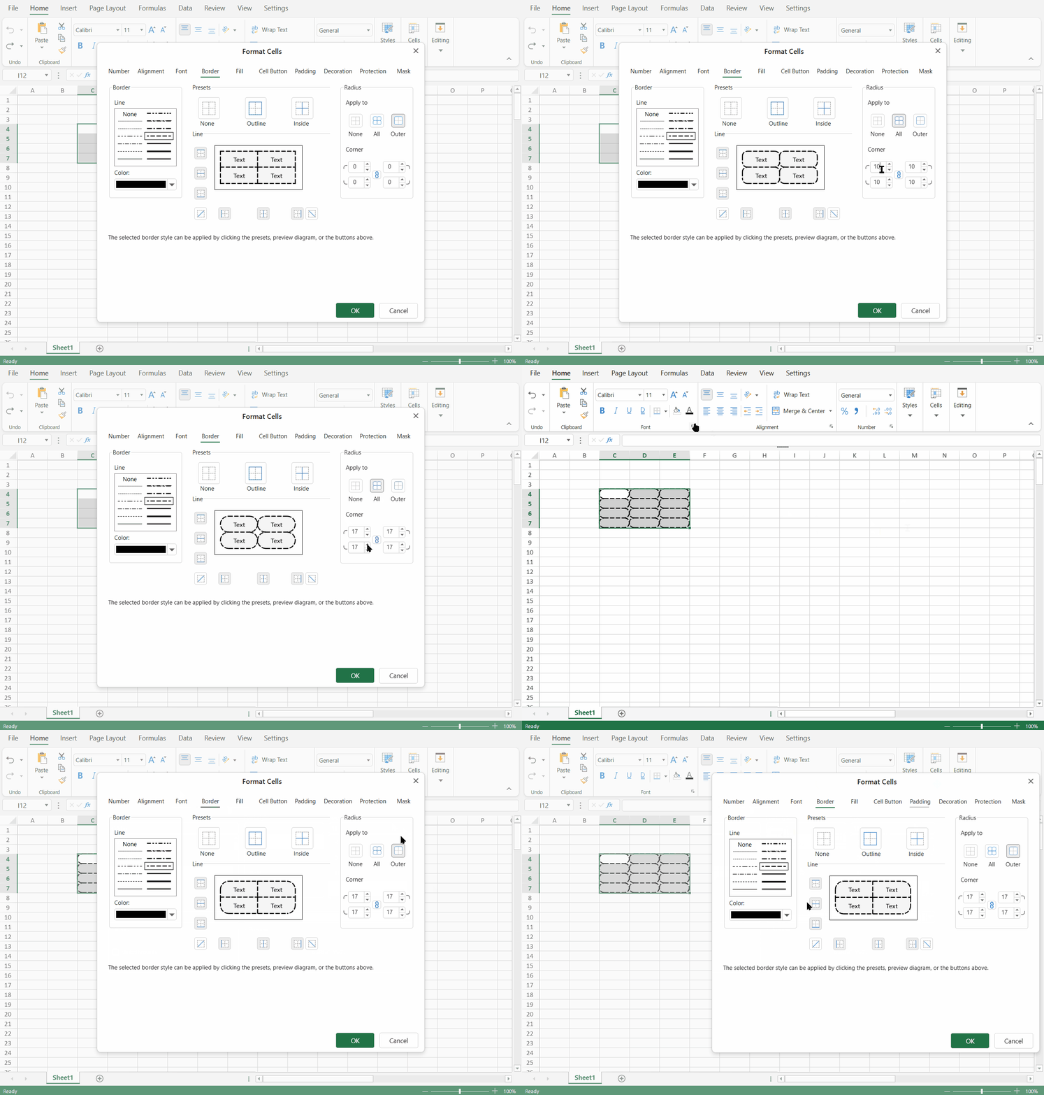
Edit Corner Values
Each corner editor accepts a non-negative integer value.
Empty values are treated as
0.Negative values are not supported.
Decimal values are not supported.
Units and percentages are not supported.
When linked editing is enabled, changing any corner value applies the same value to all four corners.
When linked editing is disabled, each corner value can be edited independently.
Supported Style Surfaces
The Radius editor is available in supported dialogs that edit cell style information.
Surface | Behavior |
|---|---|
Worksheet Format Cells | Applies radius changes to the selected cell, range, or header area. |
Cell Styles | Saves valid radius values to the style definition. |
Conditional Formatting custom format | Saves radius values to the rule style. |
Cell States | Saves radius values for the selected state style. |
Named Cell Template styles | Preserves radius values as part of the template style. |
TableSheet and Data Manager style surfaces | Supports radius where the surface edits a compatible cell style. |
ReportSheet style surfaces | Supports radius where the surface edits a compatible report style. |
Note: Availability may depend on whether the specific dialog edits a cell style or compatible style option.
PivotTable Selection Behavior
When the selected worksheet range intersects a PivotTable, Designer applies border radius through PivotTable style targets.
All applies the complete radius value to each resolved PivotTable style area in the selection.
Outer applies radius only to the outer corner positions of the original worksheet selection that are inside the PivotTable page or content range.
The Apply to setting controls how Designer applies the current editing operation. It is not stored as part of the PivotTable style and does not control how the PivotTable is rendered later.
Limitations
The following limitations apply when configuring border radius in Designer:
Radius values support non-negative integers only.
Units, percentages, negative values, and decimal precision are not supported.
Existing invalid
borderRadiusvalues do not prevent the dialog from opening. Designer displays them as zero-radius values.Some header, layout, and border combinations that are not supported by the runtime border renderer remain unsupported in Designer.