Hi,
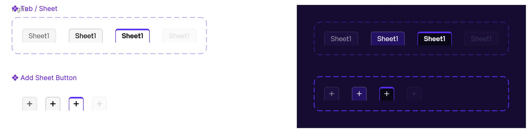
Thanks for the mockup — it’s clear what you’re after for both themes, and yes, this is doable, though most of it sits outside the documented API surface.
Sheet tabs themselves (normal/hover/active) are covered by sheetTabStyles.add(), as you’ve found. For the tab strip chrome around them — background, +, nav arrows, and the rest — SpreadJS doesn’t expose a documented styling API, but the elements are hooked up to internal CSS classes you can override. Here’s what we can confirm for v18.2.3:
Element CSS class(es)
Tab strip background .gc-tabStripBackground
New Sheet (+) button — hover / pressed .gc-tabStripNewTab-hover, .gc-tabStripNewTab-highlight
Prev/Next navigation arrows — normal / hover / pressed
.gc-navButton-normal, .gc-navButton-hover, .gc-navButton-highlight
Overflow “more” button — hover / pressed .gc-navMoreButton-hover, .gc-navMoreButton-highlight
“All Sheets” ☰ button — hover / pressed .gc-tab-strip-all-sheets-hover, .gc-tab-strip-all-sheets-highlight
Resize splitter handle .gc-tabStripResizeBarInner
A few things worth knowing before you use these:
.gc-tabStripBackground is a real DOM element, so any CSS property works on it — background-color, gradients, borders, whatever you need.
The +, nav arrows, overflow, and All Sheets buttons are drawn on canvas, not DOM. SpreadJS reads the computed border-color off these classes at paint time and uses it as the icon’s stroke color, so border-color is effectively the only property with a visible effect. background-color, border-radius, etc. are silently ignored on these.
The resize handle is a thin line, not a bordered shape, which is why color (not border-color) is the property that moves it.
A starting point for a light/dark toggle, using your palette in place of these placeholder values:
/* Light theme */
.gc-tabStripBackground   { background-color: #f6f6f6; }
.gc-tabStripResizeBarInner { color: #ababab; }
.gc-navButton-normal      { border-color: #6b6b6b; }
.gc-navButton-hover       { border-color: #7b61ff; }
.gc-navButton-highlight   { border-color: #4b2fd6; }
.gc-tabStripNewTab-hover     { border-color: #7b61ff; }
.gc-tabStripNewTab-highlight { border-color: #4b2fd6; }
.gc-navMoreButton-hover      { border-color: #7b61ff; }
.gc-navMoreButton-highlight  { border-color: #4b2fd6; }
.gc-tab-strip-all-sheets-hover     { border-color: #7b61ff; }
.gc-tab-strip-all-sheets-highlight { border-color: #4b2fd6; }

/* Dark theme — scope under whatever selector drives your dark mode */
.app-dark .gc-tabStripBackground   { background-color: #1e1b29; }
.app-dark .gc-tabStripResizeBarInner { color: #55506b; }
.app-dark .gc-navButton-normal      { border-color: #cfc9e8; }
.app-dark .gc-navButton-hover       { border-color: #9d85ff; }
.app-dark .gc-navButton-highlight   { border-color: #5b3fe0; }
.app-dark .gc-tabStripNewTab-hover     { border-color: #9d85ff; }
.app-dark .gc-tabStripNewTab-highlight { border-color: #5b3fe0; }
.app-dark .gc-navMoreButton-hover      { border-color: #9d85ff; }
.app-dark .gc-navMoreButton-highlight  { border-color: #5b3fe0; }
.app-dark .gc-tab-strip-all-sheets-hover     { border-color: #9d85ff; }
.app-dark .gc-tab-strip-all-sheets-highlight { border-color: #5b3fe0; }
After switching classes or toggling theme, force a redraw so SpreadJS re-reads the computed styles:
spread.invalidateLayout();
spread.repaint();
Best regards,
Priyam