FlexGrid: How to show a checkbox in GroupRow header (grouped rows) in Angular

Posted by: nilesh_nichal on 6 February 2026, 9:30 am EST

  • Posted 6 February 2026, 9:30 am EST - Updated 6 February 2026, 9:35 am EST

    Hi Team,

    I’m using Wijmo FlexGrid with Angular and my grid data is grouped (e.g., groups like catalog and hierarchy).

    I want to display a checkbox in front of each group header row (the GroupRow) similar to the screenshot below, so the user can select/deselect all rows inside that group.

    Expected behavior:

    Show a checkbox near the group header text (e.g., “catalog”, “hierarchy”).

    When the group checkbox is checked:

    all child rows under that group should become checked/selected.

    When unchecked:

    uncheck/deselect all child rows.

    (Optional) If some child rows are selected and others not, show indeterminate state on the group checkbox.

    What I tried / current setup:

    I already have row-level checkboxes using a boolean field (e.g., selected) in a normal grid cell.

    But the group header row is not a normal data row, and I’m not sure what is the recommended way to render an interactive checkbox there.

    Questions:

    What is the best way to render a checkbox inside a GroupRow in FlexGrid (Angular)?

    Should this be done using formatItem for group rows?

    How can I correctly update child rows for that group when the checkbox is toggled?

    Is there a built-in Wijmo approach for group selection / group checkboxes?

    Environment details:

    Wijmo version: 5.20242.21

    Angular version: 17

    Screenshot / UI example:

    (Attach screenshot)

    Please share the sample / StackBlitz.
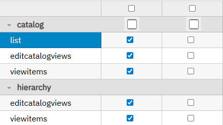
  • Posted 9 February 2026, 3:04 am EST

    Hi Nilesh,

    Wijmo FlexGrid has a built-in row selection feature using the Selector. You can explore it in the following sample - https://developer.mescius.com/wijmo/demos/Grid/Selection/CheckboxSelection/angular

    The Selector used in the above sample is used to select the grid rows; you can use it in other data columns as well, but it seems you don’t need row selection. You need to update the data in the rows under a group with the checkbox, and the group checkbox could be present in multiple columns. So, in your case, you can handle the formatItem event of the flexgrid to insert these custom checkboxes in the group rows on the desired columns. You can refer to the following sample demonstrating the same - https://stackblitz.com/edit/angular-ah2ykgxa?file=src%2Fapp%2Fapp.component.ts

    Please note that, you’ll have to use a custom mergeManager for the grid to make this work correctly, otherwise the default mergeManager will merge the cells in the group row. You’ll also need to manage the width of the first column that will display the name of the group in the group row. You can set a fixed or a min width on that column to make sure the group name is visible properly.

    Regards

  • Posted 19 February 2026, 9:24 am EST - Updated 19 February 2026, 9:29 am EST

    Hi Team,

    Thanks for the guidance and the StackBlitz sample using formatItem and a custom MergeManager. That helps.

    We’d like to achieve the same behavior using Angular templates rather than injecting elements in formatItem, so we have a few follow‑ups:

    1. Template‑based GroupRow checkbox (tri‑state)

    Is there a supported template-based way to render a checkbox inside group header rows (GroupRow) in Angular—e.g., with wjFlexGridCellTemplate (if supported for GroupHeader) or any other recommended directive/template pattern?

    could you share a small Angular example.

    If template-based rendering is not supported for group headers, is formatItem still the recommended long‑term approach, or is there another supported API we should prefer?

    1. Expand All / Collapse All actions (toolbar buttons)

      We also need Expand All and Collapse All actions (see attached screenshot). What’s the recommended API in Angular to wire toolbar buttons that:

    Expand all group levels.

    Collapse all group levels.

    Optionally expand/collapse to a specific level (e.g., expand to level 1).

    Preserve the expand/collapse state across data edits (checking/unchecking rows) without fully re‑creating the CollectionView.

    Could you please share a StackBlitz that uses:

    Angular 17, Wijmo 5.20242.21,

    Thanks again for the earlier pointers—looking forward to the best‑practice way to do this with templates.

    Environment

    Wijmo: 5.20242.21

    Angular: 17

  • Posted 20 February 2026, 2:44 am EST

    Hi Nilesh,

    1. Yes, you can achieve the same result through the templates in the flexgrid. Please refer to the sample below for the same. However, the previous approach we shared that uses the ‘formatItem’ event is also good; you can use any of them as per your choice.

    2. You can insert a custom Expand all/Collapse all button in the column header cell through templates, as per your needs. Please refer to the sample below for the same.

    Sample: https://stackblitz.com/edit/angular-m164e3so?file=src%2Fapp%2Fapp.component.ts

    Regards

Need extra support?

Upgrade your support plan and get personal unlimited phone support with our customer engagement team

Learn More

Forum Channels