Introduction to Material Design in WinForms Apps
Material Design is a popular UI style defined by Google and used by many modern applications. With ComponentOne WinForms Edition, we’ve made Material Design easy to achieve in your classic, .NET Windows Forms applications. In this blog, we will show how to style your entire desktop application with a material-inspired theme. We will explore:
- Adding Material Themes to WinForms Apps
- How to Customize the WinForms Material Theme
- Advanced Customization of the Material Theme
Adding Material Themes to WinForms Apps
ComponentOne WinForms Edition includes Material and Material Dark themes. ComponentOne Themes for WinForms makes it easy to theme your WinForms controls with many built-in themes and an easy-to-use Theme designer to create your own themes or modify existing ones.
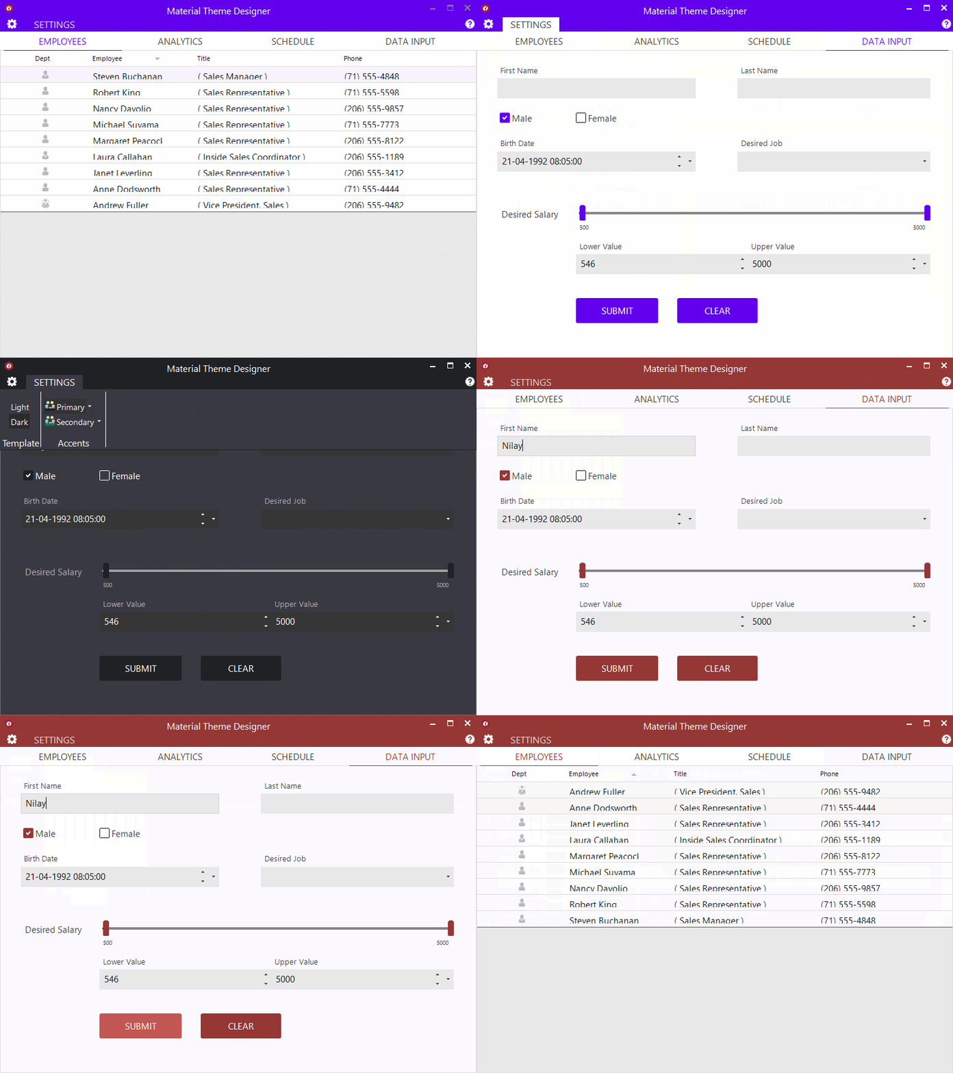
Below are some examples of what the Material themes look like applied to some ComponentOne WinForms controls:
Material themes can be applied at design time as well as at runtime. You can apply a theme at design time with the Theme Controller dialog or by modifying the App.config file. Let’s look at the different ways to set the theme.
Ready to Get Started? Download ComponentOne Today!
Setting the Material Theme at Design-Time
The easiest way to set a theme is to use the C1ThemeController component at design-time. It requires that you first download and install ComponentOne WinForms Edition for the version of .NET you are using.
-
Open a form in your application in the Visual Studio's forms designer.
-
From the designer's toolbox, locate and drag a C1ThemeController and drop it on your form. A dialog box appears, enabling you to select:
-
Application-wide default theme
-
Current controller’s default theme
-
Themes for all supporting controls already on the form.
-
In the dialog that pops up, the theme is initially specified as "(none)" for all supporting controls already on the form. This prevents unintentional loss of property settings on those controls.
-
Click the All to (default) button in the dialog so that the default theme is set on all controls. Note: If you've customized some of the controls already, this will be ignored, and the default theme will not be restored.
-
Select Material from the list of available built-in themes. (or if you already created a custom material theme you can select it here).
-
Click the All to (default) button as mentioned above, to set the default theme on all supporting controls on the form.
-
Click the OK button to close the dialog and apply the specified theme to the controls on the form.
Setting the Material Theme using App.config
You can also specify the theme at the application level using the app.config file. Add the C1.Win.C1Themes package to your application, and add the following setting to your App.Config. This will apply the built-in Material theme to your entire application.
<configuration>
  <appSettings>
      <add key="C1ApplicationTheme" value="Material"/>
  </appSettings>
</configuration>
Setting the Material Theme using Code
The third approach is to set a theme in the code. This is helpful if you need to apply or change the theme at runtime. Here, we use the C1ThemeController static class to apply themes. Just add the C1.Win.C1Themes. package to your application and add the following code to your application before it loads.
C1Theme theme = C1.Win.C1Themes.C1ThemeController.GetThemeByName(“Material”, false);
C1ThemeController.ApplyThemeToControlTree(control, theme);
How to Customize the WinForms Material Theme
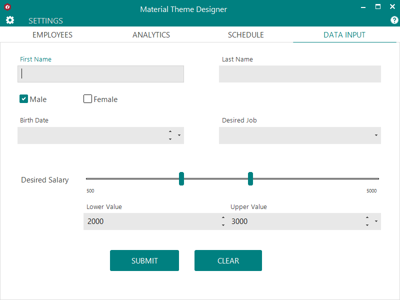
The Material Design color system consists of primary and secondary colors. These colors reflect your application’s branding and styling. By default, we use a green color scheme. We include a sample named MaterialDesign that lets you customize the primary and secondary accent colors for your Material theme. You can save the theme and apply it to your WinForms application later.
To change the color scheme for your theme, follow these easy steps:
-
Run the Material Theme Designer sample.
-
It’s named MaterialDesign installed under \Documents\ComponentOne Samples\WinForms\v4.8\Themes.
-
Or download it from GitHub.
-
-
Click on the “SETTINGS” tab and select template and accent colors based on your brand/theme.
-
Preview how the theme looks with C1 controls.
-
Click on the cog icon to open the application menu.
-
Click on “Save Theme” to save the theme at your preferred location.
-
Follow the steps from the previous section to apply the theme, but now select your saved theme in step #4.
Advanced Customization of the Material Theme
The ComponentOne Theme Designer Application allows easy designing of new themes for any controls in WinForms Edition. It also lets you edit/modify an existing theme to achieve the appearance of your choice, or match with the application theme. You can further use this application to tweak the Material theme to the most granular level allowed by the control.
A theme is an XML file with .c1theme extension that consists of a set of properties and their values (which determines the look and feel of a control). Themes are divided internally into different sections corresponding to different controls. A section, Base Theme Properties, is accessible to all other controls. This section contains a sub-section, Material, which stores the Material properties that can be altered to create different material themes.
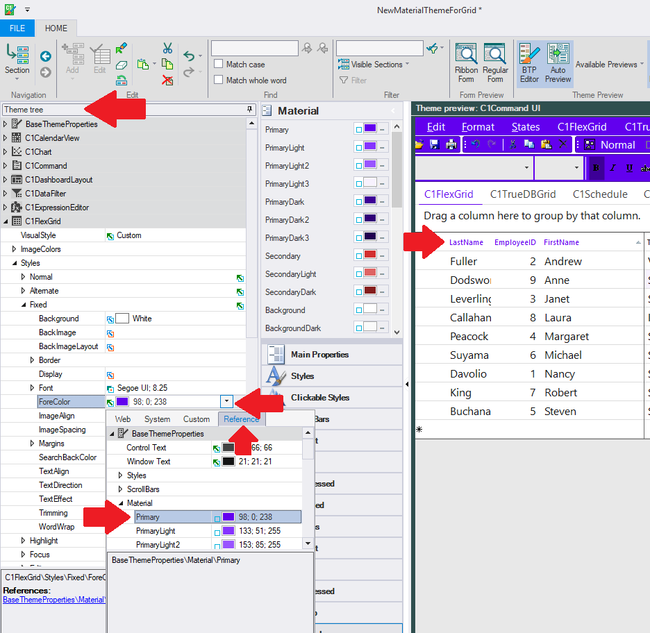
For example, let’s start changing our material theme for FlexGrid, where the headers are the primary color.
How to use the WinForms Material Theme Designer
-
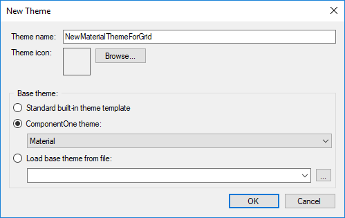
Open the ComponentOne Theme Designer from the ComponentOne Start Menu. Press Ctrl + N or File > New. Select Material as the base theme for your new theme.

-
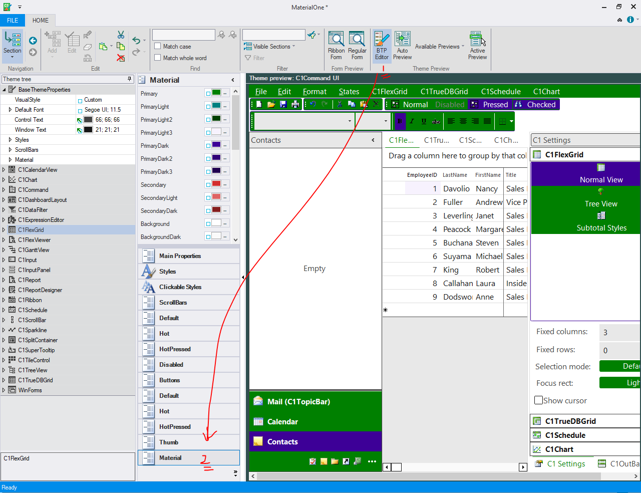
Click on the BTP Editor button (1). This opens a new Base Theme Property Editor. Select “Material” properties (2). Here, you can see the different colors used in Material:

-
Go to the theme tree and expand the C1FlexGrid node.
-
Expand C1FlexGrid > Styles > Fixed node. This node would hold the styles for a fixed (header) cell.
-
Select the ForeColor dropdown to open the color picker.
-
You can select the Reference tab in the picker dropdown to select the primary color.
-
You can save this theme and use it as mentioned in the "Applying Material Themes in your application" section. Your FlexGrid should now have a header color based on your primary color settings.
Share with us how you're designing your desktop applications and how Material theme works with your application.
Ready to Get Started? Download ComponentOne Today!


