Selection for Angular Datagrids
Like Excel, Wijmo's Angular datagrid, FlexGrid, allows you to select a range of cells over multiple rows and columns. FlexGrid also allows you to modify the marquee of the selection, as well as set the selection through other components.
Selection
Wijmo's Angular datagrid, FlexGrid, allows users to select rows or cells either by clicking the items or using checkboxes. Select more than one row or cell by holding Ctrl, Shift, Command, or programmatically.


Multiple Selection
By default, FlexGrid allows you to select a range of cells with either the mouse or keyboard. The Angular datagrid enables you to set the selection mode–permitting the selection of specific cells, continuous rows, or noncontiguous cells and rows.
Checkbox Selection
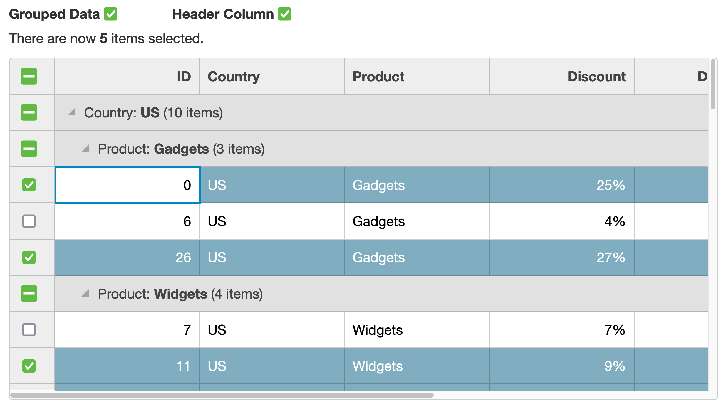
FlexGrid supports the addition of checkboxes in cells, which control row selection. You are also able to implement a master checkbox that selects and deselects all of the rows inside the Angular datagrid.


Marquee
FlexGrid supports the implementation of an Excel-style marquee when the user selects a cell inside of the Angular datagrid. Customize the appearance of this marquee to fit your styling guidelines.
Searching
If your FlexGrid has non-editable columns, you can use the Angular datagrid's autoSearch to parse through the read-only columns. Users can select a cell in a read-only column and begin typing–prompting FlexGrid to change the current selection to match what the user enters.
