C1Combo - Hide the down-arrow button

Posted by: pauld on 17 January 2019, 8:18 pm EST

    • Post Options:
    • Link

    Posted 17 January 2019, 8:18 pm EST

    We are using the C1Combo as a display-only control; no user interaction.

    When the code value bound to the combo changes, the combo shows the proper text value.

    This all works fine.

    However, we would like to hide the down-arrow button on the combo since the user will never click it anyway.

    How can we hide the button on a C1Combo control?

    Thanks.

    – Paul

  • Posted 18 January 2019, 1:47 am EST

    Hello Paul,

    We are sorry to mention but it is not possible to hide the dropdown button separately for C1Combo. Since your requirement is to disable the dropdown button, I would suggest you to cancel the BeforeOpen event of C1Combo as follows:

    Private Sub C1Combo1_BeforeOpen(ByVal sender As System.Object, ByVal e As System.ComponentModel.CancelEventArgs) Handles C1Combo1.BeforeOpen
            e.Cancel = True
    End Sub
    

    This would not let the list to be dropped down.

    There is no other way to hide the dropdown button specifically.

    Regards,

    Esha

  • Posted 18 January 2019, 1:07 pm EST

    The C1Combo is disabled so, the user cannot interact with it.

    We just want to hide the button BECAUSE the user can’t interact with the control.

    QUESTIONS:

    1. Is there some way we can create a custom C1Combo that does not draw the down-arrow button? If so, is there sample code somewhere showing how to get started with that?

    2. Is there a way to set the editor colors for a disabled C1Combo (when the control is disabled, the editor color is always the gray “disabled” color).

    Thanks.

    – Paul

  • Posted 21 January 2019, 7:18 am EST

    Hello Paul,

    1. You can use a C1ComboBox instead, in order to hide the dropdown button. Here, setting the ShowDropDownButton property to false hides the dropdown button.

      https://help.grapecity.com/componentone/NetHelp/c1input/webframe.html#C1ComboBox%20Control%20Overview.html
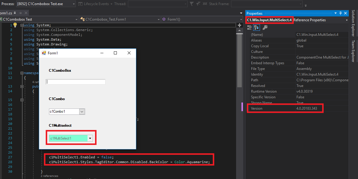
    2. Though this color cannot be changed in C1Combo or C1ComboBox directly, C1Multiselect has this provision by setting the code as;
    c1MultiSelect1.Styles.TagEditor.Common.Disabled.BackColor = Color.Aquamarine;     
    

    https://help.grapecity.com/componentone/NetHelp/multiselect/webframe.html#multiselectoverview.html

    This has been shown in the attached sample for your reference.

    You can use the control that suits you the best.

    Regards,

    EshaDropdownButtonHide_Test.zip

  • Posted 22 January 2019, 1:07 pm EST

    Thanks for the response. However, …

    Our application makes extensive use of the C1Combo.

    If we just had to switch control references, that wouldn’t be bad but, we would also have to rewrite most of the code referencing those controls because they have different events and properties. That is in no way a viable option.

    As of now, our only recourse is to cover the down-arrow button with a graphic image colored the same as the form background color.

  • Posted 22 January 2019, 1:35 pm EST

    Further, in the sample you provided, the “c1MultiSelect1” showed the standard “disabled” colors (gray on gray) and ignore the colors assigned to:

    c1MultiSelect1.Styles.TagEditor.Common.Disabled.BackColor, and

    c1MultiSelect1.Styles.TagEditor.Common.Disabled.ForeColor.

  • Posted 23 January 2019, 1:40 am EST - Updated 4 October 2022, 1:39 am EST

    Hello Paul,

    Thanks for sharing the update. Sorry, but we have no other way to work around the requirement in C1Combo.

    For C1MultiSelect: Disabled.BackColor is applied to the TagEditor as expected (see “C1MultiSelect_DisabledBackColor.png”). We are aware of the issue with ForeColor in this case and the development team has fixed the same, to be released with 2019V1 builds.

    Best Regards,

    Esha

Need extra support?

Upgrade your support plan and get personal unlimited phone support with our customer engagement team

Learn More

Forum Channels