Posted 11 August 2025, 7:24 am EST - Updated 11 August 2025, 7:29 am EST
Hi Team,
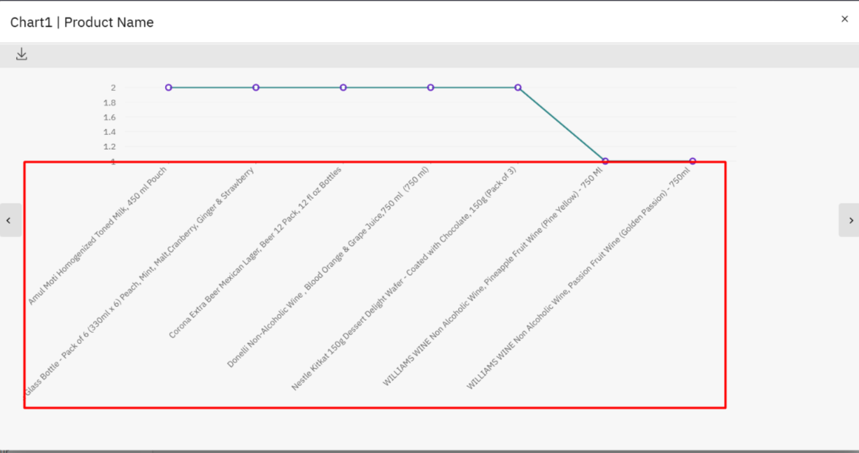
We are encountering an issue with the chart labels
- In the column chart, the labels are too long, which disrupts the overall layout and visual balance.
- In the line graph, the X-axis labels are also excessively long, affecting the chart’s appearance and readability.
To maintain a clean and consistent layout, I would like to constrain the label height or apply a more compact rendering approach. Could you please advise on the best way to handle this.
Please give us the sample stack-blitz using Angular framework.
I’ve attached a screenshot for your reference.