Posted 26 November 2018, 2:26 pm EST - Updated 3 October 2022, 11:03 am EST
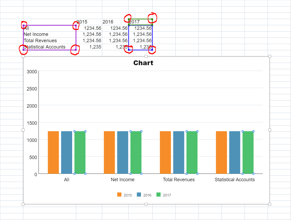
When you click on plotted chart data, the associated cell range of the data is highlighted with colorful selection borders. The problem is that these selections come with resize handles that allow the user to dynamically change the cell range of the chart data that is plotted.
But when you click on the general chart area, you get the same colorful highlights without the resize handles.
How can we disable these resize handles but still keep the colorful selection to show the user the associated cell range?