Posted 3 October 2018, 4:11 pm EST
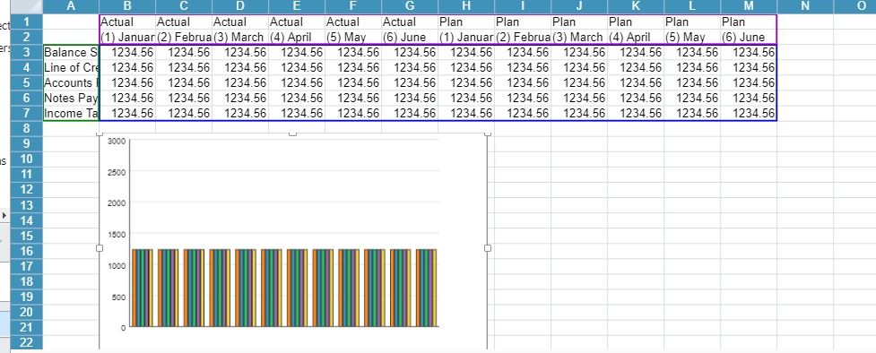
Currently, if I click on the chart’s plot area it will select the data source. I was wondering how I could achieve that through code as opposed to actually having to click on the chart.
Forums Home / Spread / SpreadJS
Posted by: ejaskierski on 3 October 2018, 4:11 pm EST

ejaskierski
Posted 3 October 2018, 4:11 pm EST
Currently, if I click on the chart’s plot area it will select the data source. I was wondering how I could achieve that through code as opposed to actually having to click on the chart.

grapecity
Posted 4 October 2018, 9:10 am EST
Hello,
You can set the data range for chart. For example:
var chart_columnClustered = sheet.charts.add(‘chart_columnClustered’, GC.Spread.Sheets.Charts.ChartType.columnClustered, 250, 20, 600, 400, “A1:D4”);
In the above chart range ‘A1:D4’ will be used for creating the chart.
Please go through the documentation link here:
http://help.grapecity.com/spread/SpreadSheets11/webframe.html#CreateColumnChart.html
Thanks,
Deepak Sharma
ejaskierski
Posted 4 October 2018, 2:17 pm EST - Updated 3 October 2022, 11:07 am EST
grapecity
Posted 5 October 2018, 8:13 am EST
Hello,
There seems to no direct way to highlight the data range in code. You can probably set the border for the complete range. You can manually get the series and it’s xValues/yValues. Then you can get the range and set the border to x values cell range and y values cell range separately. It looks like a tedious implementation to me.
Thanks,
Deepak Sharma