Percentage of Count Column Chart

Posted by: bnguyen on 12 March 2024, 6:53 pm EST

    • Post Options:
    • Link

    Posted 12 March 2024, 6:53 pm EST

    How can we create a chart with COUNT aggregate with categories with the percentage of the total count summing to 100% ?

    Currently my count for each category is much greater than 100.

    Ex)

    Count(FRUIT)

    CATEGORY: FRUIT

    Values: (Apple - 25%), (Banana - 50%), (Blueberry - 25%)

  • Posted 13 March 2024, 6:16 am EST

    Hi Bryan,

    You can use a Percentage Column Chart, and specify a ‘Count’ aggregate to your Y-Axis, please find attached a sample implementing the same.

    Regards,

    Anand

    SampleReport.zip

  • Posted 13 March 2024, 10:13 am EST - Updated 13 March 2024, 12:22 pm EST

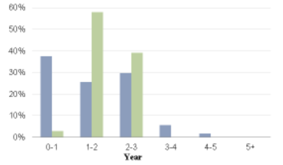
    Is it possible for it to be seen as clustered with space in between each category rather than stacked?

    Example below: 2 data fields, 1 category.

  • Posted 14 March 2024, 3:21 am EST

    Hi Bryan,

    Unfortunately, AFAIK it is not possible to show a clustered percentage chart based upon the count of elements in ActiveReports.

    Regards,

    Anand

Need extra support?

Upgrade your support plan and get personal unlimited phone support with our customer engagement team

Learn More

Forum Channels