Posted 5 March 2024, 5:50 pm EST - Updated 5 March 2024, 5:55 pm EST
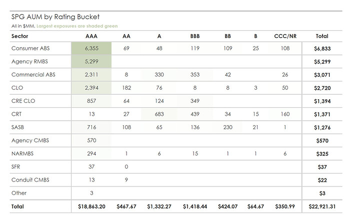
I am trying replicate a chart in AR. I am using tablix here reason being I have a column in my datasource as Rating (which has A, AA, AAA etc) and values as mkt value, so I need a table or pivot between rating and sector and sum them byt mkt values and then depending on the max and min sum values in my pivot table create a color scale with for example olive color where max is dark and min is transparent. You can also see the image attached for reference.
How to get min and max in data visualizer of background color cell and how to custom sort the columns like in order AAA, AA, A, etc ?


