
- FlexGrid for WPF Overview
- Feature Comparison
- Quick Start
- Object Model Summary
- Data Binding
-
Features
- Columns
- Row
- Scrolling Modes
- Selection
- Sorting
- Cell Merging
- Custom Editors
- Custom Icon
- Transpose Data in Grid
- Data Grouping
- Data Filtering
- Data Aggregation
- Custom Cells
- Multiple Cell Factory
- Virtualization
- Paging
- TreeGrid
- Print Support
- Row Details Template
- Layout and Appearance: ClearStyle Technology
- Freezing and Pinning
- Import Data from Excel
- Export to Excel
- Clipboard Operations
- Validation
- FlexGrid Samples
TreeGrid
One of the unique and popular features of the FlexGrid control is the ability to add hierarchical grouping to regular data grid and display it in a tree like structure called TreeGrid. This TreeGrid is very similar to the one you see in a TreeView control. It shows an indented structure with collapse or expand icon next to each node row so the user can expand and collapse the outline to see the desired level of detail by clicking on the nodes.
Although, you can create simple outline trees using FlexGrid grouping, TreeGrid helps you implement more advanced use cases such as displaying customer and order details. In a usual grid showing such data, it is difficult to see the details of each customer and order. In such case, you can create a TreeGrid to group the data in a hierarchical structure for better view and accessibility of information.
Also, the FlexGrid (or C1FlexGrid) class provides following properties, based on TreeView object model, which can be used to manage the TreeGrid.
Properties | Description |
|---|---|
Gets or sets the name of the property used to generate child rows. | |
Indicates how the tree is loaded and displayed in the grid. By default, this property has the OnDemand value, meaning the tree is initially collapsed, and the subtrees are loaded on demand as the parent’s get expanded. This is the fastest mode to load, and is very useful for scenarios where the ChildItemsPath property is pointing to a late-evaluated property or huge trees. For other scenarios it can be useful or required the tree to be expanded from scratch. To make this you can simply set TreeExpandMode to Expanded mode and the whole tree is evaluated at loading time and all its nodes are expanded by default. Similarly, there is the Collapsed mode, which evaluates the whole tree and creates all the rows at loading time, but it shows all the nodes of the tree collapsed. This property is available in .NET only. | |
Allows you to specify the index of the column that shows the toggle buttons. By default it will be zero, meaning the first column will show the buttons and -1 can be set to avoid showing the buttons. | |
Enables you to specify the length of the indentation displayed in the cells whose columns correspond to the TreeColumnIndex. | |
Gets or sets node level in the Tree Grid. |
Data Binding
Loading data in a TreeGrid is exactly the same as loading in a regular grid. TreeGrid supports both bound and unbound mode to display data. In bound mode, you can bind the TreeGrid to a data source to populate data in the grid, while in unbound mode, you can manually populate the grid with data. Following sections explains how you can display data in both bound and unbound mode in TreeGrid:
Bound Mode (Using the ChildItemsPath Property)
You can easily populate TreeGrid with data in bound mode. Following steps illustrates how you can bind TreeGrid using the ChildItemsPath property:
Create a class named CustomerInfo to represent customer information in a hierarchical (tree-like) format. Add a property named parentName property to initiate an empty string and another property named childName of type ObservableCollection class which holds a collection of child nodes, each of which is an instance of the CustomerInfo class.
public class CustomerInfo
{
    public string parentName { get; set; } = string.Empty;
    public ObservableCollection<CustomerInfo> childName { get; set; } = new ObservableCollection<CustomerInfo>();
}
In XAML view, add the following code to create a tree structure in the FlexGrid control. A single column titled "Customer Details" is added to the FlexGrid control, which uses Binding property to display the data of each data item. Each row in the control can have child rows, which are bound to the control using the ChildItemsPath property.
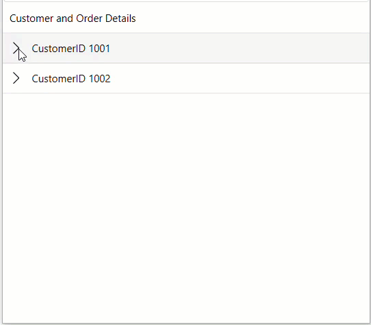
<c1:FlexGrid Name="flexGridBound"  ChildItemsPath="childName" AutoGenerateColumns="False" TreeExpandMode="Expanded" HorizontalAlignment="Stretch" Grid.Row="1" Grid.Column="0" VerticalAlignment="Stretch" >
<c1:FlexGrid.Columns>
<c1:GridColumn Header="Customer and Order Details" Binding="parentName" Width="*"/>
</c1:FlexGrid.Columns>
</c1:FlexGrid>
Create a method named SetupBoundGrid and define an instance of the ObservableCollection <CustomerInfo>class. Assign the instance to the ItemsSource property of the flexGridBound control to display data of customers in the tree form.
private void SetupBoundGrid()
{
    flexGridBound.ItemsSource = new ObservableCollection<CustomerInfo>()
    {
        new CustomerInfo
        {
            parentName = "CustomerID 1001",
            childName = new ObservableCollection<CustomerInfo>
            {
                new CustomerInfo
                {
                    parentName = "Customer Details",
                    childName = new ObservableCollection<CustomerInfo>
                    {
                        new CustomerInfo { parentName = "First Name: Pierece"},
                        new CustomerInfo { parentName = "Last Name: Jhonson"},
                        new CustomerInfo { parentName = "Email: p.jhonson@mail.com" }
                    }
                },
                 new CustomerInfo
                {
                    parentName = "Order Details",
                    childName = new ObservableCollection<CustomerInfo>
                    {
                        new CustomerInfo { parentName = "Product Name: T-shirt"},
                        new CustomerInfo { parentName = "Quantity: 2"},
                        new CustomerInfo { parentName = "Order Date: 31-5-2024"},
                        new CustomerInfo { parentName = "Total Price: $150" }
                    }
                }
            }
        },
        new CustomerInfo
        {
            parentName = "CustomerID 1002",
            childName = new ObservableCollection<CustomerInfo>
            {
                new CustomerInfo
                {
                    parentName = "Customer Details",
                    childName = new ObservableCollection<CustomerInfo>
                    {
                        new CustomerInfo { parentName = "First Name: Peter"},
                        new CustomerInfo { parentName = "Last Name:  Bronson"},
                        new CustomerInfo { parentName = "E-mail: p.bronson@mail.com" }
                    }
                },
                new CustomerInfo
                {
                    parentName = "Order Details",
                    childName = new ObservableCollection<CustomerInfo>
                    {
                        new CustomerInfo { parentName = "Product Name: Trousers"},
                        new CustomerInfo { parentName = "Quantity: 1"},
                        new CustomerInfo { parentName = "Order Date: 29-5-2024"},
                        new CustomerInfo { parentName = "Price: $100" }
                    }
                }
            }
        }
    };
}
Run the application to view the data in TreeGrid in the FlexGrid control.
Unbound Mode
In unbound mode, you have to manually set up columns and rows of the FlexGrid control. For unbound scenarios, the tree is created by adding the GridGroupRow class to the collection of rows as well as setting the Level property of other rows to specify its parent. Following steps illustrates how you can display data in the FlexGrid control in tree format:
In XAML wiew, add the following code to create a TreeGrid in the FlexGrid control:
<c1:FlexGrid Name="flexGridUnbound" HorizontalAlignment="Stretch" Grid.Row="1" Grid.Column="0" VerticalAlignment="Stretch">
<c1:FlexGrid.Columns>
<c1:GridColumn ColumnName="Customer and Order Details" Header="Customer Details" Width="*"/>
</c1:FlexGrid.Columns>
<c1:FlexGrid.Rows>
<c1:GridGroupRow Level="0"/>
 <c1:GridGroupRow Level="1"/>
    <c1:GridGroupRow Level="2"/>
    <c1:GridGroupRow Level="2"/>
    <c1:GridGroupRow Level="2"/>
<c1:GridGroupRow Level="1"/>
    <c1:GridGroupRow Level="2"/>
    <c1:GridGroupRow Level="2"/>
    <c1:GridGroupRow Level="2"/>
    <c1:GridGroupRow Level="2"/>
</c1:FlexGrid.Rows>
</c1:FlexGrid>
In .NET Framework, you can use the GroupRow class instead of the GridGroupRow class to create TreeGrid.
Create a method with the name SetupUnboundGrid to bind the rows and columns of the FlexGrid control with the customer's data.
private void SetupUnboundGrid()
{
    flexGridUnbound[0, 0] = "CustomerID 1001";
    flexGridUnbound[1, 0] = "Customer Details";
    flexGridUnbound[2, 0] = "First Name: Pierce";
    flexGridUnbound[3, 0] = "Last Name: Jhonson";
    flexGridUnbound[4, 0] = "E-mail: p.jhonson@mail.com";
    flexGridUnbound[5, 0] = "Order Details";
    flexGridUnbound[6, 0] = "Product Name: T-shirt";
    flexGridUnbound[7, 0] = "Quantity: 2";
    flexGridUnbound[8, 0] = "Order Date: 31-5-2024";
    flexGridUnbound[9, 0] = "Price: $150";
    flexGridUnbound[10, 0] = "CustomerID 1002";
    flexGridUnbound[11, 0] = "Customer Details";
    flexGridUnbound[12, 0] = "First Name: Peter";
    flexGridUnbound[13, 0] = "Last Name: Bronson";
    flexGridUnbound[14, 0] = "E-mail:  p.bronson@mail.com";
    flexGridUnbound[15, 0] = "Order Details";
    flexGridUnbound[16, 0] = "Product Name: Trousers";
    flexGridUnbound[17, 0] = "Quantity: 1";
    flexGridUnbound[18, 0] = "Order Date: 29 - 5 - 2024";
    flexGridUnbound[19, 0] = "Price: $100";
}
Run the application to view the data in TreeGrid in the FlexGrid control.