- FlexGrid for WPF Overview
- Feature Comparison
- Quick Start
- Object Model Summary
- Data Binding
-
Features
- Columns
- Row
- Scrolling Modes
- Selection
- Sorting
- Cell Merging
- Custom Editors
- Custom Icon
- Transpose Data in Grid
- Data Grouping
- Data Filtering
- Data Aggregation
- Custom Cells
- Virtualization
- Paging
- TreeGrid
- Print Support
- Row Details Template
- Layout and Appearance: ClearStyle Technology
- Freezing and Pinning
- Import Data from Excel
- Export to Excel
- Clipboard Operations
- Validation
- FlexGrid Samples
Paging
Paging lets you customize the number of items that should be displayed per page and also provides a UI for navigating through these pages. You can use paging when you are displaying a large amount of data in the grid or have a limited space in your application. It also allows you to interact more easily with the control. FlexGrid uses the DataPager control to implement paging.
type=note
The DataPager control is available in .NET 6 only. However, in case of .NET Framework 4.6.2, you can implement paging using the C1PagedDataCollection class.
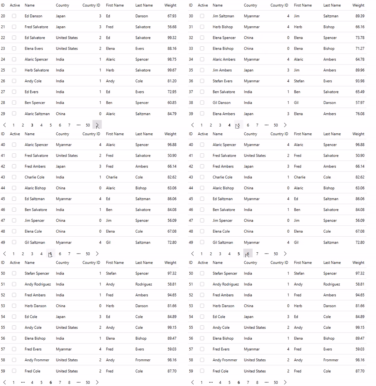
The following GIF displays data in multiple pages and allows navigation through them in the FlexGrid control.

To enable paging in FlexGrid, use the following steps. This example uses Customer.cs class created in the Quick Start topic. Here, we have used C1PagedDataCollection class of the C1.DataCollection to implement paging in the grid. The C1PagedDataCollection class is a collection class which wraps another collection to be shown in pages of a maximum number of items.
Install the following NuGet packages from the NuGet Package Manager.
- C1.WPF.Grid
- C1.WPF.DataPager
In MainWindow.xaml, and add the FlexGrid and DataPager controls and set their names using the following code.
<StackPanel>
    <c1:FlexGrid x:Name="grid" />
    <c1:C1DataPager x:Name="pager" Padding="4" Background="White" />
</StackPanel>
Switch to the code view and populate the FlexGrid and DataPager controls by adding the following code. In this example, FlexGrid fetches data from the Customer class and the data is bound to the grid and the pager.
//Generate grid data
var gridData = Customer.GetCustomerList(500);
var pagedCollection = new C1PagedDataCollection<object>(gridData);
//Binding the grid with data
grid.ItemsSource = pagedCollection;
//Bind pager with data
pager.Source = pagedCollection;
The above example used a custom class to enable paging in the grid. You can also enable paging for data virtualization in FlexGrid. For more information on data virtualization, see Virtualization.


