- FlexGrid for WPF Overview
- Feature Comparison
- Quick Start
- Object Model Summary
- Data Binding
-
Features
- Columns
- Row
- Scrolling Modes
- Selection
- Sorting
- Cell Merging
- Custom Editors
- Custom Icon
- Transpose Data in Grid
- Data Grouping
- Data Filtering
- Data Aggregation
- Custom Cells
- Virtualization
- Paging
- TreeGrid
- Print Support
- Row Details Template
- Layout and Appearance: ClearStyle Technology
- Freezing and Pinning
- Import Data from Excel
- Export to Excel
- Clipboard Operations
- Validation
- FlexGrid Samples
Custom Editors
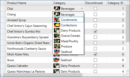
The FlexGrid control comes with two built-in editors including checkbox and combo box. The checkbox is supported to represent Boolean values, while the combo box lets you type text and select values from auto complete list. The combo box is implemented through the C1FlexComboBox class that extends a regular text box with auto complete list.
The following image shows checkbox and combo box used as editors in FlexGrid.

However, FlexGrid is not limited to built-in editors as you can create and use your own editors. To create custom editors, you can follow the approaches mentioned below:
- Implement a custom CellFactory class and override the CreateCellEditor method to create and bind your editor to the underlying data value.
- Use XAML to specify a CellEditingTemplate for the columns that need the custom editors.
Whether you are using built-in or custom editors, you can use PrepareCellForEdit event to configure the editor before it is activated. For example, the code below changes the editor to show selections as yellow on blue:
// hook up event handler
_grid.PrepareCellForEdit += _grid_PrepareCellForEdit;
// customize editor by changing the appearance of the selection
void _grid_PrepareCellForEdit(object sender, CellEditEventArgs e)
{
  var b = e.Editor as Border;
  var tb = b.Child as TextBox;
  tb.SelectionBackground = new SolidColorBrush(Colors.Blue);
  tb.SelectionForeground = new SolidColorBrush(Colors.Yellow);
}


