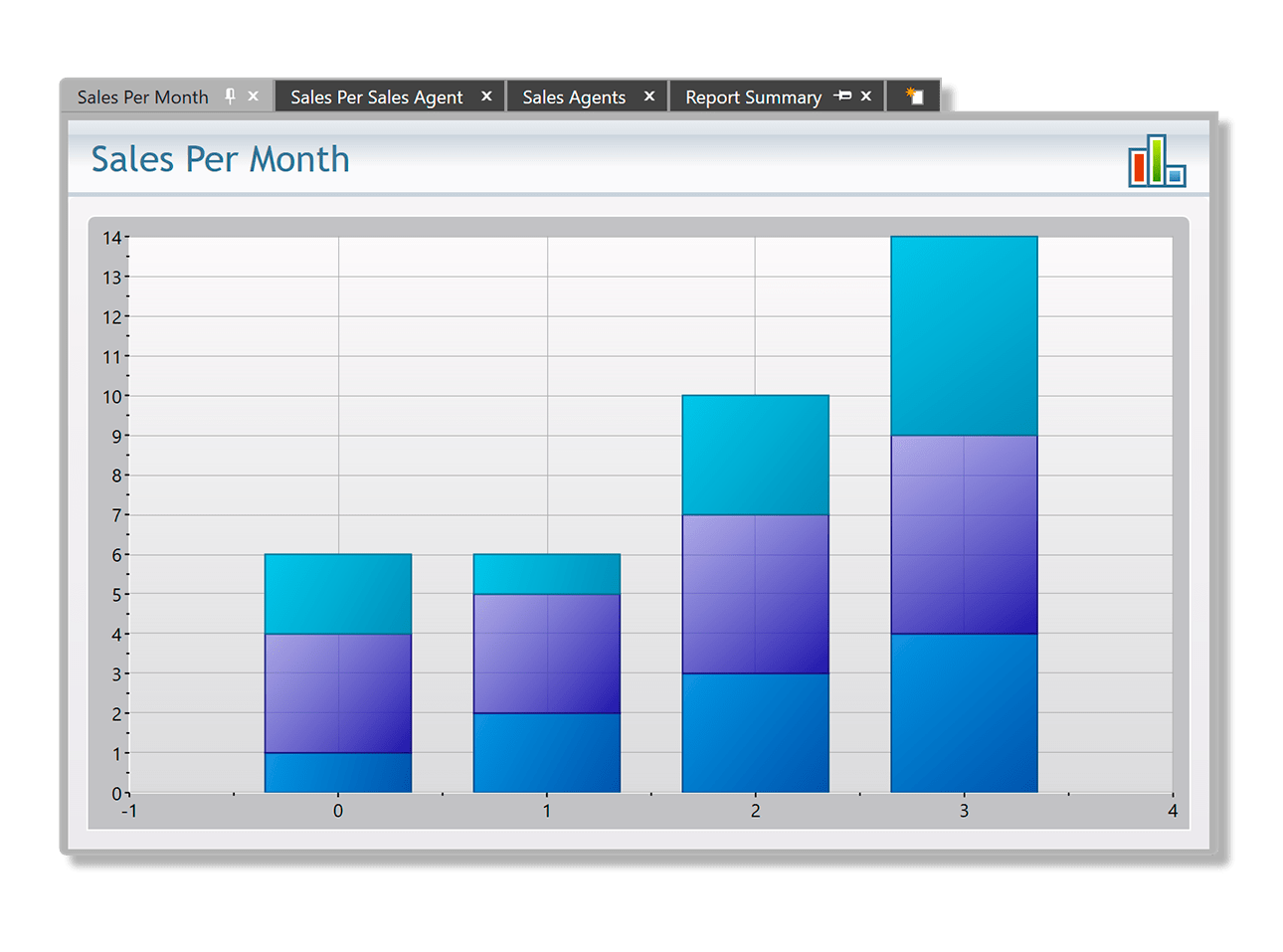
Essential WPF TabControl
ComponentOne TabControl for WPF allows you to arrange content in an efficient, organized manner. With a WPF TabControl you can add many pages to your desktop applications while optimizing screen space.
- Users can pin, close and reorder tabs at runtime
- Display large number of tabs with easy overflow navigation buttons
- Supports several shapes, positions and 20+ themes
Why Choose TabControl for WPF?
Easily Navigate Between Views
TabControl enables essential content organization and navigation so users can switch between data views on the same form.
Maximize Screen Real Estate
TabControl is especially helpful in organizing a lot of related content on a single page allowing each tab maximum screen space.
Get Essential Tab Features
TabControl includes many key features like reordering, closing, pinning, scrolling and even new tab creation.
WPF TabControl Key Features
Customizable Tab Headers
You can modify the shape of the tab headers to Rounded, Rectangle, or Sloped using a single property. This is ideal for non-designer users; you don't need to change the control's template to change the shape of the tab headers.

Display Large Number of Tabs
The WPF TabControl supports overflow navigation when there are a large number of tabs. If the tab items can't fit in the current available space, the WPF TabControl shows next and previous buttons so users can scroll through excess tabs.

New Tab Page
Just like your Web browser, the WPF TabControl includes built-in support for a new tab item with a uniform look and feel with the rest of the tabs. You simply listen to the event and provide the custom UI for the new tab.


Tab Menu for Quick Navigation
You can show all the items in a menu, just like the tabs in Visual Studio. This is useful for when items don't fit in the available space so users can still quickly access all the pages.
Additional Features
Tab Alignment and Positions
Configure the tabs to display on the top, left, bottom, or right edge of the control. Align the tabs to the left, right or center. You can even adjust the tab overlap.
Pin and Close Tabs
Control whether the user can close tabs and where to show the close button. Additionally, show a pinned icon so users can keep any particular tab in view.
Customizable Appearance
You can change the background and tab colors without changing the rest of a tab's appearance. Just like all ComponentOne WPF controls, you can change control brushes without having to override templates.
Create Docking Tab Layouts in WPF

Upgrade your static interface to a multi-tabbed docking interface with ComponentOne DockControl for WPF.
- Float and dock multiple windows anywhere on the screen or within your application
- Deliver customizable workspaces to your users complete with resizing and auto-hiding capabilities
- Extends ComponentOne TabControl for WPF


