How to Use MVVM Data Binding to Create a WPF Checkbox List
Applications demanding user input often require users to select multiple values from a ComboBox. This type of input is very specialized and often requires a third-party control. With ComponentOne WPF Edition, we provide MultiSelect, a drop-down checklist with tag editing features. With a WPF MultiSelect control, users can easily select multiple items in one field like a "select all that apply" survey question.

You can download the WPF MultiSelect control as part of the C1.WPF.Input package on nuget.org. One of the benefits of using a third-party control is that they work great with MVVM data binding or MVVM (Model-View-ViewModel) structured applications.
Ready to Get Started? Download ComponentOne Today!
Let's look at a sample with C1MultiSelect and two-way data binding with C1InputPanel.

In the sample, we have a Student business object that stores their name, age, and hobbies.
public class Student
{
    public string Name { get; set; }
    public int Age { get; set; }
    public ObservableCollection<Hobby> Hobbies { get; set; }
}


public class Hobby
{
    public string Value { get; set; }
    public bool IsSelected { get; set; }
}
For the hobbies field we would like to use C1MultiSelect to manage each students' interests. For MVVM-friendly databinding it's recommended that the list of items have its own Boolean property that determines if it's selected in the C1MultiSelect control. You can see the Hobby class has an "IsSelected" property (you can name it anything you want). You will see why this is important later.
In our View, we have defined a C1InputPanel control to quickly display an input form for each student. The ComponentOne InputPanel can auto-generate fields, or you can explicitly define each in the template. Since we want to use C1MuliSelect for the Hobbies editor, we have defined each field in the C1InputPanel control and set its AutoGenerate property to False.
<c1:C1InputPanel ItemsSource="{Binding Students}" AutoGenerate="False">
    <c1:C1InputPanel.ItemsTemplate>
        <DataTemplate>
            <StackPanel>
                <c1:C1InputTextBox Header="Name"
                                   DataBinding="{Binding Name}"/>
                <c1:C1InputNumericBox Header="Age"
                                      DataBinding="{Binding Age}" />
                <Grid Margin="5">
                    <Grid.ColumnDefinitions>
                        <ColumnDefinition />
                        <ColumnDefinition />
                    </Grid.ColumnDefinitions>
                    <Label Content="Hobbies" />
                    <c1:C1MultiSelect Grid.Column="1"
                                      Margin="8 0"
                                      ItemsSource="{Binding Hobbies}"
                                      DisplayMemberPath="Value"
                                      CheckedMemberPath="IsSelected"/>
                </Grid>
            </StackPanel>
        </DataTemplate>
    </c1:C1InputPanel.ItemsTemplate>
</c1:C1InputPanel>
You can see the C1MultiSelect implementation above. Notice that we set the ItemsSource property to the Hobbies collection and the DisplayMemberPath and CheckedMemberPath to properties on our Hobby object.
It's important to note how the data is structured. Each Student must have every Hobby added to their Hobbies collection. Then we use the "IsSelected" property on our Hobby object to determine which hobbies that student is interested in (by mapping it to the CheckedMemberPath property). For example, here is how a sample Student is defined in our View Model:
public class ViewModel
{
    public ViewModel()
    {
        // generate view model data
        this.Students = new ObservableCollection<Student>();
        this.Students.Add(new Student()
        {
            Name = "Barry",
            Age = 15,
            Hobbies = new ObservableCollection<Hobby>() {
                new Hobby() { Value = "Reading", IsSelected = false },
                new Hobby() { Value = "Writing", IsSelected = false },
                new Hobby() { Value = "Sports", IsSelected = true },
                new Hobby() { Value = "Swimming", IsSelected = true },
                new Hobby() { Value = "Games", IsSelected = false },
                new Hobby() { Value = "Sewing", IsSelected = false },
                new Hobby() { Value = "Hiking", IsSelected = true }
            }
        });
        // ... add more students
    }
    public ObservableCollection<Student> Students { get; set; }
}
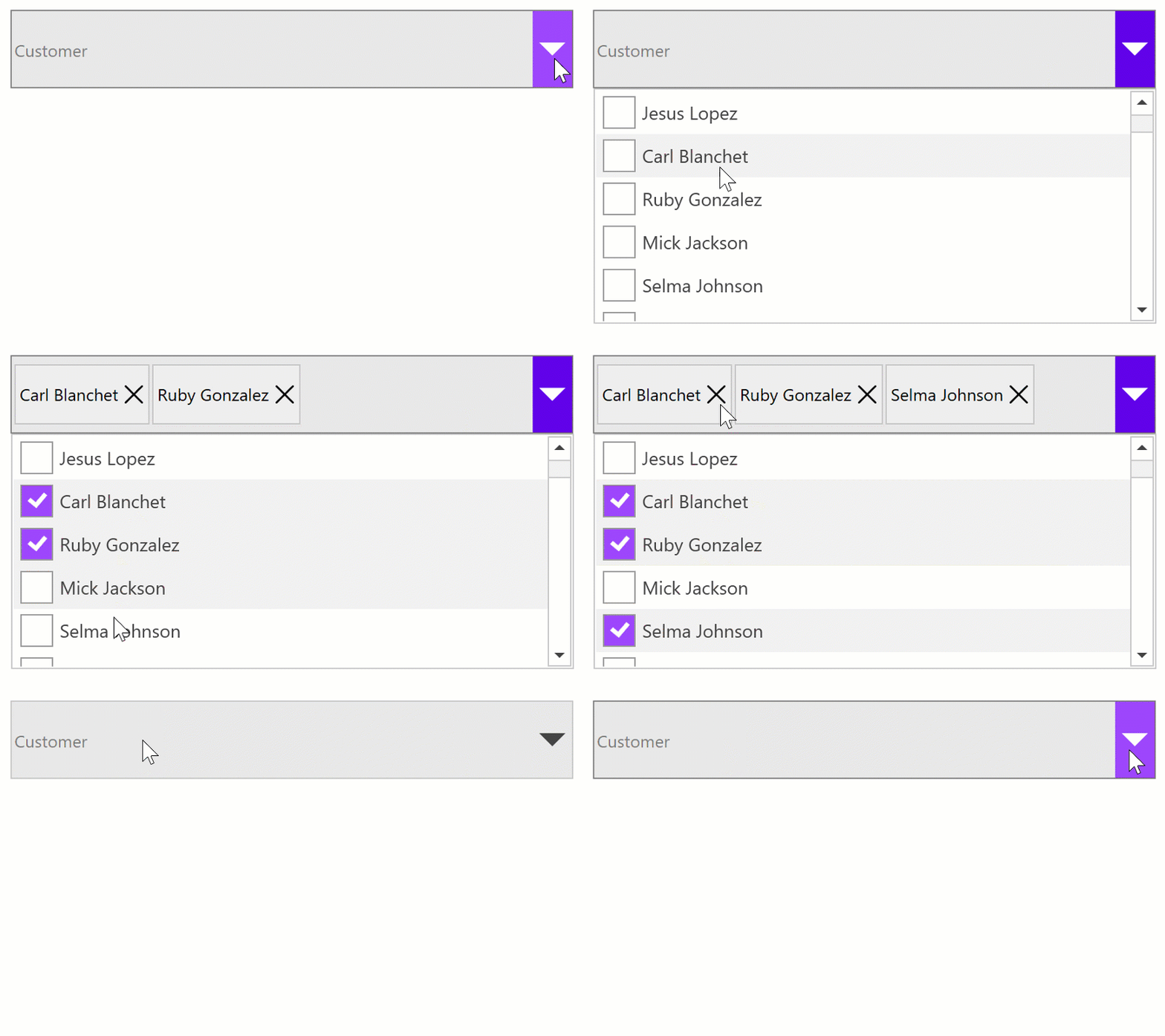
At runtime, the control displays a checklist in the drop-down and shows each selection as a tag or label. Users can remove selected items by clicking the "X" on each tag. The WPF MultiSelect control also works as an editable textbox so users can write in any value. If you don't want the drop-down portion, you can use the separate TagEditor control found in the same namespaces as a simple tag editor. If you need to obtain the selected items, you can get them from the SelectedItems property.
For the complete code, you can download the sample here.
Update June 2022: This blog was updated from an old sample that extended C1ComboBox to provide the same multi-select functionality. You can find the old sample here.
