How to Add Functional Components to a React Grid Application
In a galaxy not so far away, developers like you and I are in a constant struggle to find the perfect data components for React. Luckily, against all odds, MESCIUS developed such a component library. Wijmo. And with this fully armed and operational component library, you, too, can rule the component galaxy!
Don't just take our word for it; let's utilize and build FlexGrid, one of Wijmo's most popular components, together. We will be displaying data fetched from a popular open API called SWAPI (Star Wars API). If you want to access the reference code at any time, it can be found here. Now, let's get started.
Ready to Get Started? Download Wijmo Today!
Step 1: Setting Up Your React App
To begin our space-themed adventure, we'll utilize the Create React App tool to set up our development environment. Open up your terminal and run the following commands:
npx create-react-app swapi-wijmo-app
cd swapi-wijmo-app
This creates a new React app with a standardized structure, making it easy to organize and build upon.
Step 2: Installing Wijmo and Axios
Next, we will install the necessary packages for Wijmo and Axios. Wijmo provides React components that have unlimited power! This includes FlexGrid for efficiently displaying the data. Alongside Wijmo is Axios, which simplifies the process of making HTTP requests.
npm install @grapecity/wijmo.react.all axiosStep 3: Creating the WijmoGrid Component
We will create a reusable WijmoGrid component that will house our FlexGrid. This component takes data as a prop and dynamically generates columns based on the SWAPI data structure. Create a WijmoGrid.js file:
import React from 'react';
import { FlexGrid, FlexGridColumn } from '@grapecity/wijmo.react.grid';

const WijmoGrid = ({ data }) => {
  return (
<div>
    <FlexGrid itemsSource={data}>
      <FlexGridColumn header="Name" binding="name" />
      <FlexGridColumn header="Height" binding="height" />
      {/* Add more columns as needed */}
    </FlexGrid>
</div>
  );
};

export default WijmoGrid;
Step 4: Fetching Data from SWAPI
In App.js, we use the useEffect hook to fetch data from SWAPI when the component mounts. The fetched data is then passed to the WijmoGrid component to be displayed.
import React, { useState, useEffect } from 'react';
import Axios from 'axios';
import WijmoGrid from './WijmoGrid';

const App = () => {
  const [swapiData, setSwapiData] = useState([]);

  useEffect(() => {
    Axios.get('https://swapi.dev/api/people/')
      .then((response) => {
        setSwapiData(response.data.results);
      })
      .catch((error) => {
        console.error('Error fetching SWAPI data:', error);
      });
  }, []);

  return (
    <div>
      <h1>Star Wars Characters</h1>
      <WijmoGrid data={swapiData} />
    </div>
  );
};

export default App;
Step 5: Run and Explore
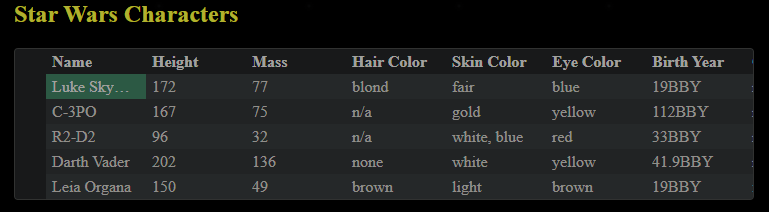
With everything in place, run the app by typing npm start in your terminal and explore all the Star Wars characters displayed in a modern-styled Wijmo Grid. All aspects can be specifically styled and customized to your liking, and Wijmo comes built-in with dozens of themes to get you started.
Here is some styling we quickly put together using Wijmo's darkly theme:
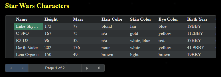
Step 6: More Features
If you want even more functionality for your grid, it is not difficult to add it with Wijmo! Let's quickly add pagination as an example of what additional features you could add.
To add pagination, we will use CollectionView. We will assign the Axios response to a CollectionView and set some of its properties. We will then use the CollectionViewNavigator in our component for pagination functionality.
In App.js, add this code:
import { CollectionView } from '@grapecity/wijmo';

const App = () => {
  var cv = new CollectionView([], {});

  useEffect(() => {
    // Fetch data from SWAPI when the component mounts
    Axios.get('https://swapi.dev/api/people/')
      .then((response) => {
        cv.sourceCollection = response.data.results;
        cv.pageSize = 5;
      })
      .catch((error) => {
        console.error('Error fetching SWAPI data: ', error);
      });
  }, []); // Empty dependency array ensures the effect runs only once

  return (
     <h1>Star Wars Characters</h1>
     <WijmoGrid data={cv}></WijmoGrid>
  );
};
Then, in WijmoGrid.js, add this after your FlexGrid:
import { CollectionViewNavigator } from '@grapecity/wijmo.react.input';

<div>
     <CollectionViewNavigator
       headerFormat="Page {currentPage:n0} of {pageCount:n0}"
       byPage={true}
       cv={data}
       />
</div>
And just like that, we have pagination functionality!
(Note: Due to the limitation of the API, the number of items returned is limited, but it works for our example.)
Conclusion:
Throughout this brief guide, we have embarked on a brief journey into the vast possibility galaxy of Wijmo and created a Star Wars-themed React app using SWAPI data. By combining the powers of React for building dynamic user interfaces and Wijmo for feature-rich data visualization, developers can create immersive and visually appealing applications quickly. As you explore, customize, and create your future project adventures, may the Force (and Wijmo) be strong in your development endeavors!
May the code be with you, always.
Ready to Get Started? Download Wijmo Today!
Tags:
Related Blogs
Try Our JavaScript UI Components & Datagrid
