Wijmo 2018 v2 has landed
Wijmo’s second major release of 2018 has landed, and it includes a new Designer for VSCode, SASS support, accessibility improvements and more.
Let’s dive in.
Design Time for Wijmo Controls
Until now, Wijmo controls were easy to use, but still required writing code. We're happy to announce that we now have design-time environments for creating and customizing Wijmo controls. We're providing two beta products for using a design surface similar to Visual Studio, including a live preview and property grid. The two designers are:
- A VSCode designer for customizing Angular Wijmo components
- A web-based designer for creating and customizing PureJS Wijmo controls
New Wijmo Designer for Angular in VSCode (Beta)
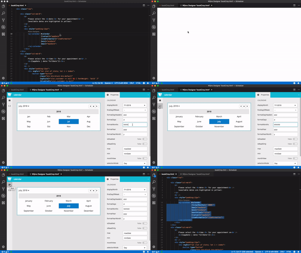
This designer is an extension for VSCode. When installed, it adds a “Wijmo Designer…” action above each Angular Wijmo component. When the action button is clicked, it opens up a design surface for customizing that specific component. You can change properties, bind events and save your changes back to the Angular application.
To install this extension in VSCode, click “install” from the Designer page on VS Marketplace.
You can also search “wijmo” in VSCode’s extension manager and install from there.
Make sure to reload VSCode after install. Then open up an Angular application that uses Wijmo controls and try launching the designer.

View the video tutorial | Read the blog | Get the VSCode extension
New Wijmo Designer for PureJS (Beta)
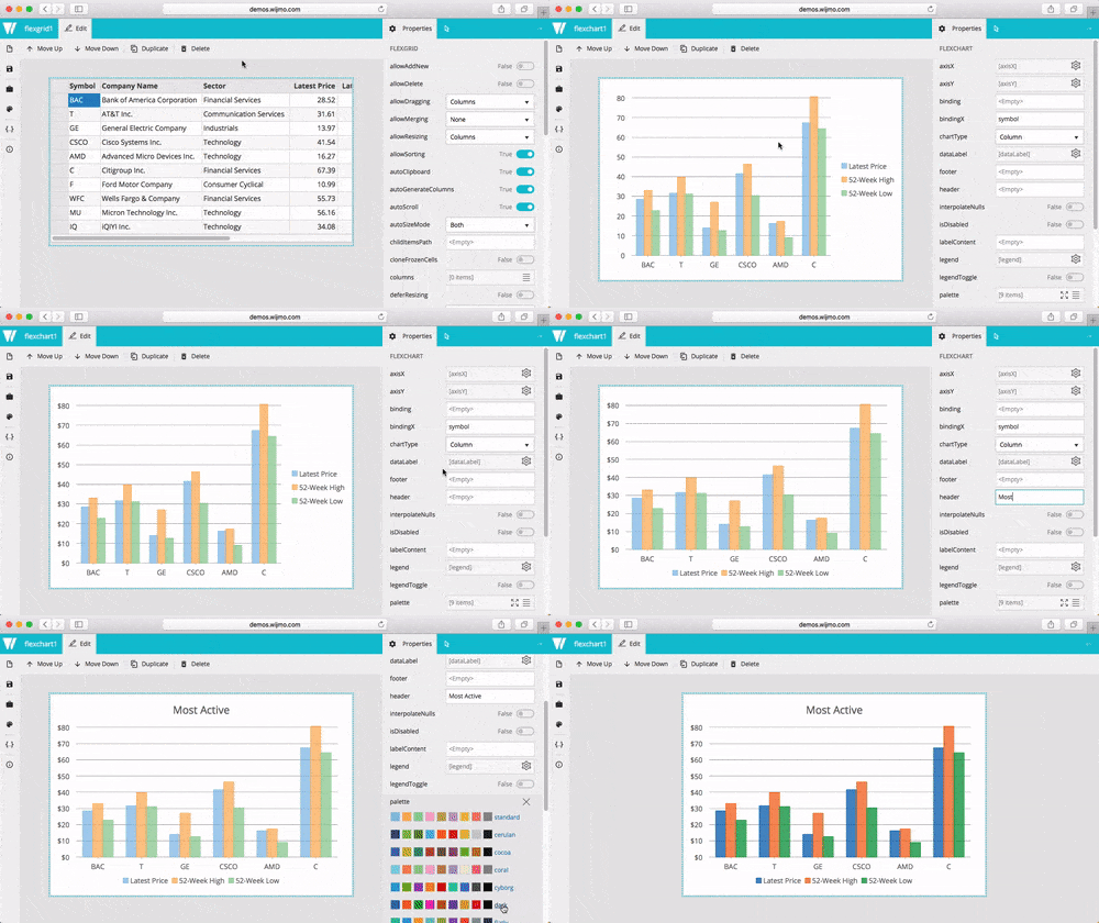
This designer is a web application for creating and customizing Wijmo controls. You can run this designer in any browser. It allows you to add controls to the design surface and then customize them to your liking. Once finished, you can copy the generated code into your own application.

The generated code from this designer is plain HTML and JavaScript. The generated code includes the references, host element, and JavaScript needed to initialize the controls.
View the video tutorial | Read the blog | Launch the Wijmo Designer
SASS Support for Controls and Themes
Our control styles (layout, default styling) were previously written in CSS. Initially, it started simple, but it had grown to a point where it was hard to manage. We decided to rewrite our styles using SASS and a better organization. The end result will be similar for our customers, but you'll experience some nice benefits.
- First, you can easily use our SASS files to create your own themes. We're providing our SASS files for you to use and customize as you like.
- Second, you can now choose which SASS modules you want to include in your application. For example, we now have a Wijmo-Core file that only includes the core modules (not enterprise) and it's only a fraction of the size. You can really optimize your CSS size by selectively choosing what to include.
- Last, we're one step closer to Shadow DOM support in our Web Component interop. We're still thinking of how best to approach this topic, so please send any feedback you have in the meantime.
We hope these improvements help making styling Wijmo applications even easier. We tried to keep things as stable as possible by testing against older themes, and we're confident that your themes should work with these changes.
New React/Redux Cryptocurrency Tracking Application
We're happy to reveal a real-world reference application for Wijmo that uses React and Redux. The application is a financial dashboard for tracking cryptocurrency values that's modelled after a production application one of our customers would develop. It uses modern design patters for React/Redux and a variety of Wijmo controls, and should help you evaluate and develop Wijmo apps.

Try React/Redux CryptoCurrencyTracking sample
Vue 2 Interop Enhancements
As Vue continues to gain popularity, we're improving our interop. This release adds some nice enhancements to our Vue 2 support. Most significantly, child components now correctly work in dynamic scenarios like along with the v-for and v-if directives.

We also added components like WjFlexGridDetail, added numerous child components, and added some new samples. Thanks for all the feedback on Vue, and please keep it coming!
Try Vue 2 AllComponents sample
ES6 and ESModule support
We've also added ES6 versions of Wijmo modules (Beta version), which you can find in the NpmImages folder of Wijmo download zip:
- wijmo-es2015-esm-min – in ESM module format (ES6 import/export statements)
- wijmo-es2015-commonjs-min – in CommonJS module format
We'll be continuing to research and develop our ES6 support this year. Feedback here is welcome!
Web Components in Wijmo
We just introduced a beta version of the Wijmo web components interop, which exposes Wijmo controls as web components, or more specifically as custom elements. Wijmo web components allows you to declaratively add Wijmo controls to HTML page, and manipulate them as usual DOM elements, without the use of any additional framework. Some browsers that don't fully support web components standards may require some additional polyfills.

If you're not familiar with web components, here's a good introduction to this technology.
The key aspects of the current state of the Wijmo web components implementation:
- Wijmo "top-level" web components that represent Wijmo controls, like wjc-flex-grid component representing FlexGrid control, are inherited from the corresponding control classes. For example, WjcFlexGrid component class extends FlexGrid control class. This also means that the base Wijmo Control class extends the HTMLElement class when Wijmo is used in the "web components mode".
- Child components that are complementary to top-level components, like wjc-flex-grid-column components that define FlexGrid columns, function as wrappers over Wijmo classes they represent. Child components are directly inherited from the HTMLElementclass, and the underlying Wijmo class instance is accessible via the special control property of the component.
- Wijmo class properties can be defined using attributes on the component element. When the attribute value changes, the corresponding Wijmo class property is updated accordingly. Changing the class property value doesn't entail changing of the corresponding attribute value. This probably can be changed in the future, but right now we have not decided whether it's necessary.
- JavaScript code can subscribe handlers to Wijmo control events using native Element.addEventListener('event', handler) method.
- Wijmo components don't use Shadow DOM now. This will be addressed in future versions of the interop. One of the challenges here is that Wijmo allows deep customization of its control's parts via CSS, whereas the goal of Shadow DOM is to prevent it. There are new proposals to the Shadow DOM specification that can mitigate this limitation, and we're closely following the changes. For now, Wijmo web components and their parts can be customized in the same way as ordinary Wijmo controls, using global CSS.
One of the benefits of web components is that the same component can be used in different frameworks and benefit from the frameworks’ additional capabilities like attribute, property, and event bindings.
For now, we added the Web Components In Angular sample that demonstrates how to use Wijmo web components in an Angular application. Samples for other popular frameworks like React, Vue, Polymer, and others are on the way.
Please send us feedback while our Web Component interop is in beta: Web Components Intro sample | Web Components In Angular sample
Angular 6 and TypeScript 2.7 Support
As we already announced, Wijmo supports Angular version 6.0.0. We're still working on upgrading all our samples to Angular version 6 and our TypeScript version to 2.7. A future release will include those.
We also have an interesting blog about using Wijmo with Angular Elements: Angular 6 Support blog | Exploring Wijmo with Angular Elements blog
New Samples
- WebComponentsIntro sample | Web Components intro blog
- WebComponents AllComponents sample
- React/Redux CryptoCurrencyTracking sample
- Vue 2 AllComponents sample
- Vue 2 FlexGrid DynamicColumns sample
- Vue 2 FlexGrid GroupPanel sample
- Vue 2 FlexGrid RowDetail sample
Change Log
- [WebComponents] Added Beta version of the WebComponents interop (wijmo.webcomponents.xxx.js modules). The Samples\TS\WebComponents\WebComponentsIntro sample explains the status and usage of the interop. WebComponentsIntro sample | Web Components introduction blog
- [npm] Wijmo is published to the global npm registry as the 'wijmo' package. | Wijmo and NPM
- [WebComponents] Added AllComponents sample, which includes all major supported components. WebComponents AllComponents sample
- Added web-based Wijmo Designer application for designing PureJS controls with a Visual Studio-like property grid and design surface Web-based Wijmo Designer | Web designer blog
- Added VSCode Wijmo Designer extension for designing controls with a Visual Studio-like property grid and design surface VSCode Wijmo Designer | VSCode designer blog
- Wijmo CSS files are implemented using Sass now. Read the blog
- [React/Redux] Added React/Redux CryptoCurrencyTracking sample. This is a quite big application implemented using React, Redux and Wijmo for React interop. React/Redux CryptoCurrencyTracking sample
- [ES6] Wijmo ES6 npm images (wijmo-es2015-commonjs-min and wijmo-es2015-esm-min folders in NpmImages) of build 462 are approved as a release version.
- [a11y] Added a wj-state-focus class selector that complements the wj-state-focused selector. The wj-state-focus selector gets the Wijmo control that has the focus. The wj-state-focused selector gets all Wijmo controls that contain the focus. For example, if you have nested Wijmo controls A, B, and C, and control C contains the active element, then .wj-state-focus will select C and .wj-state-focused will select A, B, and C. The wj-state-focus selector can be useful for implementing focus outlines in CSS. For example:
.wj-state-focus,
a:focus,
button:not(.wj-btn-default):focus,
input:not(.wj-form-control):focus,
input[type=checkbox]:focus {
    box-shadow: 0px 0px 17px 0px rgb(41,173,68);
}
- [a11y] Improved accessibility for Calendar, TreeView, InputDate, and FlexGridFilter.
- [a11y] Added aria-required attribute to the FlexGrid native editor element
- [a11y] Replaced buttons with button elements (better accessibility, supports enter/space keys)
- [a11y] Replaced all cell buttons in FlexGrid with button elements (filter, detail, list, collapse/expand)
- [a11y] Added ARIA attributes to buttons in DropDown, InputDateTime, InputNumber, Calendar, ColumnFilterEditor controls
- [a11y] Added aria-selected attribute to selected items in ListBox, Calendar, TreeView (like FlexGrid and TabPanel)
- [a11y] Cleaned up ComboBox ARIA attributes
- [a11y] Added roving tabindex to Calendar and TreeView controls (better accessibility, like FlexGrid and TabPanel)
- [a11y] Added a 'describedById' property to the FlexGrid's ColumnCollecion and Column classes. This is used to set the aria-describedby attribute on column header and filter elements.
- [a11y] Added a keyActionEnter property to the FlexGridDetailProvider class.
- Improved FlexGrid.virtualizationThreshold to support arrays: [rowThreshold, columnThreshold]* [Vue2] Added numerous child components, like various chart series.
- [Vue2] Child components now correctly work in dynamic scenarios like along with the v-for and v-if directives.
- [Vue2] Added WjFlexGridDetail component.
- [Vue2] Added new samples.
- All samples use httpS CDN references.
- OData samples use httpS now.
- WijmoHelp is updated with the Wijmo Designer topic.
- Documentation is updated with the Sass related topics.
- Added a Gauge.stackRanges property that causes the control to stack the ranges. The RadialGauge shows them as concentric sectors, the LinearGauge as stacked bars.
- Added a FlexGrid.autoSearch property that allows users to search for content in the grid by into non-editable cells.
- Optimized ComboBox performance when opening the drop-down.
- Optimized ListBox performance when populating the list.
- Added an ODataCollectionView.expand property to allow retrieval of related entities (as in OData's $expand option).
- Added an ODataCollectionView.jsonReviver property that allows customization of the parsing process for JSON data returned from the server.
- Support to insert/remove columns in bound sheet for FlexSheet.
- Added a document property to the PdfPageArea class.
- Added a drawDetailRows property to the IFlexGridDrawSettings interface.
- Added a requestHeaders property to the ReportViewer and PdfViewer controls.
- Added a beforeSendRequest event to the ReportViewer and PdfViewer controls.
- Added a parameters property to the ReportViewer control.
- Improved CollectionView sorting to handle diacritics (accents).
See the full changelog for breaking changes
