Using the MultiColumnComboBox Extension for ComboBox
In our latest 2019 v1 Release, we added the MultiColumnComboBox Control, an extension of C1 ComboBox Control. So, what makes it different from a ComboBox? This control isn't limited to rendering a flat list of items in the DropDown, it instead renders a Grid inside the DropDown. Therefore it is possible to display more information inside the DropDown than a standard ComboBox.
Now that we know what makes it different, how about we discuss a scenario where it would be useful.
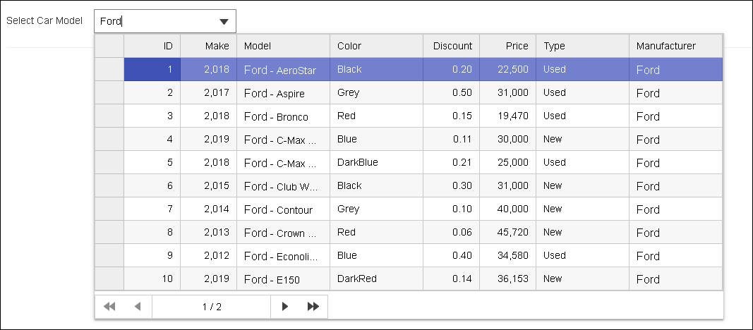
Let's suppose we are developing a website for a car dealer portal, and we want to give users the feature to select car models based on a manufacturer (Ford, for example) and then make specific choices regarding model, make, and new/used.
Implementing such a feature would require using a few ComboBoxes like the one in the image below:

We may even want to display more information like color, discount, and price range basically providing more information to narrow down their search. One way is to allow the user to filter their search criteria by selecting from various options. This will obviously result in adding more ComboBoxes to the page that already seems overloaded.
Wouldn't it be easier for the end user if the page just had a single ComboBox that displayed this information, thereby saving on the screen space and number of user action required to reach to the desired option?
Using the ComponentOne MultiColumnComboBox we can easily implement this with a single ComboBox. Users can type the car manufacturer name "Ford" inside the TextBox and it would display a grid with make, model, color, discount, type and price range as columns. This would provide a quick and detailed glance of all relevant information regarding "Ford" as shown in the image below. Also, it makes the UX for the page look better than the previous implementation.
The Control Panel replaces the traditional ComponentOne web installer, and it makes it much easier to simply pick a platform and install a suite of controls that support it. In this article, we’ll take a look at all of the major features supported in the new ComponentOne Control Panel.
Next, we'll discuss:
- Setting up the project to use the MultiColumnComboBox control
- Adding the MultiColumnComboBox as Input
- Formatting the Control's Dropdown
- Using the MultiColumnComboBox as Custom Editor for FlexGrid
Setting Up the Project to Use the MultiColumnComboBox Control
-
Create a new MVC project using C1 MVC Standard template. The template automatically handles registering resources, namespaces and licensing.
-
Add a reference of C1.Web.Mvc.Extension.DLL from the Extension samples bin folder to the project. (If C1.Web.Mvc.Extension.DLL is not found inside the solution, then we need to rebuild the solution to get this assembly.)
-
Add following name spaces within
<namespaces></namespaces>under system.web.webPages.razor in web.config file.<add namespace="C1.Web.Mvc.Extensions.Fluent" /> -
In _Layout.cshtml file, register resources by adding following code within head tag @Html.RegisterMultiColumnComboBoxScripts()
After completing the above steps, we are ready to use the MultiColumnComboBox in our projects as Input Control.
Adding the MultiColumnComboBox as Input
Here, we are going to add the MultiColumnComboBox as InputControl in the project. The control is available in the "Custom" HTMLHelperExtension and can be added using the following code in the web page where required:
<style>
    /* Change the Dropdown width*/
    .wj-dropdown-panel {
        max-width:893px;
    }
</style>
@(Html.Custom().MultiColumnComboBox().Id("MultiColumnCmb")
        .Bind(m=>m.Bind(Model).PageSize(10))
        .SelectedValuePath("ID").DisplayMemberPath("Model")
        .IsEditable(false)
)
Formatting the Control's Dropdown
Let's say in our example we wanted to apply some formatting to the frid to highlight some of the values in the grid.
For example, we might want to highlight when the discount on a car model is more than or equal to 50%, we could implement a functionality where the "Discount Price" will blink when it satisfies this condition.
Another example could be that we would like to display all car models which are of the type "new" with a green background to highlight them.
We can use the GridItemFormater property to format the items in the dropdown. If we would like to customize displaying FlexGrid e.g. set format for columns, change column position, etc. we can handle the OnClientIsDroppedDownChanged event and make changes after getting the FlexGrid instance.

The GridItemFormater accepts the function with two parameters, the FlexGrid and FormatItemEventArgs instance.
<style>
input { /* styles the Input element font */
font-family: Arial !important;
font-size: 14px !important;
}
.wj-cell { /* styles the FlexGrid cells’ font */
font-family: Arial !important;
font-size: 14px !important;
}
#MultiColumnCmb.wj-content {
border:1px solid #808080;
}
.wj-header{ /* Remove the boldness from FlexGrid’s heade */
font-weight:normal !important;
}
.wj-dropdown-panel {
max-width:893px;
}
.blinking{ /* class to blink the Text in cell */
animation:blinkingText 0.5s infinite;
font-weight:bold;
}
@@keyframes blinkingText{
0%{ color: #000; }
50%{ color: red; }
100%{ color: #000; }
}
</style>
<script>
function FormatGrid(s, e) {
if (e.panel.cellType == wijmo.grid.CellType.Cell) {
var color = "";
/* Styles the Discount column if value is 50% by blink text */
if (s.columns[e.col].binding == "Discount" && s.rows[e.row].dataItem.Discount >= 0.50) {
e.cell.innerHTML = "<div class='blinking'>" + wijmo.Globalize.format(s.rows[e.row].dataItem.Discount,"p2")+"</div>";
}
/* Add green background for New cars */
if (s.columns[e.col].binding == "Type" && s.rows[e.row].dataItem.Type=="New") {
e.cell.innerHTML = "<span style='background:green;color:white;padding:1px 6px;'>New</span>";
}
e.cell.style.color = color;
}
}
function DropDownChanged(s,e) {
if (s.isDroppedDown) {
/* Modify Columns properties to format FlexGrid */
var grid = wijmo.Control.getControl(s.dropDown.querySelector(".wj-flexgrid"))
grid.headersVisibility = 'Column';
grid.columns.getColumn("ID").visible = false;
grid.columns.getColumn("Make").format = "g";
var modelCol = grid.columns.getColumn("Model");
modelCol.width = "*";
if (modelCol.index == 2) {
grid.columns.moveElement(2, 1);
}
var discntColumn = grid.columns.getColumn("Discount");
discntColumn.width = 104;
discntColumn.format = "p2";
grid.columns.getColumn("Price").format = "c0";
}
}
</script>
@Html.C1().CollectionViewService().Id("CollectionVeiwService").Bind(Model)
<div style="margin-top:15px;">
<span >Select Car Model</span>
@(Html.Custom().MultiColumnComboBox().Id("MultiColumnCmb")
.ItemsSourceId("CollectionVeiwService")
.SelectedValuePath("Model").DisplayMemberPath("Model")
.PageSize(10)
.Placeholder("Select Car Model")
.OnClientIsDroppedDownChanged("DropDownChanged")
.GridItemFormater("FormatGrid")
)
</div>
Now implementation is complete, and we are ready to use the Multi ComboBox in our project.
Advanced Implementation: Using the MultiColumnComboBox as a Custom Editor for FlexGrid
MultiColumnComboBox can also be use a custom editor for FlexGrid inside the cells. This enables the implementation of the above example inside a FlexGrid (as shown in following GIF).
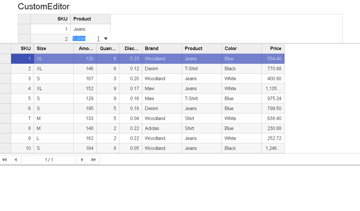
Let's look at the same with the following steps:
Step 1: Adding the MultiColumnComboBox as Custom Editor
The control should be placed within the script tag with text/template as the type. We also need to set the ID attribute to refer to the CellTemplate for FlexGrid.
Use CollectionViewService to bind data to handle the data parse to json and avoid requesting data again on initializing the editor.
@Html.C1().CollectionViewService().Id("collectionViewService1").Bind(ViewData["Sales"] as List<Sale>)
<script type="text/template" id="prdctEdtr">
    @(Html.Custom().MultiColumnComboBox().Id("Multi")
                .ItemsSourceId("collectionViewService1")
                .IsEditable(false)
                .SelectedValuePath("Product")
                .DisplayMemberPath("Product").CssStyle("width","100%")
                .TemplateBind("Text", "Product")
                .ToTemplate()
    )
</script>
Step 2: Set FlexGrid CellTemplate's EditTemplate ID attribute to the Script's ID "prdctEdtr" containing the MultiColumn control as the editor.
@(Html.C1().FlexGrid().Id("Grid").Bind(Model).AutoGenerateColumns(false).Columns(
            c => {
                c.Add().Binding("ID").Header("ID");
                c.Add().Binding("Product").Header("Product").CellTemplate(ctb=>ctb.EditTemplateId("prdctEdtr"));
            }
    )
)
Thanks for following along. Please leave any questions in the comments below.
Happy Coding!
